
There are five data sets of global average temperature in the troposphere (the part of the atmosphere where our weather occurs) based on satellite data, from the two main providers, RSS (Remote Sensing Systems) and UAH (University of Alabama at Huntsville). UAH provides two of them: TLT (temperature in the lower troposphere) and TMT (temperature in the mid-troposphere); while RSS provides three: TLT, TMT, and TTT (temperature in the total troposphere). They’re all different, and each has gone through a number of revisions since the satellites began collecting data in 1979.
The UAH data are overseen by John Christy and Roy Spencer. When Christy testifies in congress (which he has done several times) he invariably uses his own data product, usually the mid-troposphere version UAH TMT. Here’s the latest version, v6.0, together with a linear regression line (in red):

Determining the uncertainty in the trend according to linear regression is complicated by the strong autocorrelation of the data. We can eliminate much of that problem by using annual averages rather than monthly data, which look like this:

The estimated rate since 1979 is 0.85 +/- 0.42 deg.C/century (95% confidence). That’s the lowest rate of increase of all five troposphere data sets.
The highest rate of increase of the five data sets is for the TTT product from RSS:

For these data the estimated rate is 1.82 +/- 0.48 deg.C/century — more than twice as fast as for the UAH TMT data! If we compare the warming rates of all five, we get this:

Naturally one wonders, why are they so different?
The UAHTLT data are warming faster than the UAHTMT data simply because the lower troposphere seems to be warming faster than the mid-troposphere. But that raises the question, why is this reversed for the data from RSS? That’s because the RSS data for TMT are their latest version 4, but they haven’t yet published a version 4 for TLT, that’s still on the older version, v3.
In testimony before congress, retired admiral David Titley (formerly chief oceanographer of the U.S. Navy) mentioned three problems with satellite data sets: orbit drift, mismatch between different satellites, and stratospheric contamination. Addressing these problems is the reason RSS has revised their data products recently. Their newest version 4 addresses the problem of orbit drift and improves the match between different satellites. Doing so results in “substantially increased global-scale warming relative to the previous version”:

The impact is strong enough that their new TMT shows faster warming than their old TLT.
The new RSS product, TTT, is designed to reduce the effect of stratospheric contamination. The stratosphere is actually cooling (because of CO2 increase), and if it contaminates a troposphere estimate it will introduce false cooling, leading to estimates of warming which are too small. As RSS states, “In the simpler TMT product, about 10% of the weight is from the lower stratosphere. Because the lower stratosphere is cooling at most locations, this causes the decadal trends in TMT to be less than the trends in the mid and upper troposphere..” They also illustrate the effect of implementing their new version:

In short, the revisions to RSS products have directly addressed some of the known problems with satellite data, strongly suggesting that the new RSS data sets — especially TTT version 4 — are a more accurate measure of how tropospheric temperature is changing. If you use the UAH data, you still have to wonder about orbit drift and mismatch between different satellites, and if you use UAH or RSS data for TLT or TMT, stratospheric contamination is still a serious problem.
Another way to evaluate the satellite data is to compare is to the upper-air measurements from thermometers carried aloft by balloons. They radio their readings back to earth, which is why it’s sometimes referred to as “radiosonde” data. Satellites have the advantage of more global coverage, but radiosondes have the advantages of being from actual thermometers, and of dating back to 1958 (satellite data don’t start until 1979).
There are a number of different global estimates of tropospheric temperature from balloon-borne instruments; one which is specifically designed for climate study is RATPAC (Radiosonde Atmospheric Temperature Product for Assessing Climate). It’s easy to retrieve a global average because the data providers have already computed it. So too has the U.K. dataset HadAT2, but the version I find only extends through the end of 2012, while RATPAC has been kept up-to-date. The two versions are in excellent agreement:

Let’s compare the satellite data to the RATPAC data, since it extends to the present year.
RATPAC global estimates are seasonal, so I’ve computed seasonal averages from the monthly satellite data. The match between RATPAC and UAH TMT (the slowest-warming of the five satellite data sets) is rather poor:

The wiggles match pretty well, but not the trend — there’s a pronounced drift between them, with UAH TMT running quite a bit cooler than the balloon data. Also, the correlation coefficient of UAH TMT with RATPAC is poorer than that of any other satellite data set. This argues very strongly against the accuracy of the UAH TMT data.
The satellite data set with the best correlation to RATPAC data is the one warming fastest, RSS TTT:
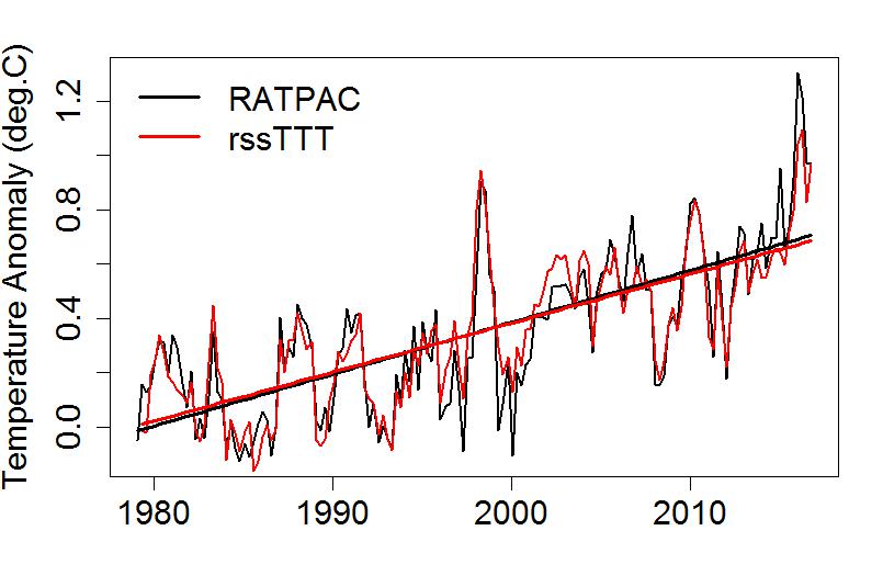
Not only the wiggles, but the trends match. In fact the trend according to RATPAC is 1.91 +/- 0.51 deg.C/century, in excellent agreement with RSS TTT but flatly contradicting UAH TMT. It’s interesting to note that the correlation between RATPAC and satellite data sets is better for all three RSS data sets than for either UAH data set.
Bottom line: the reasons for the recent revisions to RSS data and direct comparison to balloon data both lead me to believe that the RSS data products are distinctly superior to the UAH data. In particular, the RSS TTT product, because it has a much better correction for stratospheric contamination, seems best of all, and matches the balloon data best. It’s also the satellite data set showing the fastest warming.
We don’t live in the upper atmosphere, we live on Earth’s surface, where temperature is measured by thermometers. Some people believe (and climate deniers want you to believe) that the satellite data sets are better than surface temperature data sets based on thermometer measurements. ‘Tain’t so. In fact, Carl Mears, lead scientist processing the satellite data for RSS, says outright that the surface temperature records are more accurate. You can hear him say so here (21 seconds in, at 0:21).
The reason deniers claim the satellite data is superior is that they want to discredit the surface temperature (thermometer) record, and that’s because the surface data show so much warming. But among the satellite data sets, there’s one which shows far less warming: UAH TMT. Odd that these days they make a habit of showing that one, the one satellite data set which shows the least warming and correlates least with balloon data. Come to think of it, it’s not odd at all…
This blog is made possible by readers like you; join others by donating at Peaseblossom’s Closet.


Will be interesting to see what RSS TLT v4 shows. I hope RSS is working on that.
Will also be interesting to see if Christy and Spencer make drift, satellite continuity, and stratospheric corrections to the UAH data. If not, I suspect it, and they, will justifiably lose scientific credibility.
I hope Ted Cruz follows the Open Mind blog (fat chance!) so he will stop making absurd claims about satellite data showing no warming.
“There are five data sets of global average temperature in the troposphere “
There is also a TMT (and TUT) set from NOAA Nesdis STAR. It’s petty much in agreement with RSS TMT.
Rather than comparing questionable global satellite-based temperature measurements to extrapolations of actual thermometer estimates, has someone compared the appropriate spatial subset of satellite-based temperature estimates to actual spatial estimates made from actual thermometers? Or is that too difficult given that drift means the time/location of a satellite-based temperature reading is difficult to specify (thus making comparison to a particular balloon impossible)?
Microwave emissions from oxygen molecules in the 50 to 60 GHz band are highly sensitive to both temperature and pressure. It is a major task to collect, calibrate, deconvolve and homogenize 40 years worth of data from a dozen different satellites with changing orbits and aging instruments. It is a nearly Herculean one to turn that into a time series of global lower tropospheric temperatures accurate to the requisite ~0.1 °C to compare to land-based measurements.
That only RSS and UAH have taken on the task, with the latter consisting predominantly of two researchers who have raised many red flags concerning their competence and/or objectivity should be cause for caution. The multiple changing and often poorly documented processing routines employed over the years has given contrarians a rich source of material to misuse and abuse. “But the satellite data shows…” is right up there with statistically insignificant pauses in global warming trends.
It was amusing to see emeritus physicist-for-hire William Happer testifying in front of Ted Cruz’s Senate committee earlier this year, and revealing in his testimony that he thought the satellites were using infrared thermal emission measurements to determine atmospheric temperatures. Some ‘expert’.
Is the time of measurement error or stratosphere contamination the cause of the Drift https://tamino.wordpress.com/2016/01/15/drift/ ?
The fit of the TTT with the radiosonde data set is stunning. It’s pretty clear that RSS has done a great job cleaning up their interpretation of the satellite data while Spencer and Christy are allowing stratospheric contamination to offset much of the upper tropospheric warming in their data set.
Steve, remember that the satellites are actually sampling outgoing radiation from a pretty large volume not a point That’s why Christy & Spencer have the problem with contamination by stratospheric cooling. Radiosonde data are pretty close to being point measurements of temperature. That’s why surface temperatures and radiosonde temperatures are more precise and accurate than satellite temperature data.
Since balloon sondes measure on the way up and they (at least now) use GPS to measure altitude it should be possible to measure T vs h in 1 km chunks, uniting ground and satellite records
NOAA STAR has made a swift move and produced a new dataset v4.
ftp://ftp.star.nesdis.noaa.gov/pub/smcd/emb/mscat/data/MSU_AMSU_v4.0/Monthly_Atmospheric_Layer_Mean_Temperature/
This was necessary since they used the same model for diurnal drift correction as RSS 3.3, and Mears et al (2016) found that this model didn*t correct the drift sufficiently.
The new STAR v4 use the Po Chedley et al (2015) method to correct the TMT channel for drifts.
The overall trends (1979-now) of STAR and RSS versions 4 are quite similar:
TMT: 0.144 and 0.139 C/dec, respectively (UAH v6 0.83 C/decade)
TTT: 0.184 and 0.179 C/dec (UAH v6.0.123 C/dec)
The STAR and UAH TTT-indices above are not official, but are easily made with the TTT = 1.1*TMT-0,1*TLS formula. For UAH the trend is similar to the third decimal with their own TLT product.
The TMT-channel doesn’t make sense, from an atmospheric physics perpective, since it mixes warming troposphere with cooling stratosphere.
Ratpac 850-300 mbar, a standard index for the free troposphere, and TMT is not a fair comparison. If Ratpac data gets a TMT-weighting the trend is lower, about 0.13 C in the satellite era.
The TTT-concept was once invented by the University of Washington team (Fu et al) with the intention to make the best satellite equivalent of the free troposphere layer 850-300 mbar. Needlessly to say that TTT is most useful satellite index, or..?
Skeptics don’t like comparisons between radiosondes and satellites, because they reveal a significant divergence in the AMSU era.

They complain that radiosondes, eg Ratpac A, hasn’t near global coverage and can’t be compared to satellite products
However, that claim can easily be tested. Here I have made the comparison apples to apples as far as possible, with same coverage in UAH (station dropouts also included) and same TLT-profile i Ratpac:
The chart demonstrates two things:
Ratpac A has a good global coverage.
UAHv6 TLT diverge significantly from radiosondes in the AMSU-era, about 0.2 C per decade
RSS 3.3 TLT is equally bad, whereas UAH 5.6 TLT and RSS v4 TTT only diverge by half (about 0.1 C/decade) compared to Ratpac A.
Nicely demonstrated. I think this is an efficient way to beat the apples-oranges challenge that George and Eli described. The global vs non-global issue is very minor, so finer resolution isn’t needed. Still, if one were calibrating or validating, I suspect greater resolution would be preferred, at least in a few test cases.
[Distraction: Perhaps not meaningful but it looks like the subsampled data show slightly greater absolute difference to about 1994 (cooler) and then less absolute difference since about 1998 (warmer).]
Reblogged this on Don't look now and commented:
“among the satellite data sets, there’s one which shows far less warming: UAH TMT. [The deniers] make a habit of showing the one satellite data set which shows the least warming and correlates least with balloon data.”
I’ve a paper comparing satellite data sets, which was just posted as early release on JTECH. Here’s a link to the abstract:
http://journals.ametsoc.org/doi/abs/10.1175/JTECH-D-16-0121.1
We are still awaiting the publication of Spencer & Christy’s paper describing their Version 6 analysis, data which I included in my analysis. I think there are problems with their approach, but I can’t comment until I have time to digest their published methods.
Luke warmers see a fast bit matching models up to the 1998/98 peak followed by a slow or flat bit a lot slower than models. Until 2015 it was possible to claim the current temp is cooler than an earlier peak – the so called “pause”. However 2016 was so warm that is nolonger arguable true. However, look at the last peak. There is a big dip just after. If there is no big dip in 2017 the “pause” is dead. That is a big dip expect to hear about the pause again.