Rebranding – Twitter Goes Dark and Launches New Logo ‘X’

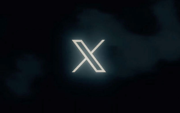
In a very surprising move (Or not!), Elon Musk announced that he will be rebranding the popular social media platform Twitter and moving it to X.com. The transformation has been quite sudden and is generating a lot of buzz. The new owner of the network also revealed that the iconic bird logo will be ‘retired’ and an X symbol will take its place. As a logo design company, here’s our take on it.

Image Source: Arstechnica.com
The Rebranding – X
When it comes to rebranding, there are a lot of things to consider. For once, the blue bird is one of the most recognized logos across the globe and is instantly associated with the platform. So, this transformation could lead to confusion among users and possibly a drop in them as well. For a complete overhaul of the brand, there have to be driving factors. These include a new vision, purpose, change in brand values and loss of meaningful connections with the users.
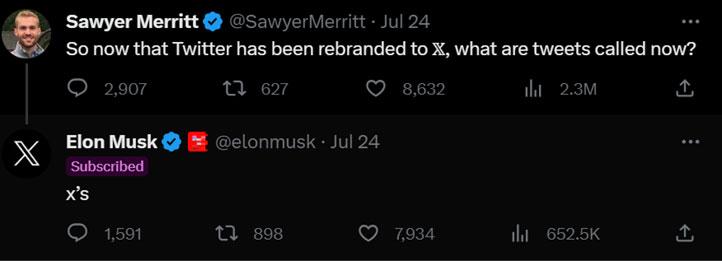
When it comes to Twitter, the reasons behind the rebranding seem a bit vague. Other than one major factor. Musk stated that he wanted to turn the platform into an ‘everything app’. But the new visual elements unveiled so far have only made the transition more confusing. Does the ‘X’ logo really represent Twitter as accurately as the bird? And what to say about ‘tweeting’?
Musk directly addressed questions regarding the logo change and what users could expect after the rebrand.

Image Source: Twitter/SawyerMerritt
The blue bird logo was first introduced in 2006, and refined over the years. The version that we saw until now was launched in 2012. However, Musk has said that he believes the blue bird doesn’t accurately reflect the current state of Twitter.

Image Source: About.twitter.com
The new X logo is a minimalist, black-and-white design that is more in line with Musk’s vision for Twitter. The X is meant to represent the “crossing of ideas” that happens on Twitter, and it is also a reference to the company’s new name, X Holdings.
Like the previous one, this one is also designed to ensure logo adaptability for long-term survival. The logo change has been met with mixed reactions. You could say that a majority of users are not happy about seeing the X appear on their screens. And this might be justified.
This transformation occurred in a few days and for now, it appears a bit thoughtless too. Despite what it may seem like, it is clear that Elon Musk is bringing in a new era for Twitter. And this is just the beginning. the logo change is a significant step in Twitter’s new era under Elon Musk.
What Does the Logo Change Mean for Twitter?
The logo change is a sign of the changes that are happening at Twitter under Elon Musk. He has said that he wants to make Twitter a more open and inclusive platform, and he believes that the new logo reflects this goal.
The X logo is also a sign of Musk’s vision for Twitter’s future. He has said that he wants to make Twitter a “digital town square” where people can come together to discuss important issues. It appears as a simple and minimalist that is well-suited for this goal.
It is still too early to say what this change means for the platform. If we go back in history at some of the rebrands that failed to connect with their audiences, we might find quite a few examples. Airbnb faced some backlash when it introduced its redesign and Gap completely lost its direction and had to move back to its old brand identity quickly.
While it is too early to say what the long-term impact of the logo change will be, it is clear that the change is a significant step in Twitter’s new era under Elon Musk.
How Are People Reacting to It?
So far, people are very divided over this rebrand. According to Bloomberg, it has wiped out billions in value from the Twitter brand. As Musk took over the platform, he introduced a lot of changes that drew a negative reaction from users with many also leaving or shifting to other options. When it comes to logos that are as well-known as the bird, it can be difficult to think of anything else.
Now, this doesn’t mean that rebranding does not work. But in some cases, it may cause customer loyalty to decrease and lead to negative public perception. As it is happening with ‘X’. The logo for the desktop version already changed on Monday and people are beginning to see it on their apps too.
Desktop is just hilarious. School kids have a better understanding of brand roll out. #TwitterX pic.twitter.com/AMCrMELw80
— HappyToast★ (@IamHappyToast) July 24, 2023
The X logo just looks like someone put the close window button on the wrong side
— Saysi (@SaysiOnTwit) July 24, 2023
Musk’s decision to rebrand Twitter to X was likely motivated by a number of factors. First, he wants to merge the platform with others in the future. Secondly, the X name is a reference to Musk’s first company, X.com, which was associated with PayPal. Third, the X name is a more generic and versatile name than Twitter, which could allow the company to expand into new areas in the future.
Despite the criticism from users and uncertainty over the future, the rebrand has moved ahead very quickly. Interestingly, Musk tweeted to his followers, asking for submissions for the new logo design. The ‘X’ is created by a fan and considered an ‘interim symbol’ and will most likely be replaced in the coming weeks.
Is the Rebrand Successful?
For now, nobody can predict whether the rebrand to X will be successful or not. However, it is clear that Musk is committed to this transformation and incorporating further changes within the platform. In my opinion, this is a risky move so far.
Twitter has global brand recognition and draws millions of active users on a daily basis. For them, the bird is the only symbol, on their smartphones and other devices. As the new logo changed, long-time users were confused about what it represented.
Given that Musk is still introducing changes to the brand identity design, this uncertainty will likely continue until there is a cohesive strategy.
Now, I’m not saying this rebrand for Twitter has failed to hit its mark, like many long-time users, I also feel an emotional connection with the bird symbol and am a bit disappointed to see it being retired. Whether the X logo sticks or not, we can only find out in the future.


