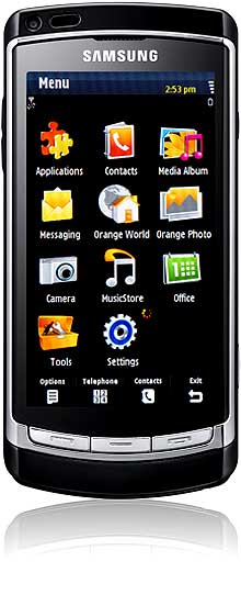
Let me see if I can explain my opinion of Samsung's i8910 touchscreen mobile – available through Orange – using words even a cat could understand: NO SAMSUNG AND ORANJ UR DOING IT RONG. There. I think that just about covers it.

Well, perhaps a little exposition might help. It begins with the absence of any indication as to which is the power button (it's the "end call" key). Get the phone turned on, leave it alone, and the screen auto-locks, but helpfully says: "Press and Hold the lock key to unlock." But there are no keys, only buttons, and none with a lock icon. Are you starting to get it yet? The i8910 has a gorgeous screen, with fabulous HD-quality graphics. If you were using it to play back video, and if it were priced accordingly, you'd be happy. Its video is killer. Wonderful. But the user interface (UI) is awful. Its phone functionality is fine, but the thinking behind its more powerful functions has come from someone used to throwing the kitchen sink in first and asking usability questions afterwards.
Central to this is the i8910's peculiar idea of what a menu or screen is. Consider the BlackBerry, really the first usable smartphone: it offers a menu of apps on a screen, from which you choose one by scrolling. Or the iPhone: it has multiple screens that you can swipe between, showing apps you can then choose.
Clearly, Samsung saw both but didn't like to choose between them. So the i8910 lets you swipe between screens of applications … or applications. There's the main "your life in a screen" screen you get with Windows Mobile (plus Orange's annoying and unremovable Orange World logo, to push you towards its overpriced walled garden). Then there's another screen with the applications – Contacts, Media Album, Messaging, Orange World (again?) Orange Photo, Camera, Music Store (Orange again …), Office, Tools and Settings. But inside Office is a stack of other apps. QuickOffice looks promising – create a document, presentation or spreadsheet – but you need to buy a licence. Gah! Then, Applications is another folder of, well, applications – radio, video player and games and so on. Press the central key and you switch between the "life on a screen" screen, and the "many, but not all, applications on a screen" screen. Madness.
How can it make sense to have things spread up and down the different layers on the menu? Can you not see the sense in the "all at one level" approach of the iPhone and BlackBerry? Evidently not, although you thought the iPhone's gestural interface worth copying to switch between open applications. I've got news for you, though: there's a reason why it's done like that. You haven't grasped it. You're a lovely video player, you take nice photos, and you might even have a decent browser. But as a smartphone, you're only for the dumb.
Pros: excellent screen; high-quality video and photos
Cons: poor UI; unremovable Orange links; lack of apps
orange.co.uk
Comments (…)
Sign in or create your Guardian account to join the discussion