UI: Redesign Zamzar Landing Page

Role: UI Designer
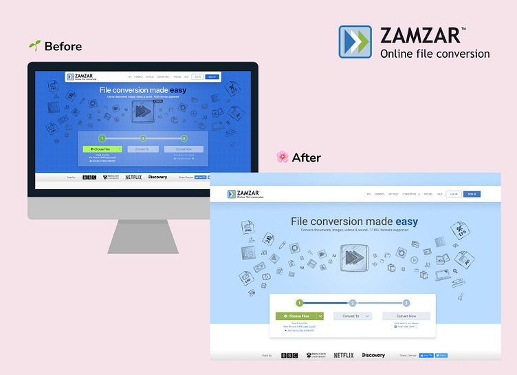
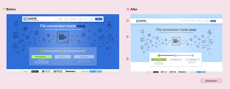
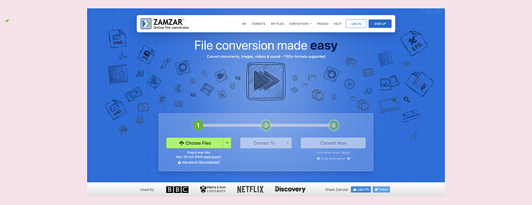
I redesigned Zamzar, an online tool for converting files to the format of your choice. As an avid user of the platform, I noticed that its UI design was outdated and traditional. To improve the user experience, I gave the design a modern, minimalist look and used brighter and cool colors to enhance its visual appeal.
Changes Made
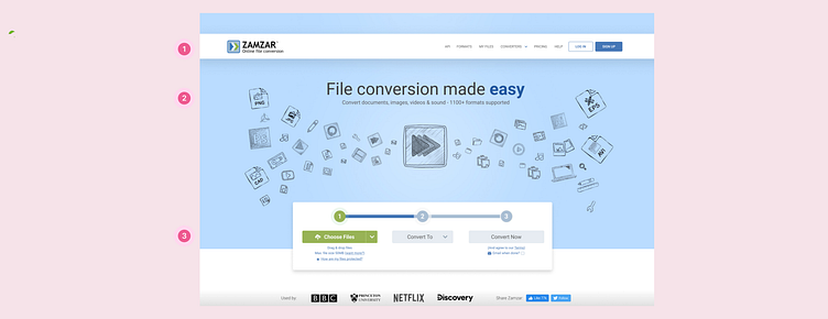
1.) I opted for a full horizontal navigation bar instead of a floating one. This allows for a cleaner and more organized layout. To maintain the brand's identity, I used the logo color for the button.
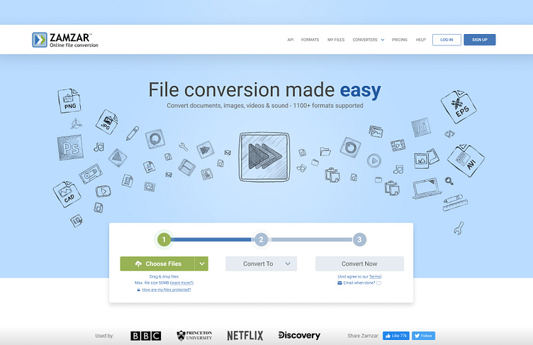
2.) I made the background photo lighter to help the header text stand out more. Additionally, I created a clearer and more intuitive process for the user to know exactly which step they are currently on.
3.) I made the selection box float to emphasize what the user should do on the page. This creates a more prominent and clear call-to-action. I maintained the brand's color scheme by avoiding neon green, which did not match the overall aesthetic.
Takeaways
Overall, I aimed to create a simple and clean design for the users in my redesign of Zamzar. This improves the overall user experience by creating a more intuitive and user-friendly interface. The new design is also visually appealing and consistent with the brand's identity, creating a seamless experience for the user
Disclaimer: I am not affiliated with Zamzar. I am here to improve my skills and help in creating better products.


