ArtSeen
Albers and Morandi: Never Finished
On View
David ZwirnerJanuary 7 – April 3, 2021
New York
The work that’s never truly done for the scholar of art is to relate an intimate experience of the artist’s task without merely boiling it down to a referential precipitate. David Leiber, in his juxtaposition of Josef Albers and Giorgio Morandi, has managed to do this. By ignoring a strict art historic bracketing and shotgun-pairing these two modest masters, he proposes that their compulsive attention to subject and material might actually attain a sublime aesthetic concordance. Their mutual call to duty can be characterized as: “Look hard—and then look harder still.” As one makes one’s way amongst these diminutive works in Zwirner’s cavernous precincts, a barometric pressure born of haptic proximity settles in between Morandi’s stucco-dry brushstrokes and Albers’s surprisingly fluid geometry. And the official interregnum between abstraction and representation gets practically diminished so that one is free to roam a tactile universe of color, gesture, scale, balance and pictorial poetics without the imperative to make of this display of visceral immediacy an Instagram souvenir.

Morandi’s still lifes are anything but still, their close-packed aggregations of bottles, boxes, and vases simultaneously suggesting stolid containment and fidgety neuroticism. The artist keeps this perceptual imbalance in check with under-saturated colors in complementary contrast and chromatically-negotiating “middle” colors. Given Morandi’s hermetic circumstances, having ensconced himself at home as domestic demiurge with a determined cast of tchotchkes, one might be tempted to read his anxious centering and decentering of the subject as a symptom of post-WWII existentialism. It’s a relief, though, that in this particular show, one seems gently redirected away from such psychophysiological detours. Focusing on a painting like Natura morta (Still Life), (1953), one finds an assemblage of two white bottles and one yellow, lined up with a white cylindrical box and an array of equally tall cylindrical objects in darker reds, blues, and greens, all pushed up against the right picture frame. This forces the extremely under-saturated yellow/yellow orange ground to form, by pictorial default, a dramatic spiral toward the left- hand side of the canvas. Hence one experiences an equilibrating primary triad of red, yellow and blue, modulated by undertones of green chromatically nailing this dynamic pictorial yin-yang to the wall. One therefore enters the painting with one expectation (contingent balance) and comes out the other end with an altogether different take (timeless dynamic symmetry).

Another deceptively simple painting, Natura morta (Still Life) (1959), operates in a similar manner: a shadow tethers the assembled cylindrical items to the lower right of the picture’s limits. Again, upon close inspection of Morandi’s color juxtapositions one notes careful increments of red, green, blue-violet, and white set against a ground divided between under-saturated yellow-green and violet. These smoldering color relationships pinging through the artist’s micro- sculptural brushstrokes are the real subject of the painting: senses beyond superficial optics are called for here, as poetic equilibrium never simply depends upon predictable weights and measures. This was exactly the point of William Carlos Williams’s cryptic missive in his quotidian allegory of The Red Wheelbarrow. Like Williams, Morandi extends his poetic universe vastly out from simple object observation. The graphic skill required to do just this is made evident in the collection of the artist’s etchings on hand here. One sees in these works his topographical decision-making laid bare: figures and grounds emerge from incremental gesture. Unable to depend upon his facility with color, the artist concretizes his vision with a vocabulary of delicately striated and cross-hatched planes. Morandi refrains from using cross-contour lines to represent volume, so the overall effect of these prints, like Natura morta con quattro oggetti e tre bottiglie (1956), is planar and abstract despite their representational subjects, recalling Cézanne’s proto-cubist brushstrokes or the steely, faceted delineation in Raymond Duchamp-Villon’s early drypoints. For Morandi, like these others, invented “abstract” gesture was indivisible from the concrete expression of vision.
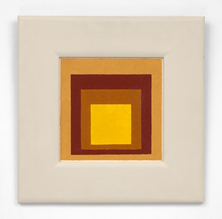
Albers, known primarily as an influential teacher of color-as-experience at the Bauhaus, Black Mountain College, and Yale University, was preoccupied in his later career with an extensive series of paintings and prints he titled Homage to the Square. His most lasting legacy is Interaction of Color, a groundbreaking 1963 book that stresses the immediate, complex experience of color over its reductive scientific or symbolic functions. So this introduces a meta-critical dimension to one’s response to his Homage series: did Albers actually practice what he preached? For the most part he did, which raises another issue—that of didactic purpose, which might seem anathema to lyrical expression, but for Albers, perhaps, it seemed more of a trenchant challenge to a cliché of artistic Romanticism. Optical experience, for him, was primary, and he faithfully stuck with it, which is not to say he couldn’t improvise within his Homage. Examples of such improvisation abound in Zwirner’s show. While the coordinated display of three chromatically-related works such as Homage to the Square (1963), Study for Homage to the Square (1964), and Homage to the Square: White Aura (1968) may seem to flow empirically one to the next, each retains its own “aura.” And upon close inspection one often notices surface manipulation, such as areas in which the underlying canvas or Masonite matrix is exposed in white dot patterns that sparkle like the glinting of light refracted on water.

Indeed, I was surprised by the “wet” feeling of the Albers works, particularly set against the general feeling of desiccation in Morandi’s oils. This can be clearly seen in Study for Homage to the Square (1973), in which a dark orange “aperture” gives way to a dark grey field containing a lighter gray square. Each of these color fields is shot through with pointillist dots of exposed Masonite white, lending them an achromatic static electricity. In other instances one notes a wavering line separating each square area—not that hard-edged after all. Another work included here, not from the Homage series, points to the complexity of schema that Albers was capable of, although perhaps he preferred to simplify in later paintings. Untitled (Variant/Adobe) (1958) is a long horizontal rectangle of dark oranges and reds enclosing a green field within which sit two upright violet rectangles. It has a very contemporary feel: its planar interactions have that afterimage overlap one recognizes from too much “screen-time.” This contemporary viewer, faced everyday with an embarrassment of pop-up squares, was happy to retreat to the less articulated finitude of the Homage series format.
This revelatory exhibit avoids resting solely on pseudomorphic bracketing or a simple correlation between Morandi’s ostensibly dull subjects and Albers’s “square” objective. While Albers’s direct objective was color interaction and a redundantly reinforcing structure, and Morandi seemingly settled upon domestic arrangements as quietist reflections of the everyday, a long visit to this exhibition thankfully relieves the viewer of such general assumptions.
