Books On Books Collection – Alastair Noble

In Memoriam+ (2021)

In Memoriam+ (2021)
Alastair Noble
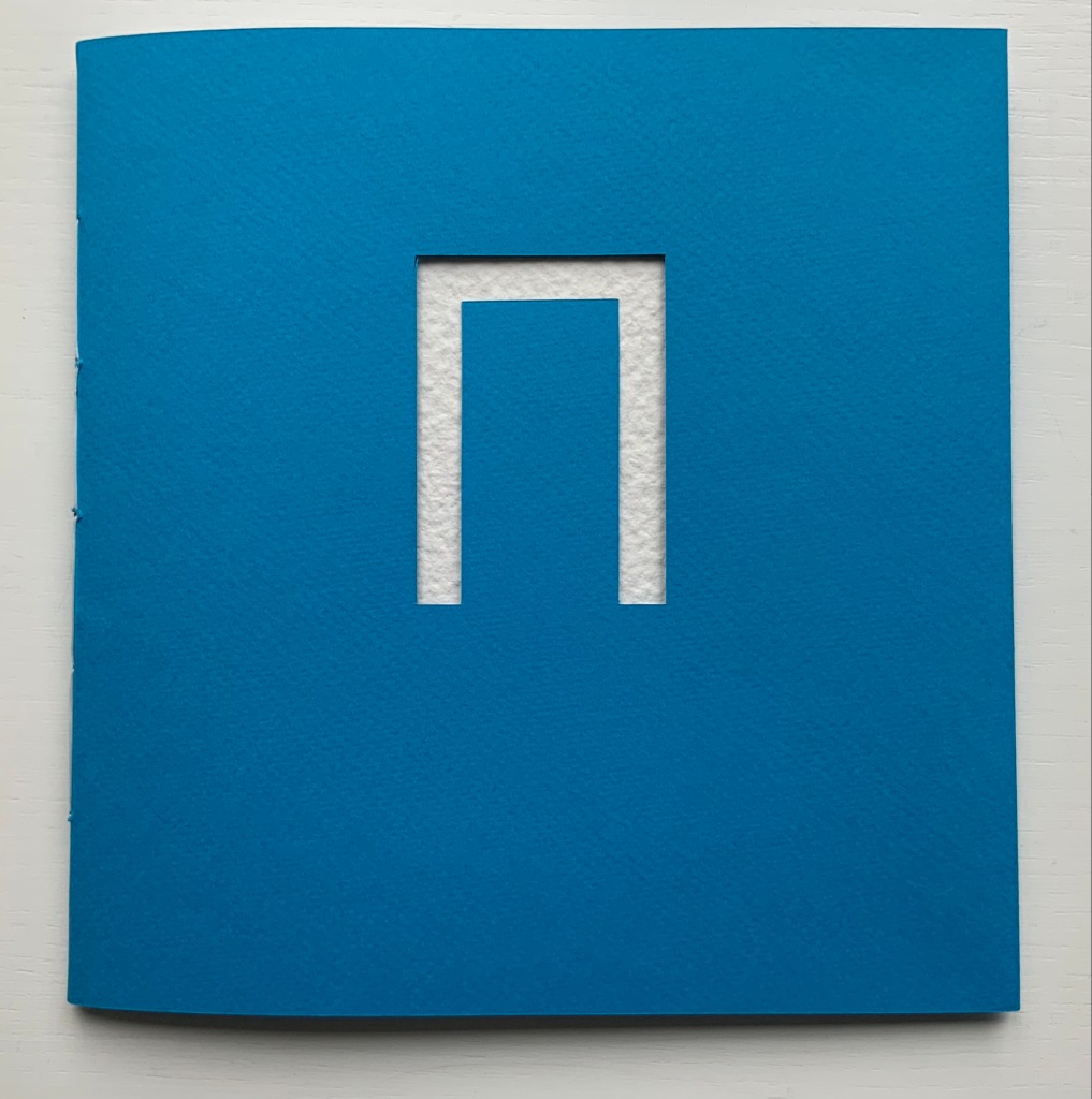
Booklet thread-bound to HMP boards, cover with cutout. H210 x W205 mm, 12 pages. Edition of 22, of which this is #4. Acquired from the artist, 25 April 2021.
Photos of the work: Books On Books Collection. Displayed with permission of the artist.

This work pays tribute to Ian Hamilton Finlay, whose Little Sparta, a garden across seven acres in Scotland, that expresses an artistic vision through typography, sculpture, installations and nature. Noble writes about the origins of his tribute:

I first visited Little Sparta twenty years ago and then again last year in July out of lockdown. Thereafter, coincidentally I found a brick buried in my garden with the work “Temple” embossed on it. Consequently this became the catalyst for a little homage in form of small installation in my garden that used the brick as a foundation to an arch made from white marble fragments that suggests the Portara for Apollo’s
Temple Naxos. This installation became the stimulus for this small artist’s book completed during lockdown in my studio in Liverpool, UK.
— Entry in Book Arts Newsletter, No. 138 March – mid-April 2021, p. 43.

Noble has expanded and intensified his small garden homage into a slender and rich work of book art. The sculpted structure of it — how the cover, pages, images and text work with each other — rhymes with Finlay’s art, Greek mythology and Nature. Noble’s choice of the portal to Apollo’s Temple to link the found brick and arch of marble fragments to Little Sparta and Finlay’s art finds one of its echoes in the cover’s cutout and the marble-white textured board behind it. Another echo lies in the words “metamorphosis” and “metaphoric” laid out to form an arch on the page below. And just as sonic echoes overlap one another, the words and image themselves echo across the double-page spread with the laurel leaf emblem of Daphne’s transformation to escape the pursuit of the lyre-bearing sun god and mythic patron of poets laureate.

Other overlapping echoes arise from the Greek and English word pairs on the double-page spread below. The presence of the Greek words obviously chime with Apollo’s Temple, but the presence of the English chimes more deeply with the word “metamorphic”. What is a translation if not a metamorphosis? And the rhyming of “lyre” and “liar” chimes even more deeply with “metaphoric”. What is a metaphor if not like a lyre and liar at the same time that tells us Daphne’s death is her translation into life as a tree?

Noble’s use of “meta” for his arch’s lintel also echoes Finlay’s aphoristic concrete poetry, a good example of which is The Errata of Ovid.

The Errata of Ovid (1983/4)
Ian Hamilton Finlay, Gary Hincks
Miniature portfolio. H76 x W80 mm.
Offset printed in red and black, eight loose cards enclosed in a flap folder. Typeset in Bruce Old Style(?); illustrations by Gary Hincks; card stock unknown.
Acquired from Woburn Books, 31 October 2019.
Photos: Books On Books Collection

Beyond the tribute of image/word-play, Noble’s artist’s book strikes a performative echo with the history of Finlay and Hincks’ artists’ book. A few years after the publication of The Errata of Ovid, Finlay drew up ”Six Proposals for the Improvement of Stockwood Park Nurseries in the Borough of Luton”, which included a caprice with a wall and plaques. The wall in Stockwood Park stands today, presenting the text of The Errata of Ovid engraved in eight stone plaques (minus the colophon but with the addition of “For ‘Adonis’ read ’Anemone’”). So Noble’s artist’s book followed his garden installation whereas Finlay’s garden installation followed his artist’s book. If only for perfection of that echo, one might wish Finlay’s installation be transported to Little Sparta and let Luton be satisfied with its airport!

Thresholds (2020)

Thresholds: Doors, Gates & Barriers Puno Peru (2020)
Alastair Noble
Perfect bound paperback. H215 x 140 mm, 48 pages. Acquired from the artist, 11 May 2021.
Photos of the work: Books On Books Collection.

Like In Memoriam+, this work has its roots in location and a portal metaphor. While also employing juxtaposition of text and images as a structural device, it relies on images of a category of sought readymades (doors, gates and barriers) rather than a found object (like the garden brick on which the artist builds his arch) for a structuring device that is simultaneously material and metaphor.

The way Noble uses his sources of text (Gaston Bachelard’s The Poetics of Space, Martin Heidegger’s “Building Dwelling Thinking” and Georg Simmel’s Bridge and Door) causes the reader/viewer to contribute to structure and metaphor. The first sentence of Bachelard’s excerpt begins “How many daydreams” and starts at the top of page 2; Heidegger’s beginning “The threshold” starts in the middle of page 26; and Simmel’s beginning “The human being” starts at the bottom of the page 2. Bachelard’s first sentence ends on page 8, Heidegger’s on page 28, and Simmel’s on page 12. Unless one has the mind of a symphonic composer or connoisseur, it is impossible to attend to all three excerpts simultaneously and turn the pages in one sequence. Instead, it is necessary to turn the pages back and forth along three tracks to absorb the excerpts, and the metaphoric effect is to open and close those doors, gates and barriers repeatedly, which is …

… what Noble’s very last page implies.

But finally, over the course of multiple readings/viewings, the linear photographic sequence on the recto pages seems to shift. Each image takes on a different aspect depending on the excerpt being followed. Combined with the back and forth page-turning, this shifting and break in the linear photographic sequence leaves the reader/viewer with the simulation of walking around, up and down and through Puno and its doors, gates and barriers.

Southern X 2006 : Open City, Ritoque Chile (2006)

Southern X 2006 : Open City, Ritoque Chile (2006)
Alastair Noble
Perfect bound paperback, spine taped. H215 x W218 mm, 32 pages. Acquired from Specific Object, 2 May 2021.
Photos of the work: Books On Books Collection.

Like Thresholds, this work, too, has its roots in location, but more akin to In Memoriam+, it draws on poetry, installation and performance. Open City is a utopian site affiliated with the School of Architecture of the Catholic University of Valparaíso. Accommodations and buildings have arisen by collective collaboration. There is no plan. One of the traditions associated with construction on the site is the reading of excerpts from the book Amereida (1967), a collective epic poem, which the school describes as “a poetic vision of the American continent”.

Reading the text takes us into the permanent question about being American from the recognition of the appearance of America seen as a discovery or gift. From the first page of the poem, the encounter with the unknown opens the possibility to begin to think of the new world as a gift, a gift. Its main sign: the Southern Cross, the light that goes up the horizon and guides in the north. — “Amereida

Inspired by the Amereida during a sabbatical visit to the school and Open City, Noble proposed an installation: Southern X 2006. Given that the Amereida takes the Southern Cross for its main sign and that this sign appears across the night sky in the shape of a kite, Noble’s direction for his installation sculpture was set before he began.

The actual sculpture is but a piece of a larger collective artwork consisting of Manuel F. Sanfuentes Vio’s reading from the Amereida, the students’ procession in the shape of the Southern Cross to the site selected by Noble, the collective construction of the kite, the planting of poles and the placement of the kite on them — and of course this book that photographically documents the performance of the installation and textually presents the read passages of the Amereida.

Foldings (1998)

Ephemera for Foldings (1998) Kathy Bruce and Alastair Noble. Poster and staging sketches.
Photo: Books On Books Collection.

With Foldings, Noble joined forces with Kathy Bruce, his wife. Six masked dancers wear costumes that are in effect human-size folios across which the pages of Un Coup de Dés have been printed front and back in French. As a prerecorded English translation is read by numerous voices corresponding to the changing fonts, the dancers rotate and display the lines being read. A performance was given as part of the exhibition A Painter’s Poet, held at the Leubsborf Art Gallery (Hunter College). This fell under the aegis of the Millennium Mallarmé celebrations in New York, the poster for which can be seen above overlaying the staging sketches for the performance. Later, as part of an installation under the title Navigating the Abyss (Brookdale Community College, Lincroft, New Jersey), the costumes were suspended from the ceiling along with a framed screen mesh reminiscent of Noble’s As if / As If (see above).

Postcard from the performance (1998). Images from the installation Navigating the Abyss © Kathy Bruce and Alastair Noble. Permission to display from the artists.
Photo of staging sketches and poster: Books On Books Collection.

Further Reading

Ian Hamilton Finlay“. 3 November 2019. Books On Books Collection.

Un Coup de Dés Jamais N’Abolira l’Appropriation” — An Online Exhibition”. 1 May 2022. Bookmarking Book Art.

Admin. 25 October 2011. “Alastair Noble exhibits Babel/Babble at the SCGP Art Gallery” Simons Center for Geometry and Physics. Accessed 18 June 2021.

Danto, Arthur. December 2020. “Making Choices“. Art Forum. Accessed 18 June 2021.

Howard, Michael. 1 September 2008. “Alastair Noble: Imagination Made Material“. Sculpture Accessed 18 June 2021.

Noble, Alastair. May 2007. “Open City“. Sculpture 26 (4): 20-21. Archived from the original on 31 August 2017. Accessed 29 April 2021.

Pendleton-Jullian, Ann M. 1996. The road that is not a road and the Open City, Ritoque, Chile. Cambridge: MIT Press.

Pérez de Arce, Rodrigo, Fernando Pérez Oyarzun, and Raúl Rispa. 2003. Valparaiso School: open city group. Basel: Switzerland.

Books On Books Collection – Heavenly Monkey

Francesco Griffo da Bologna: Fragments and Glimpses (2020)

Francesco Griffo da Bologna: Fragments and Glimpses (2020)
Rollin Milroy
H234 x W159 mm, 114 pages. Edition of 50, of which this is #32. Acquired from Heavenly Monkey, 4 November 2020. Photos: Books On Books Collection.

Several collections of Aldine volumes made themselves known around 2015, the 500th anniversary of the death of Aldus Manutius. Several have digitized their collections to make them more accessible. By gathering these fragments and glimpses of the hand behind the roman, Greek, Hebrew and italic typefaces designed and cut in late 15th-century and early 16th century Venice for those volumes, Heavenly Monkey (founded and run by Rollin Milroy) has followed a different path. A collector himself and artist of the book, Milroy has created this work to bring himself and the reader closer to Francesco Griffo da Bologna and the historical and contemporary hunt to identify him and appreciate his typographic accomplishment.

He presents a letterpress work in the modern version of the Bembo typeface cut by Griffo for the Aldine printing of Pietro Bembo’s tract De Aetna (1495), whence the typeface gained its name. In another step closer to Griffo, not only does Heavenly Monkey use simplified versions of initial letters attributed to Griffo, he offers up a note and display page that include those letters not used in the text (see below).

Note that distortion of the letters is due to photography of the curved page.

Physically true to its title, the book consists — except for the frontmatter, backmatter and brief explanatory text — of fragments: extracts from secondary sources and an actual leaf from the Aldine edition of Ovid’s Heroidum Epistolae set in Griffo’s first italic type. The leaf comes from the second of the three-volume Aldine Ovid, which over time was subject to prudish excision of racier parts, which Heavenly Monkey speculates may have led to the break-up of the copy used here to supply the leaf included. Some historians and collectors may question the inclusion of the leaf. Others as well as artists of the book will thrill to it as an act of preservation, appropriation, dissemination and homage.

The book’s prologue is an English summary of a passage from Giuseppe Fumagalli’s 1905 lexicon of Italian typography that sets out and settles the 19th century debate about the identity of Griffo, a confusion that would resurface for the legendary typographer Stanley Morison in 1923. With a narrative technique similar to an epistolary novel, Milroy lays out extracts from histories of printing, prefaces to reprints of Aldine works, biographies of the historians in the debate, the Fine Arts Quarterly Review and bibliographical journal articles to tell the story of “which Francesco was he?” The same technique lays out the development and differing opinions in reception of Griffo’s cutting of the roman, Greek, Hebrew and italic types. While following the stories of those faces, the reader walks through a hall of illustrious historians and typographers — Nicolas Barker, Joseph Blumenthal, Philip Meggs, Giovanni Mardersteig, Stanley Morison again, Alfred Pollard, David Pottinger, Daniel B. Updike and many others. The next set of extracts explores the feud that led Griffo to leave Aldus Manutius and Venice to set up on his own in Fossombrone.

The next set of extracts attests to Griffo’s typographic legacy, and then comes the tipped-in foldout that protects the leaf taken from the Aldine Ovid, followed by the listing of Griffo’s six works published on his own, documented in F.J. Norton’s Italian Printers 1501-1520.

An important contribution comes in Appendices I-IV with Emma Mandley’s translations of key passages from books, letters and documents of the main protagonists in the debate over Francesco da Bologna’s identity: Antonio Panizzi, Giacomo Manzoni, Adamo Rossi and Emilio Orioli. Lovers of type specimens and the style of Stanley Morison will welcome the samples of the modern versions of the roman fonts for Poliphilus and Bembo and the italic fonts for Blado and Bembo. In a grace note, Heavenly Monkey includes samples for the italic and roman fonts of Mardersteig’s Dante, which Robert Bringhurst opined “has more of Griffo’s spirit than any other face now commercially available” (The Elements of Typographic Style, 1996, p. 213)”.

Dante is the typeface Heavenly Monkey wanted initially to use but, on deciding that the main text would be set in italic, declined it. The Dante samples offer the reader the chance to compare and contrast it with the other faces and weigh Bringhurst’s opinion and Heavenly Monkey’s choice.

Like many fine press editions, Francesco Griffo da Bologna treads the boundary of the artist’s book or the work of book art. It certainly resonates with different works in the Books On Books Collection:

The leaf from the Aldine Ovid chimes with Jacqueline Rush Lee‘s sculptural interpretation of Ovid’s Metamorphoses and Ian Hamilton Findlay’s The Errata of Ovid.

Milroy’s “scrapbook” protrayal of Griffo and contemporaries will remind some of Russell Maret‘s typographic adventure in Hungry Dutch.

Anything to do with Venice brings to mind Peter Koch‘s edition of Joseph Brodsky’s love letter to Venice Watermark and Bodil Rosenberg‘s sculptural evocation of that city in Canal Grande.

But overall, Griffo‘s bibliographic historical nature resonates far more with that of another of Milroy’s works in the collection: About Agrippa.

About Agrippa (2015)

About Agrippa (a book of the dead): A Bibliographic History of the Infamous Disappearing Book (2015)
Rollin Milroy
Perfect bound softcover. H290 x W210 mm. 48 pages. Edition of 50. Acquired from Rollin Milroy, 5 December 2018. Photos: Books On Books Collection. Displayed with permission of Rollin Milroy.

In the Bodleian Libraries Rare Books Collection is a yellowed, oatmeal-colored remnant of a linen casebound thing holding leaves of paper, some sharply trimmed, some with deckled edges, various colored single-sided prints tipped in between and amongst the folded and gathered leaves, a square hollowed out of a final gathering of inseparable leaves and sealed with a lining of gritty silver-gray paste. And burned onto its cover is this:

William Gibson and Dennis Ashbaugh’s Agrippa (A Book of the Dead) (1992) is as wrapped in mystery and mystique as Griffo’s identity. For the collection, Milroy’s two books play the roles of historical bookends: each addresses works from the second phases of a technological shift in the history of the book. Griffo and Manutius mark the beginning of the post-Gutenberg and post-incunabula phase of book publishing. Gibson, Ashbaugh and their publisher Kevin Begos mark the beginning of the post-Apple I phase of digital publishing. Aldine books are rare; Agrippa is even rarer, designedly so. Gibson’s titular poem is on a floppy-disk embedded in a book (H16 x W11 inches). The disk was programmed to self-erase as it was played.

Milroy provides a valuable and attractive resource covering the inception, the production, pricing, dissemination/performance and reception of Agrippa. Like Griffo, About Agrippa brings the reader closer to the principals, the mystique and importance of the work. Both books deserve an audience of students of book art and book arts as well as collectors. Here’s hoping that any library with a strong collection of fine press books and artist books will acquire them.

Further Reading

Aldus Manutius, 6 February 1515 – 6 February 2015“, Bookmarking Book Art, 8 February 2015.

Hall, Gary. 2013. “On the unbound book: academic publishing in the age of the infinite archive“. Journal of Visual Culture, 12:3, 490-507.

Milroy, Rollin. 2015. About Agrippa (a book of the dead): A Bibliographic History of the Infamous Disappearing Book. Vancouver, BC: Still Creek Press.

Milroy, Rollin. 1999. Francesco Griffo da Bologna: Fragments & Glimpses: A Compendium of Information & Opinions about his Life and Work. Vancouver, BC: A Lone Press. The first version of the work.

Books On Books Collection – Ian Hamilton Finlay

The Errata of Ovid (1983)

The Errata of Ovid (1983/4)
Ian Hamilton Finlay, Gary Hincks
Miniature portfolio. H76 x W80 mm
Offset printed in red and black, eight loose cards enclosed in a flap folder. Typeset in Bruce Old Style(?); illustrations by Gary Hincks; card stock unknown.
Acquired from Woburn Books, 31 October 2019.
Photos: Books On Books Collection

Consisting of eight cards or leaves held together by a folder, this small work falls within the defined limits of the miniature book, according to the Miniature Book Society (US). It seems to fit better the looser mould of conceptual art. After the first or second leaf, the joke — “For ‘this character’s name‘ use ‘the name of the thing into which the character is turned‘” — is clear: metamorphosis = erratum. But the tongue-in-cheekiness goes beyond the title and text wordplay.

“Errata” is an anatomical part of the book, but this work is larger than the usual book part — an errata slip — and while smaller than a book, it lays claim to be a book. What seems to be one thing is also another. Its binding is a folder, the “cover” illustration (upper left) is a broken pillar, an erratum of sorts, and each erratum appears on a “loose leaf” — much like a portfolio of prints. The roots of “portfolio” are portāre (to carry) and folium (leaf), but given that the Latin for “door” is foris, isn’t it a near homonymic pun that the “title page” (upper right) shows a forum-like portal, a door opening on the leaves that follow? What seems to be one thing could be another.

With two pages taken up by the title page and colophon, there are only six errata (for Atys, Cyane, Daphne, Echo, Narcissus and Philomela). Why only six? Is Finlay, like many conceptual artists, leaving it to the viewer to complete the work? What if the curious and obsessed return to the Metamorphoses to come up with the other “errata” in the tales (Cyparissus, Myrrha, Perdix, Syrinx and all the rest)? But hang on: if the curious and obsessed carry on and mentally correct all of the errata, won’t Ovid’s Metamorphoses be “corrected“, or metamorphosed, out of existence? And when there are no more errata, how could there be a work called The Errata of Ovid?

A few years after the publication of The Errata of Ovid, Finlay drew up ”Six Proposals for the Improvement of Stockwood Park Nurseries in the Borough of Luton”, which included a caprice with a wall and plaques. The wall in Stockwood Park stands today, presenting the text of The Errata of Ovid engraved in eight stone plaques (minus the colophon but with the addition of “For ‘Adonis’ read ’Anemone’”). Did Finlay imagine the park’s visitors standing before the wall like stone sculptures themselves smiling or frowning at the concrete poet’s wit?

Hincks’ India-ink-drawn illustrations — especially those for Cyane and Narcissus — are delicate and rough at the same time. The two for Cyane and Narcissus in particular warrant a close look for their representation of reflections in water, perhaps the most metamorphic element, Nature’s closest instance of metaphor and metamorphosis.

Further Reading

Books On Books Collection – Jacqueline Rush Lee”, 8 October 2019.

Duncan, Dennis; Smyth, Adam, eds. Book Parts (Oxford: Oxford University Press, 2019), pp. 258-59.

Eyres, Patrick. ”A people’s Arcadia: the public gardens of Ian Hamilton Finlay in relation to Little Sparta”, Studies in the History of Gardens & Designed Landscapes, 29:1, 2009, pp. 115-32. DOI:10.1080/14601170701807088.

Finlay, Alec, ed. Ian Hamilton Finlay: Selections (Berkeley, CA: University of California Press, 2012), p. 190.

Books On Books Collection – Jacqueline Rush Lee

This collection note is a reminder of how comparison and contrast can lead to understanding how particular works evoke pleasure, thought and appreciation.

The First Cut (2015)

Ovid’s Metamorphoses has lent inspiration to poems, paintings, sculptures and even cinema — why not book art?

The First Cut (2015)
Transformed Harvard Loeb Library Translation of Ovid’s Metamorphoses
H7.75″ x W5.5″ x D6.5″
Photos: Books On Books

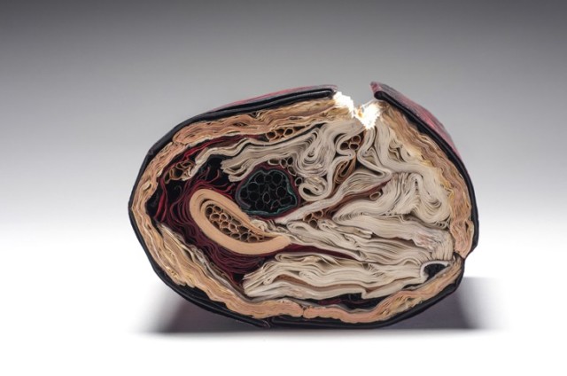
Lee’s The First Cut transforms the two Harvard Loeb volumes into what appears to be a block cross-cut from a tree with red and black bark, split down one side showing the inner bark and flesh. The metaphoric metamorphosis of book back to tree alludes to the transformation of Daphne, Myrrha and others into trees but that is only one of many changes to which The First Cut leads the eye and mind.

Looked at on edge, the object shows the might-have-been-expected concentric tree rings transformed into a variety of quills, folds and warped signatures. Some inked black, some red; some a bleached white, some an aged beige. The numerous shapes in the cross-sectional view are changing and press on other changing shapes. Likewise in Metamorphoses there are manifold transformations of humans: not only into trees but flowers, birds, stones and more as well.

There is also something uterine or endoscopic in the cross-sectional view. There is plenty of sexual activity between humans and the gods in different forms in Ovid’s poem. A tree serves as Adonis’ womb, and Ovid often provides agonizing descriptions of limbs and organs undergoing their change. Among so many metamorphoses, which is “the first cut”?

Silenda (2015)

Silenda (Black Sea Book). 2015 (Sister of Nous) Transformed Peter Green Translation of Ovid's "Tristia and the Black Sea Letters." H9.5" x W12" x D6.5." Manipulated Text, Ink, Graphite Photo: Paul Kodama In Private Collection, NL

Silenda (2015)
Transformed Peter Green Translation of Ovid’s The Poems of Exile: Tristia and the Black Sea Letters
Manipulated Text, Ink, Graphite. H9.5″ x W12″ x D6.5.”
Photos: Paul Kodama

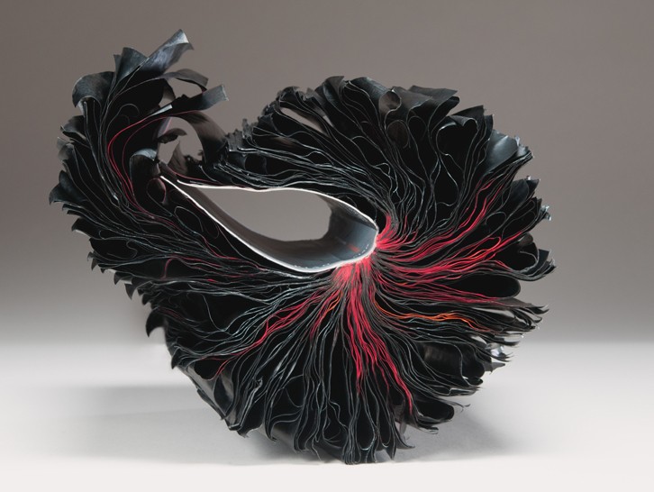
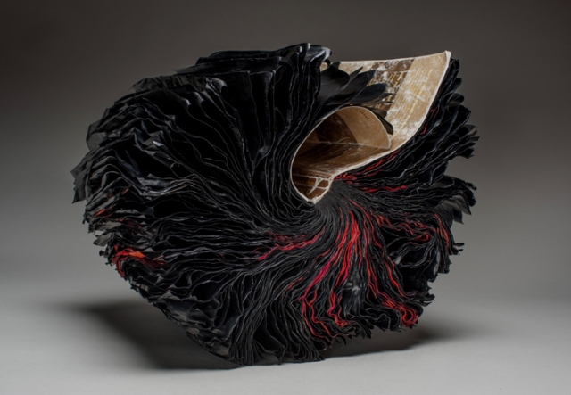
The Latin word “silenda” means “secret”, which evokes the still unknown offense that led to Ovid’s exile by Emperor Augustus in 8CE to Tomis (now Constanţa, Romania) where Ovid wrote his poems of exile. The ink-blacked pages evoke both the hiddenness of the secret and the black despair into which Ovid sank.

Silenda strongly resembles another of Lee’s works: Nous [There’s No Why Here] (2014), an altered philosophy book. The Greek word “nous’ means “the faculty of intellectual apprehension and of intuitive thought”, especially as it applies to a grasp of first principles. The subtitle to Nous and the opaque ink-blacked pages work more broadly, bluntly and ironically with the identity of that work’s raw material than is the case with Silenda.

Nous [There’s No Why Here] (2014)
Jacqueline Rush Lee
Photo: Paul Kodama

How do we weigh one work against the other? On the basis of the identity of the raw material? On the basis of the title? (What if both were “untitled”?) On the basis of execution? On the basis of how well the source material, the title and the execution combine and how they “work” with the visual impact of the object created?

The questions aren’t restricted to these two works, this artist or book art. Consider the numerous instances of “incised and excised” books. The term is used here for works such as Brian Dettmer’s Eye Surgery (2005) or A Sentimental Journey #1 (2018), where the artist has cut through the front cover, down through the pages, and left sentences and images in meaningful relief. Many other artists have produced similar works, but Dettmer’s combination of technique and the object’s close alignment with its source book set the bar for this kind of art. His individual works invite that closer look at their similarities and reward the look with differences to enjoy.

To return then to Lee. Her works (The First Cut, Silenda and previous ones similar to them) also have set a bar for this variety of book art. They invite a closer and comparative look. Within her own body of work, her series invite this. Silenda is part of the Inked series, whose output compares and contrasts productively with that of the series Ex Libris. The process Lee used for the latter series whereby “books and periodicals were fired in controlled kiln environments with no clay or slip addition” resulted in “fragile, bloom-like forms or skeletal remains, while others were coral-like, calcified forms with covers that were shell-like in feel with text, cover titles, and book cover colors present in their new, warped state”.

Ex Libris: Endoskeleton (1998)
Jacqueline Rush Lee
Fired book in kiln (Biology book)
H7 x W15 x D17 inches

The results from the two series’ different techniques are clearly night and day. Beyond similarities of shape, there is another similarity that unites the works across the two series — the practice of ekphrasis, or rather reverse ekphrasis. Ekphrasis generally refers to literary efforts to depict a work of art: Auden describing Breughel’s Icarus or Jarrell describing Donatello’s David. In the process, the poems go beyond mere description or allusion; they stand on their own. Reversing this, Lee (and Dettmer) take physical instances of literary works and create art that depends on the literature from which they are actually made, and they stand on their own.

But if the viewer is not or cannot be aware of the identity of source material, is the work a lesser work for that? Without some awareness of the biblical stories, images and symbols to which a religious work of art alludes, the experience of the work seems certainly lesser. But does that apply to these ekphrastic works (reverse or otherwise)? Does the more slightly subtle way that the title of Silenda works with its source than Nous works with its source give an added edge to Silenda?

Dettmer and Lee provide offer another basis by which to appreciate their works: that of innovative variation of technique and form. Dettmer’s move from the relief effect of Eye Surgery to three-dimensional carving of single and multiple volumes (for example, Tristram Shandy, 2014) shows such innovation. Such innovativeness enhances our appreciation and preferences across his works and those of other “book surgeons”. Likewise a visit to Lee’s site will prove that the breadth of her innovation is even wider than the impressive evidence of The First Cut, Silenda, Nous and Endoskeleton.

Further Reading

Bookmarking Book Art – Jacqueline Rush Lee, updated 2017”, 30 January 2017.

Bookmarking Book Art – Jacqueline Rush Lee”, 17 June 2013.

Lyte, Brittany. “Jacqueline Rush Lee Layers New Meaning Using Old Books”, Living, April 2017 Volume No. 2, pp. 20-30.

Strob, Florian. “Buch und Kunst”, Lesen, 6 October 2010, pp. 22-23.

On “inverse ekphrasis”:

Bookmarking Book Art – Ovid

At the end of a year when we have been reminded that creative works of merit can often issue from the dungheap, The Guardian reports that Rome’s city council has decided to revoke the 8 AD exile of Publius Ovidius Naso. Ovid whiled away his time in the backwater of the Black Sea composing the Tristia and The Black Sea Letters, respectively bewailing in couplets his condition and pleading with the recipients of his letters to intervene with the emperor.

We don’t know what “carmen et error” (poem and mistake) caused Augustus to banish Ovid. But should the city council have focused on the works rather than the man? Does great art justify “rehabilitation”?  Who knows.

At least the news prompts a new look at Jacqueline Rush Lee‘s transformation of the Tristia and Black Sea Letters.

Silenda (Black Sea Book). 2015 (Sister of Nous)
Transformed Peter Green Translation of Ovid’s “Tristia and the Black Sea Letters.”
H9.5″ x W12″ x D6.5.” Manipulated Text, Ink, Graphite
Photo: Paul Kodama
In Private Collection, NL

Bookmarking Book Art – Jacqueline Rush Lee, updated (2017)

The First Cut 2015 Transformed Harvard Loeb Library Translation of Ovid's Metamorphoses H7.75" x W5.5" x D6.5" Photo: Paul Kodama In Private Collection, NL
The First Cut, 2015
Transformed Harvard Loeb Library Translation of Ovid’s Metamorphoses
H7.75″ x W5.5″ x D6.5″
Photo: Paul Kodama
In Private Collection, NL

a result of an ongoing series of work started in 2013 in which [she] inserted a sculptural book form into the cavity of a tree to simulate a whorl in a tree hollow. What was initially an artistic, whimsical gesture became one where conditions were set in action, and consequently, over time the books returned to their botanical origins and were gradually subsumed by nature. The books changed state; at first “painted’ by a natural patina of mold in which the colours mutated and muted over time. The forms then became petrified and wood-like, with traces of their former texts still present, but like cultural artifacts: positing how time, changing weather conditions, and insect activity would finally affect the narrative of the original work. As iconic vessels of culture, knowledge, and classification systems, WHORL resonates as an imprint on how we leave our mark on nature, and how nature eventually leaves its mark on us a larger, comprehensive system at work.

Detail from Whorl ("Nestled") 2016 Site-Specific Installation on view September 6, 2016- September 7, 2017 University of Hawaii at Manoa Art Building's Bamboo Breezeway © Copyright jacqueline rush lee 2017. All rights reserved.
Detail from Whorl (“Nestled”) 2016
Site-Specific Installation on view September 6, 2016- September 7, 2017
University of Hawaii at Manoa Art Building’s Bamboo Breezeway
© Copyright jacqueline rush lee 2017. All rights reserved.

Whorl. Transformed Book Sculpture Detail 2014. Part of an Ongoing Project H11.5" x W7.5" x D8" Photo Documentation: Jacqueline Rush Lee © Copyright jacqueline rush lee 2017.
Whorl, 2014
Transformed Book Sculpture Detail, Part of an Ongoing Project
H11.5″ x W7.5″ x D8″
Photo Documentation: Jacqueline Rush Lee
© Copyright jacqueline rush lee 2017. All rights reserved.

In the following commissioned work — based on Ovid’s Tristia — the artist has applied the technique from her 2007 inked series “… when [she] was also working with the sculptural and expressive qualities of paint and sumi-e ink. Referencing page layering, and the earlier faded ink fore edges of [her] Volumes series..this work invokes the meditative through the act of applying ink and obliterating meaning to create new meaning.”

Silenda (Black Sea Book). 2015 (Sister of Nous) Transformed Peter Green Translation of Ovid's "Tristia and the Black Sea Letters." H9.5" x W12" x D6.5." Manipulated Text, Ink, Graphite Photo: Paul Kodama In Private Collection, NL
Silenda (Black Sea Book), 2015 (Sister of Nous)
Transformed Peter Green Translation of Ovid’s Tristia and the Black Sea Letters
H9.5″ x W12″ x D6.5.” Manipulated Text, Ink, Graphite
Photo: Paul Kodama
In Private Collection, NL

The Tristia consists of letters and meditations that Ovid sent to Rome from Tomis on the Black Sea Coast, where the Emperor Augustus had exiled him for what Ovid mysteriously calls his carmen et error (poem and mistake).  Silenda is from the Latin for “mysteries” and “that which must be kept silent.”  The ink-saturated and unfurled pages of Silenda echo the poet’s black despair, the barrenness of exile, and the scarlet edging echoes his bleeding heart.

The sister work referred to in the caption is shown below.

Nous 2014 (There's no why Here) Manipulated Philosophy Book, Ink, Graphite Reason & Responsibility: Readings in Some Basic Problems of Philosophy, Fourteenth Edition. Feinberg & Shafer-Landau H13.5" x W12" x D9" H34.5 x W30.5 x D23cm Photo Paul Kodama
Nous (There’s no why Here), 2014
Manipulated Philosophy Book, Ink, Graphite
Reason & Responsibility: Readings in Some Basic Problems of Philosophy, Fourteenth Edition. Feinberg & Shafer-Landau
H34.5 x W30.5 x D23cm
Photo Paul Kodama

In informal usage, nous means common sense or practical intelligence; in its more formal philosophical usage (from the Greek), it means the mind, intellect or intuitive apprehension. The artist’s alliance of title, technique and material here enriches the work but also presents the viewer of Nous and Silenda with questioning insight into book art.

Since the technique has blacked out the volume’s essays on central issues in metaphysics, epistemology, philosophy of religion, philosophy of mind, and ethics, as well as debates over the value of philosophy and the meaning of life, of course there is “no why Here”. Rush Lee is an exceptionally witty artist, so I wonder whether the pun also arises from the absence of a section on Aesthetics in the Feinberg anthology.

But that’s not the main query that Nous and Silenda taken together prompt. Both works are so similar in appearance that they could be mistaken for one another.  For book art in which the innovative technique yields such similarity of works, how should we react to pieces where meaningful distinction is implicit in such differences in the material used that can only be known from labels that may or may not accompany the works?  If we were to switch the labels of these two works, would we “mis-appreciate” them?

I think we would. Despite the close technical similarities of these two works, my reaction to each is enriched by knowing those differences and matching the choice of title of the work to the material used. That is a lesson I would apply even to works titled “Untitled” — the lesson really being to look harder, even beyond the “why”.

Bookmarking Book Art – Jacqueline Rush Lee (2013)

From the artist’s website:

Jacqueline has been working with books for fifteen years and is recognized for working with the book form. Her artworks are featured in blogs, magazines, books and international press. Selected bibliography include: BOOK ART: Iconic Sculptures and Installations Made from Books; PAPERCRAFT: Design and Art with Paper and PLAYING WITH BOOKS: The Art of Up cycling, Deconstructing, and Reimagining the Book. Jacqueline’s work will also be featured in Art Made from Books, Chronicle Press, 2013 by Laura Heyenga. …  She exhibits her artwork nationally and internationally and her work is in private and public collections, including the Allan Chasanoff Book Under Pressure Collection, NY.

The Chasanoff collection connects Lee with Doug Beube, whose work has been noted here. Beube was the curator of the Chasanoff Collection from 1993 to 2011.   In his interview with Judith Hoffberg in UmbrellaVol 25, No 3-4 (2002), he comments on the purposes of Allan Chasanoff, a book artist in his own right, in putting together the collection The Book Under Pressure:

There are a number of ideas that meets Allan’s criteria in acquiring work, of which I’ll try to convey a couple. The first is; the problem of the book to perpetuate information is inefficient, it’s an obsolete technology due to the advent of the computer.  Another premise is; at the latter part of the 20th century the book is being used for purposes other than its utilitarian design. Allan has been working extensively with computers and digital imaging since 1985 and understands that the book is as “an outdated modality”, he’s fond of saying. He’s not interested in the book decaying or in its destruction, nor is he referring to the content of books, artist’s books, production costs, mass appeal or where they get exhibited. His interest is in the book as an antiquated technology.

Lee’s process of kiln firing to transform individual books, as with the dictionary above, strikes a harmonious chord. The kiln does not reduce the book to ash but rather petrifies it.  Another way of exploring “the book under pressure.”   Lee’s and Beube’s work are brought together again by Paul Forte  at the Hera Gallery for an exhibition entitled Transformed Volumes.