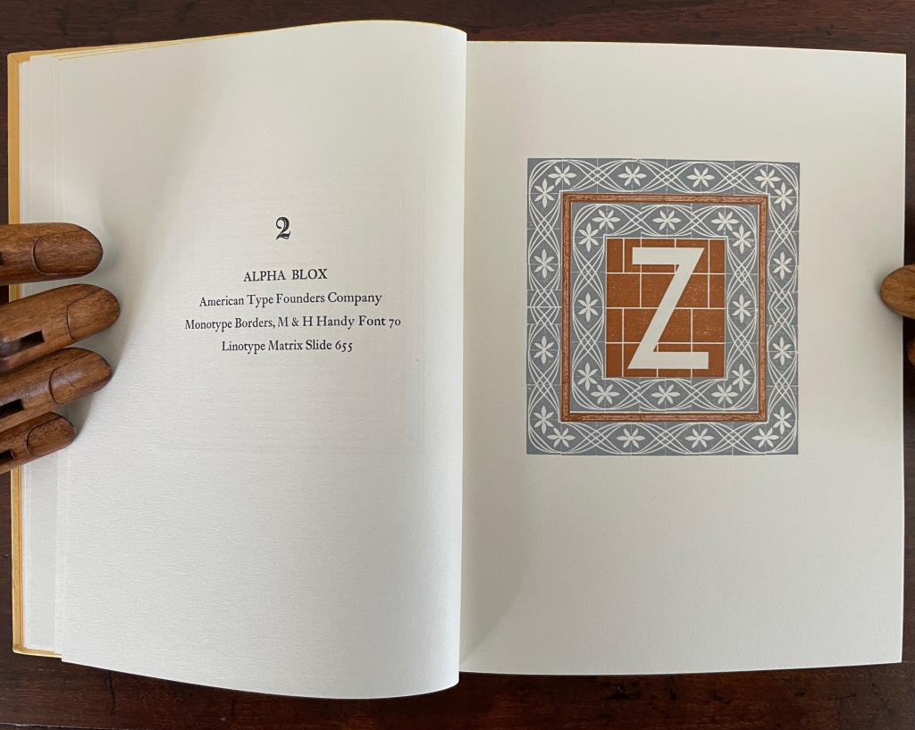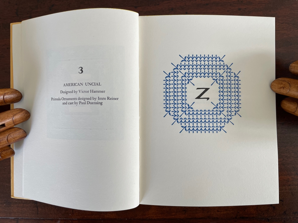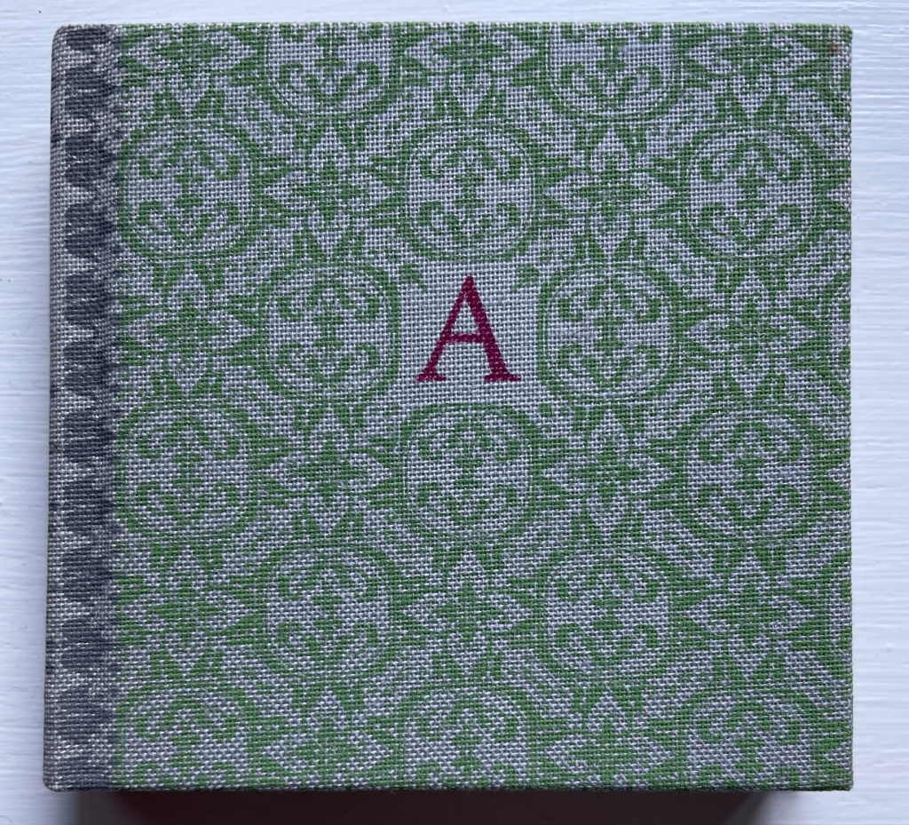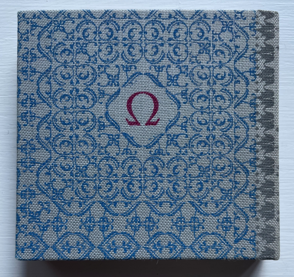
Books On Books Collection – Colleen (Ellis) Comerford

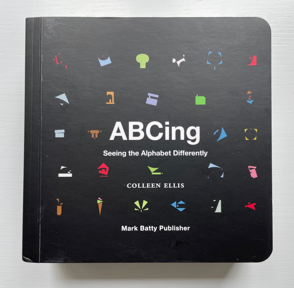
ABCing (2010)

ABCing: Seeing the Alphabet Differently
Colleen (Ellis) Comerford (2010)
Board book, illustrated paper-on-board cover. H160 x W160 mm. 66 pages. Acquired from Powell’s Bookstore, 29 June 2023.
Photos: Books On Books Collection. Displayed with artist’s permission.

Presented by the publisher as a primer for designers and students, ABCing is also an artist’s book in its own right. Page after page, Colleen (Ellis) Comerford wields each alphabet character, the pages themselves, the shapes from the space around and within a letter, and bold colors alongside the most abstract concepts, their dictionary definitions and etymology like canvas, brush and paint, or block and chisel. She breaks off the negative space in and around a letter and resizes, reorients and recombines the pieces into an image that is a visual metaphor for the named concept beginning with the letter. Each spread is an epiphany.
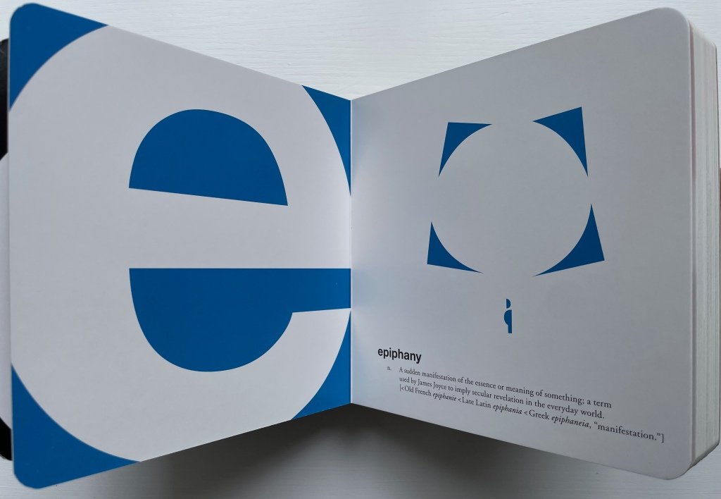
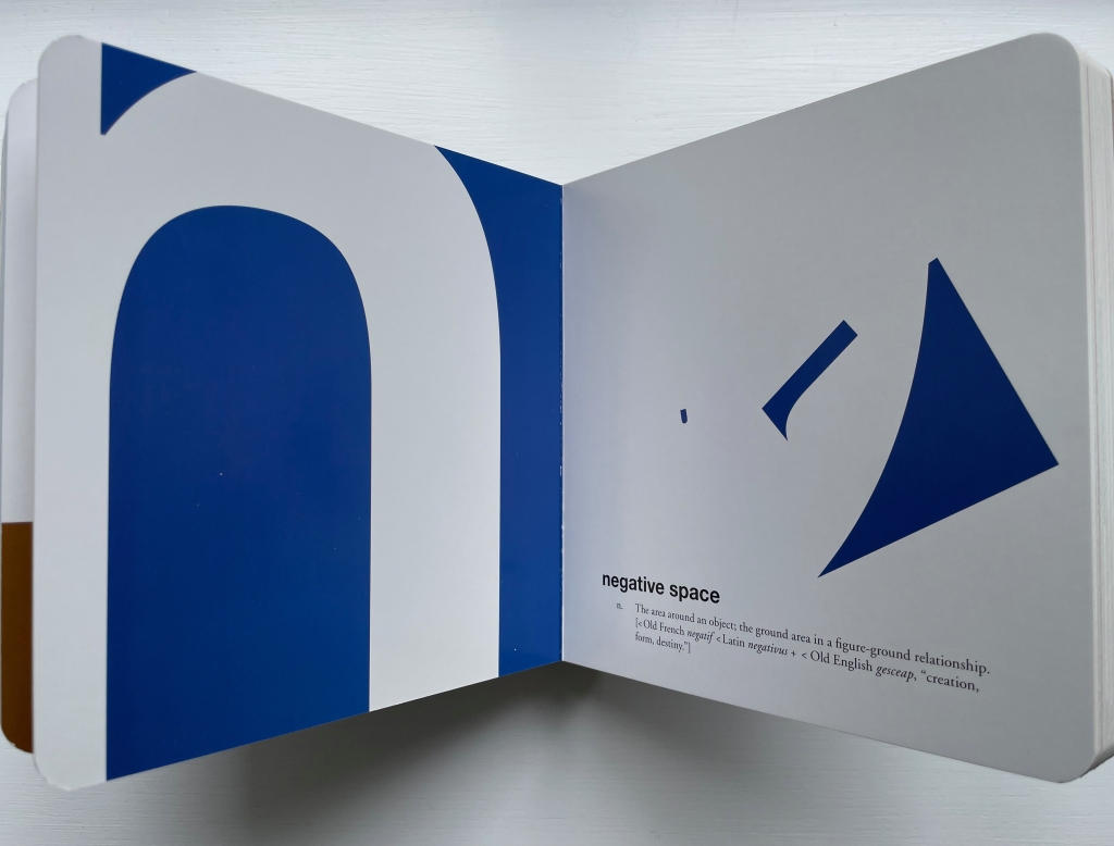
Sometimes the image represents an object that begins with the same letter as the concept. Consider for example the letter “m” (for metaphor). The artist repurposes the four shapes around the character on the left into a figure on the right that suggests “m is for moo” (or a Highland “koo”) in the analogous way that “a figure of speech in which one term is used to refer to something that it does not literally denote”.
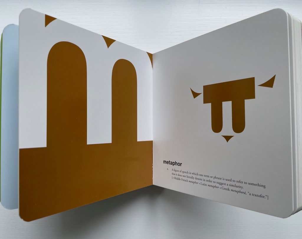
Sometimes the image enacts the concept, as with the letter “n” — appropriately so for the concept of negative space. Illustrating the “figure-ground relationship”, the large hump under the letter becomes the smallest of the three shapes and recedes into the background while the small triangle by the letter’s ear becomes the largest and foreground element of the image.
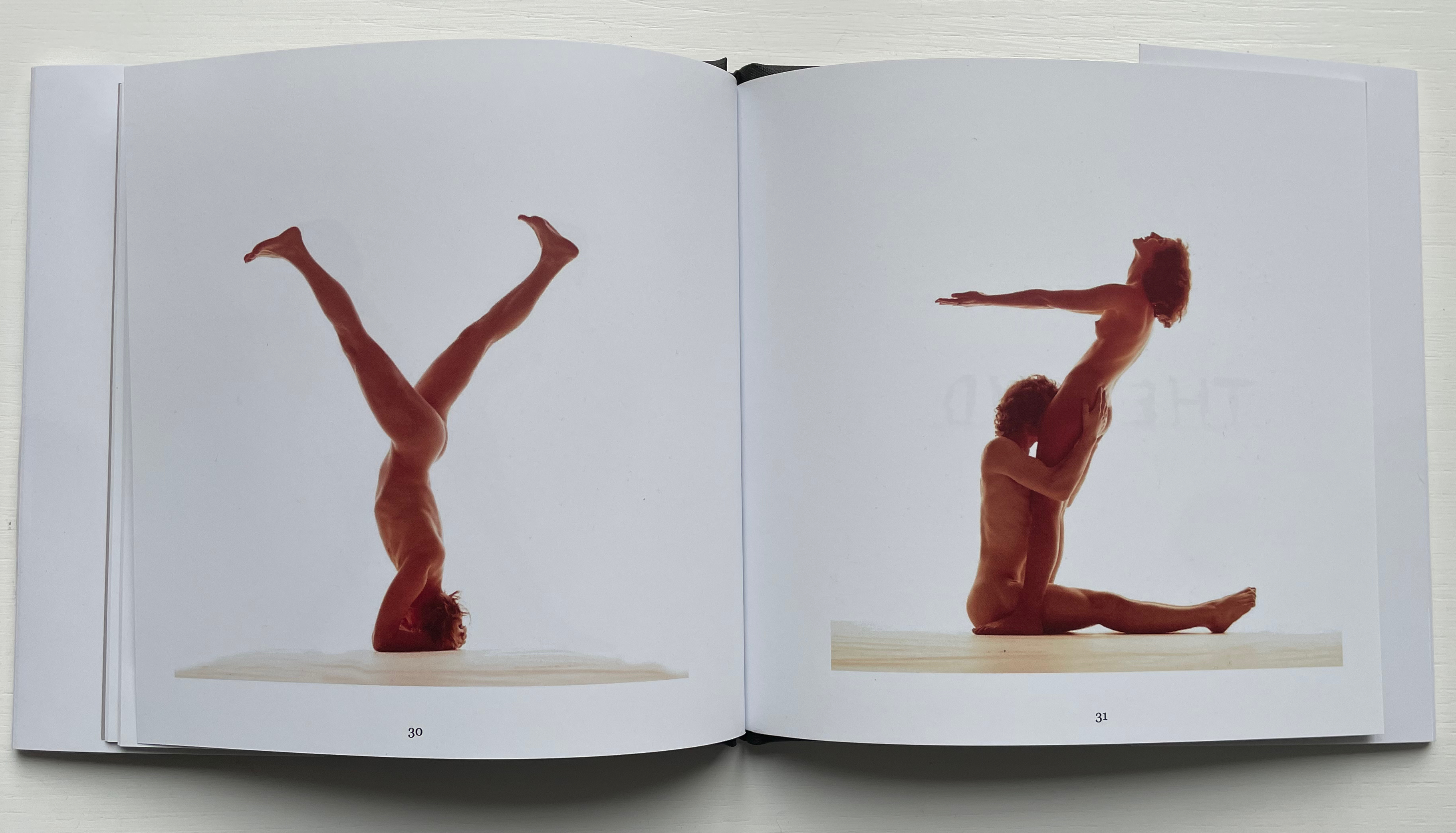
On more occasions, ABCing avails itself of the alphabet-art tradition of anthropomorphism. “Z for zeitgeist” is an almost Futurist reminder of how often artists have used the human body to form the letters of the alphabet. There’s a skateboarder, a clown, an oversized Sherlockian eye and magnifying glass, and an angry face made up of the bits from around the letter “t” for tone.
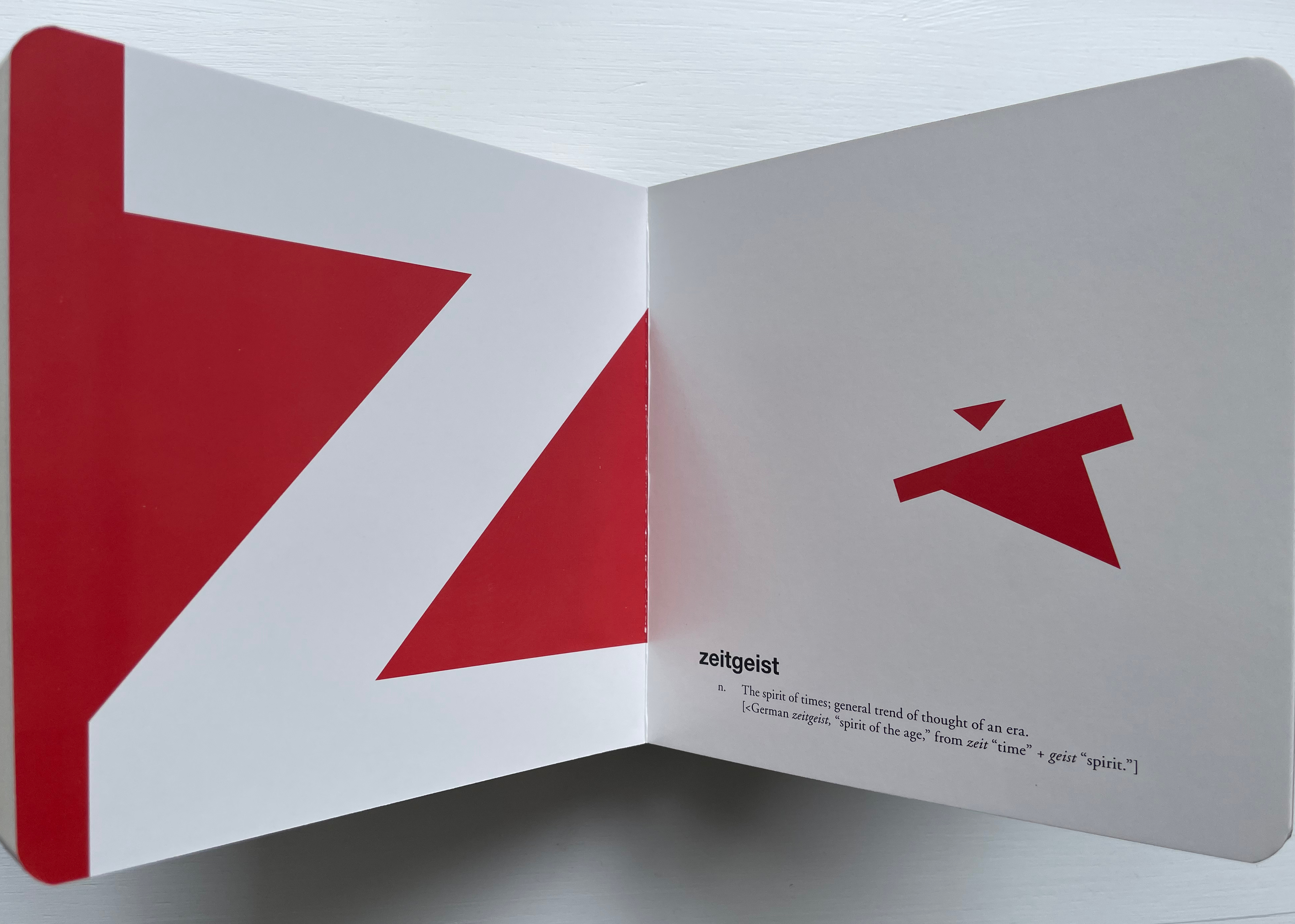
ABCing‘s letter “z”;
Alfabeto figurato” (1632)
Giovanni Battista Braccelli Etching, Naples.
Love Letters: An Anthropomorphic Alphabet (2008)
Rowland Scherman
Casebound, doublures, perfect bound. H178 x W180 mm. 34 pages. Acquired from Rowland Scherman, 3 March 2023.
Photos of the book: Books On Books Collection. Displayed with permission of Rowland Scherman.

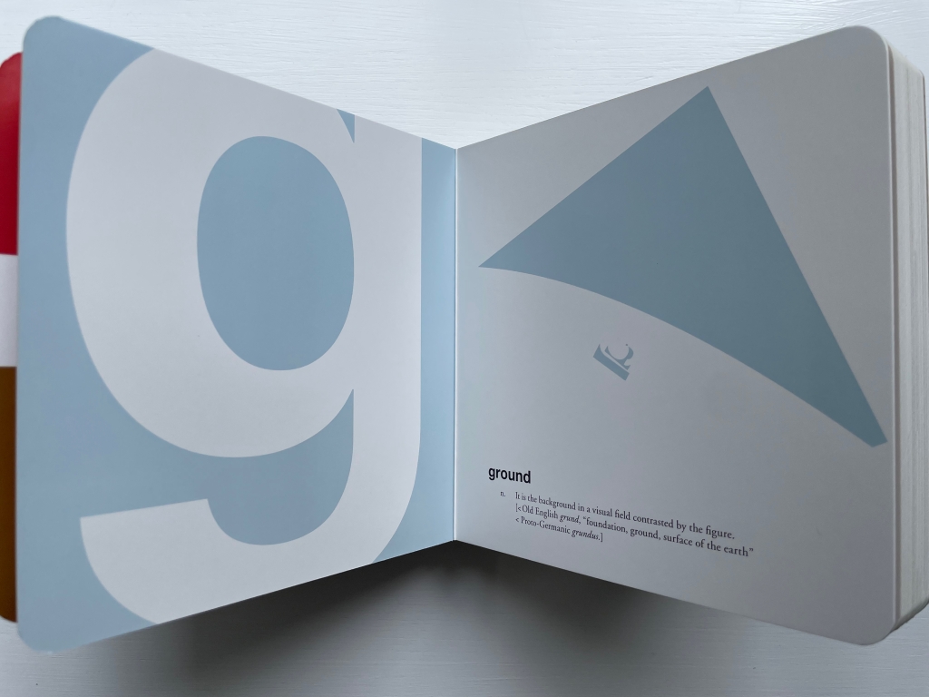
Most often the image is oblique. For instance, in “g” for ground, we have a boat sailing along the edge of the flat, enlarged triangle, taken from the space just before the ear of the “g”. As a large background in contrast with the small figure of the sailboat, it does illustrate the concept, but the figure and shape also allude to the flat-earth beliefs buried in “<Old English grund, ‘foundation, ground, surface of the earth’ < Proto-Germanic grundus“.
Others are less oblique: for example, “i” for imagination with the shapes from the negative space forming a snippet of cinema film; “p” for Polaris, with one piece being the star and rest the sea and sailboat; “r” for rhythm with pieces forming a bass drum pedal; “v” for variety with a multi-flavored ice-cream cone; and “x” for x-height with a caliper.

The alphabet and abstraction are, of course, deeply connected. In function, the letters are abstract signs representing sounds. In pictographic origins, they are abstract signs representing objects whose names begin with that sound (A for aleph, “ox”). In composition, just a small combination of strokes are abstraction enough to identify the letters themselves. Here are Bruno Munari and Lisa McGarry presenting that latter point in two very different ways.
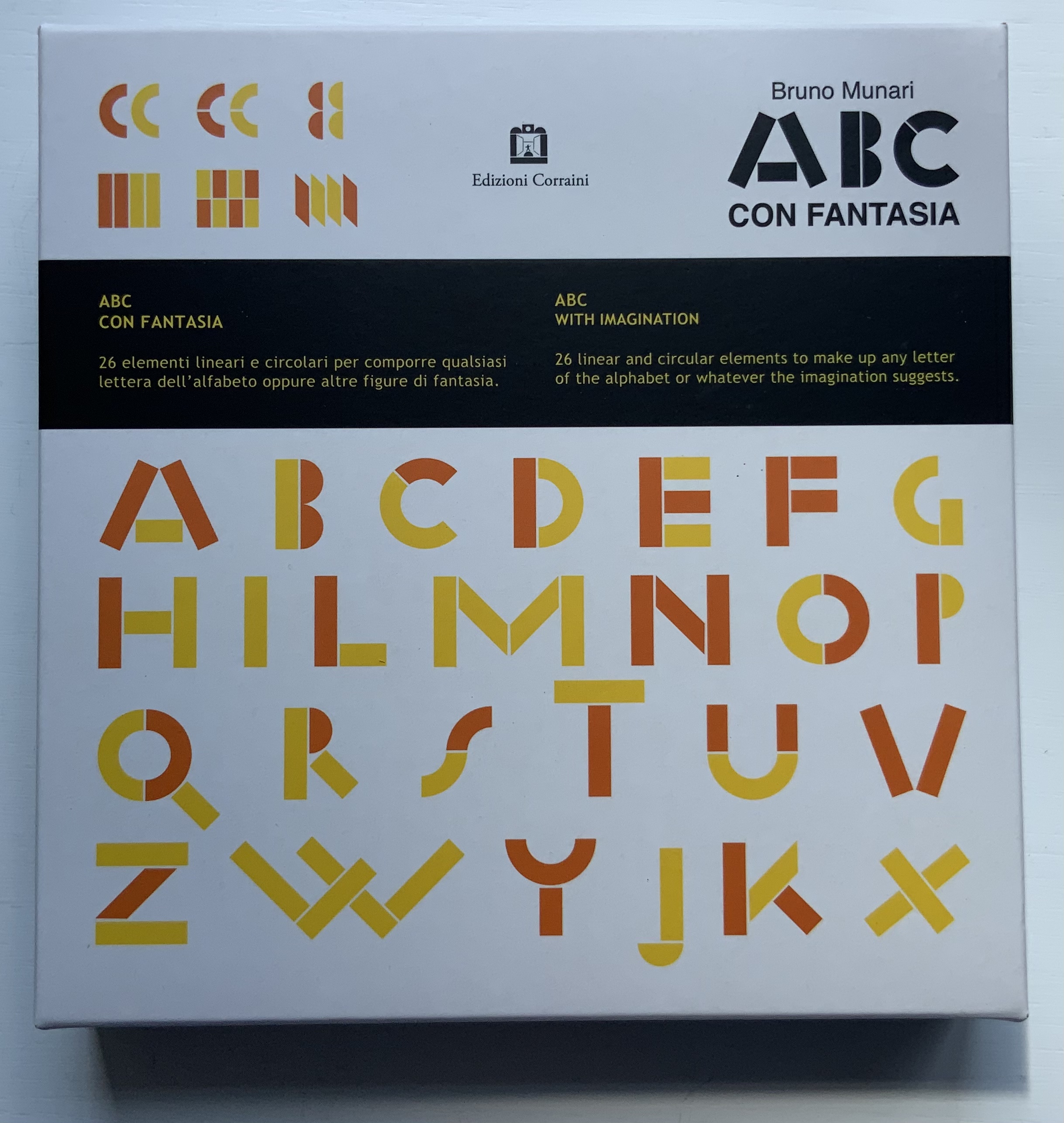
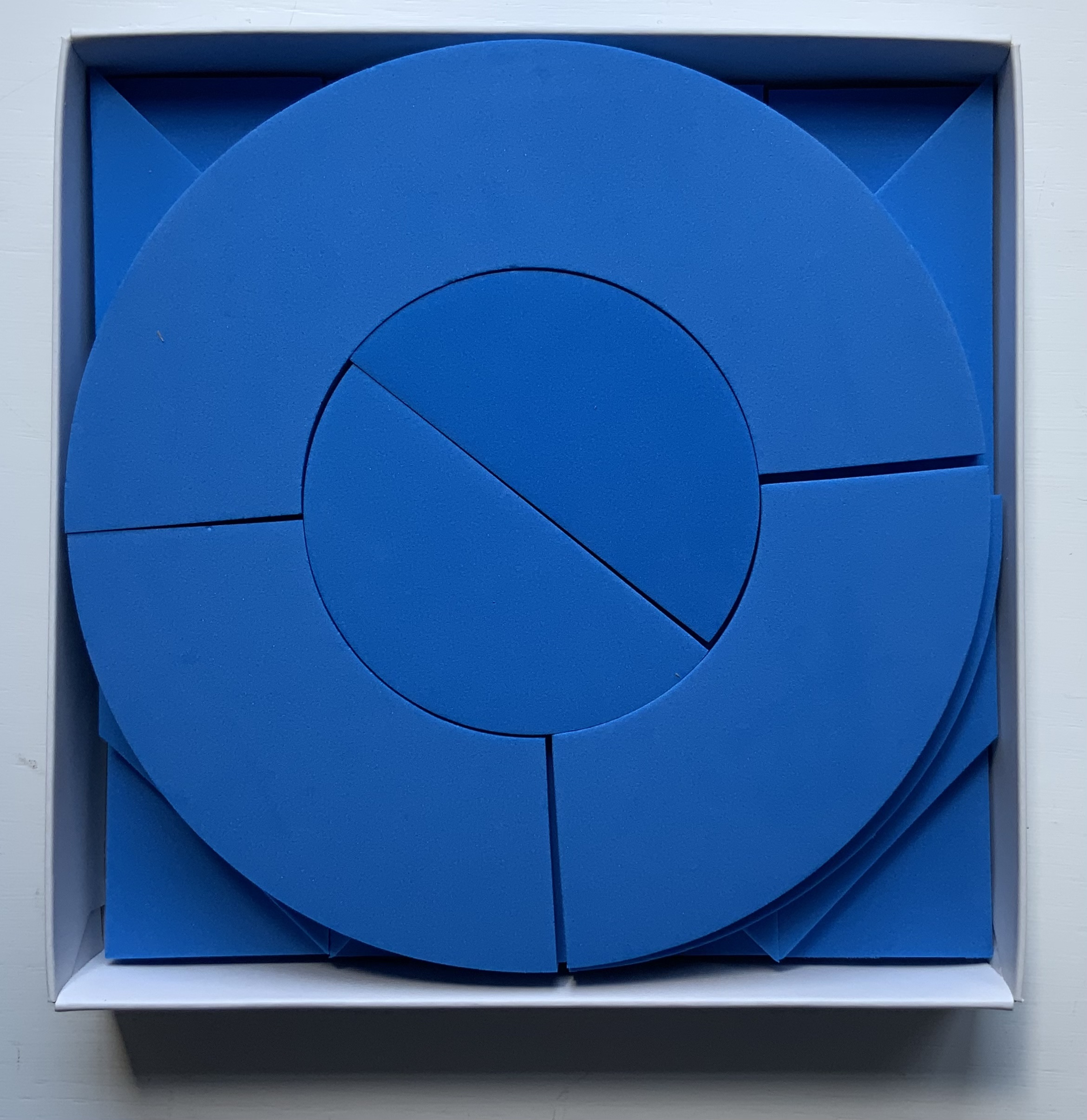
ABC con fantasia (2008)
Bruno Munari
Boxed set of shapes. H x W Acquired from Corraini Edizioni, 4 August 2020.
Photos of the work: Books On Books Collection. Displayed with permission of  Corraini Edizioni. © Bruno Munari. All rights reserved to Maurizio Corraini s.r.l.
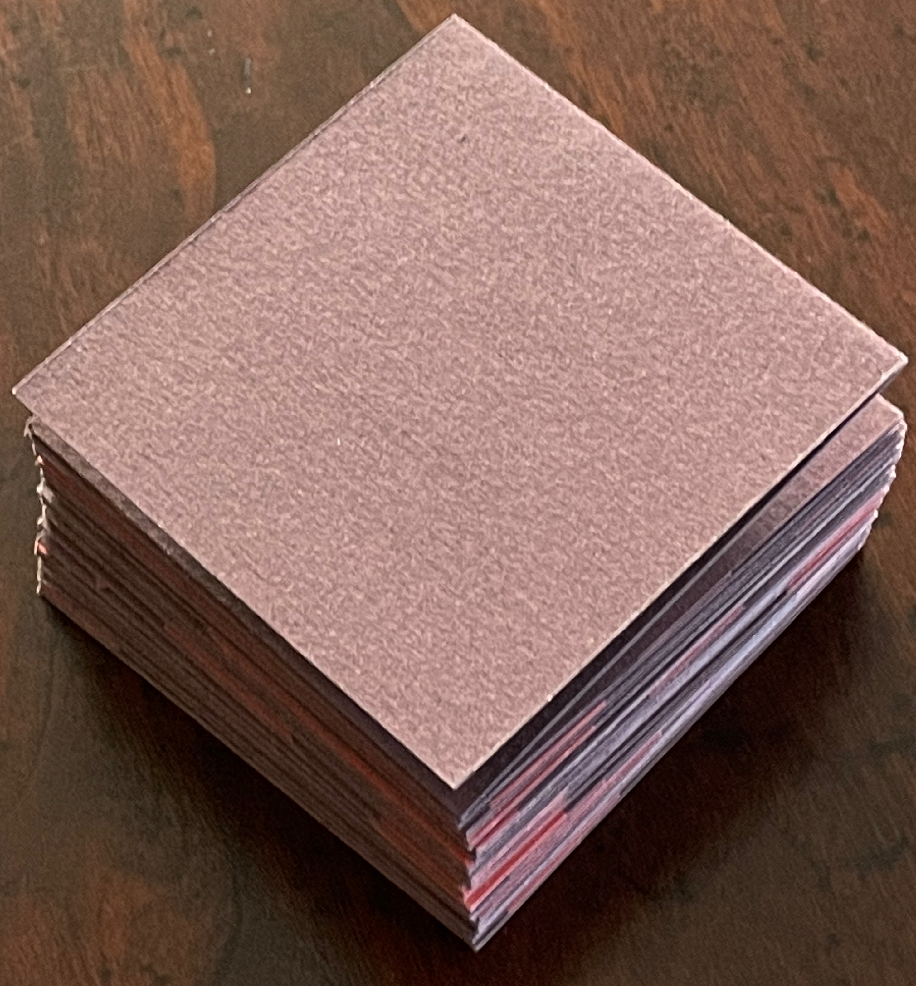
Twenty-six/Fragments (2012)
Lisa McGarry
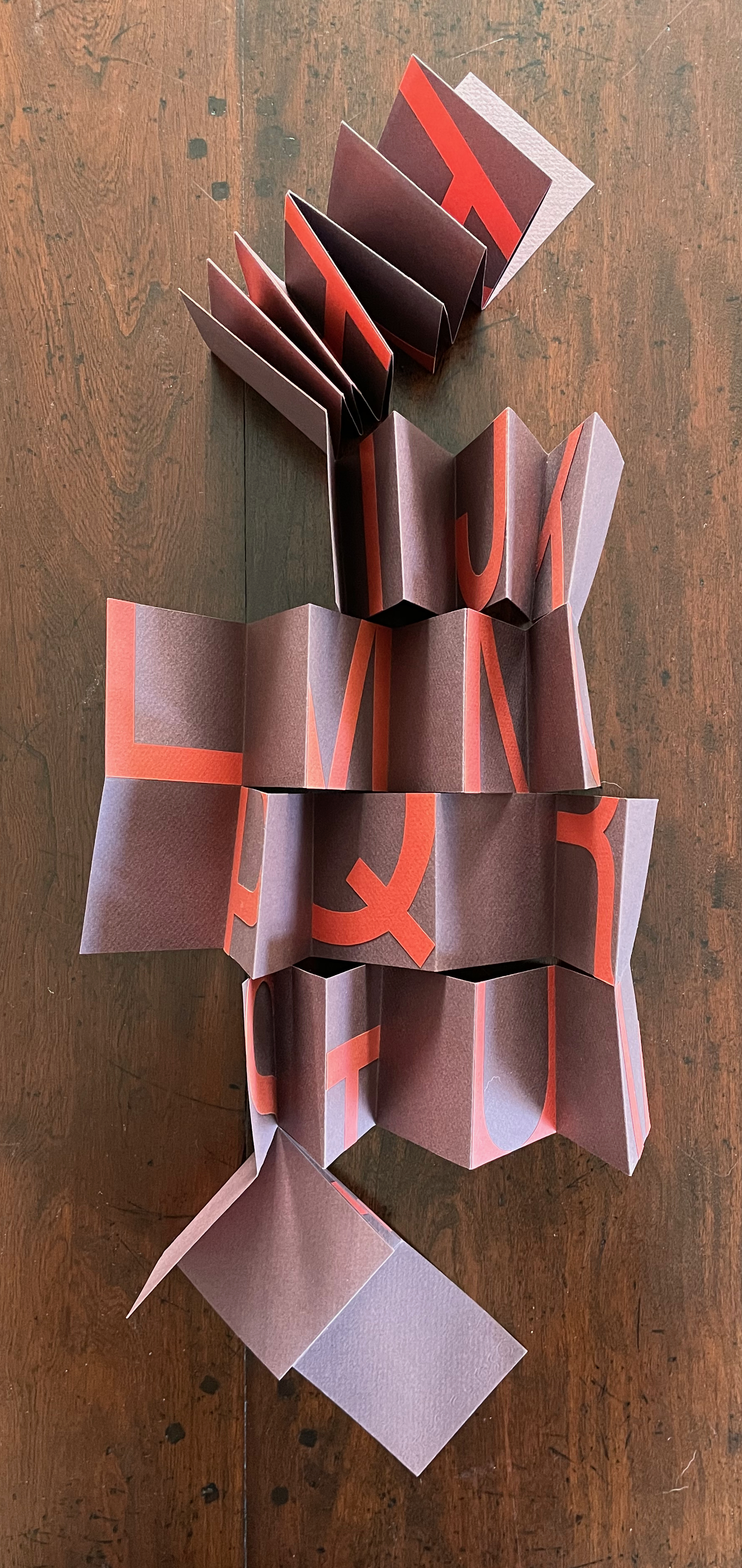
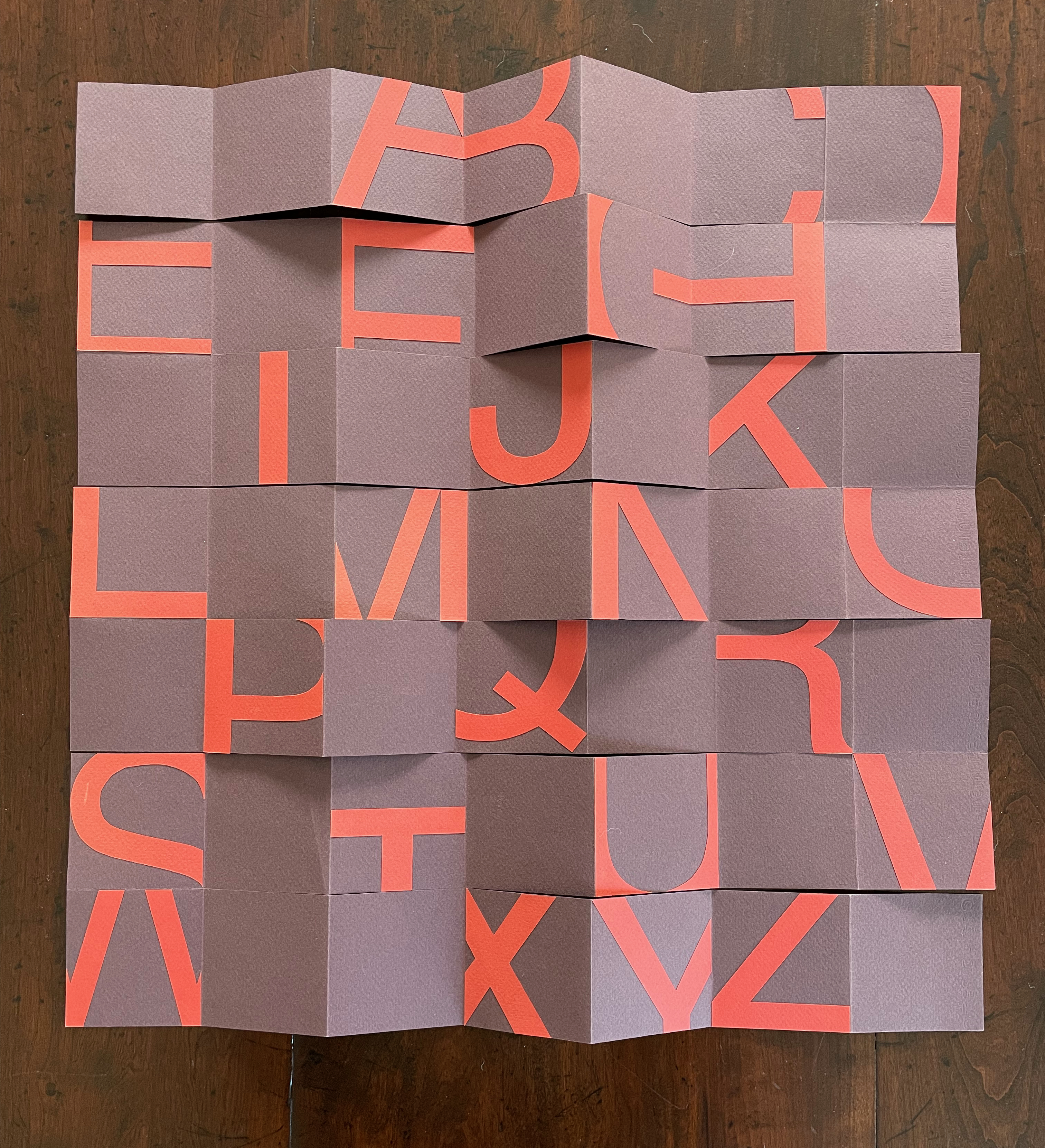
Single sheet, collage, meander cut and fold. Closed: 70 x 70 x D15 mm. Open: 490 x 490 mm. Acquired from the artist, 20 March 2023.
Photos: Books On Books Collection. Displayed with artist’s permission.

ABCing, however, takes abstraction in a different direction — away from sounds and objects and toward ideas and concepts. The direction may be different, but the results are often like magnets pulling on works whose alphabet categories relate indirectly, subtly and delightfully to ABCing.

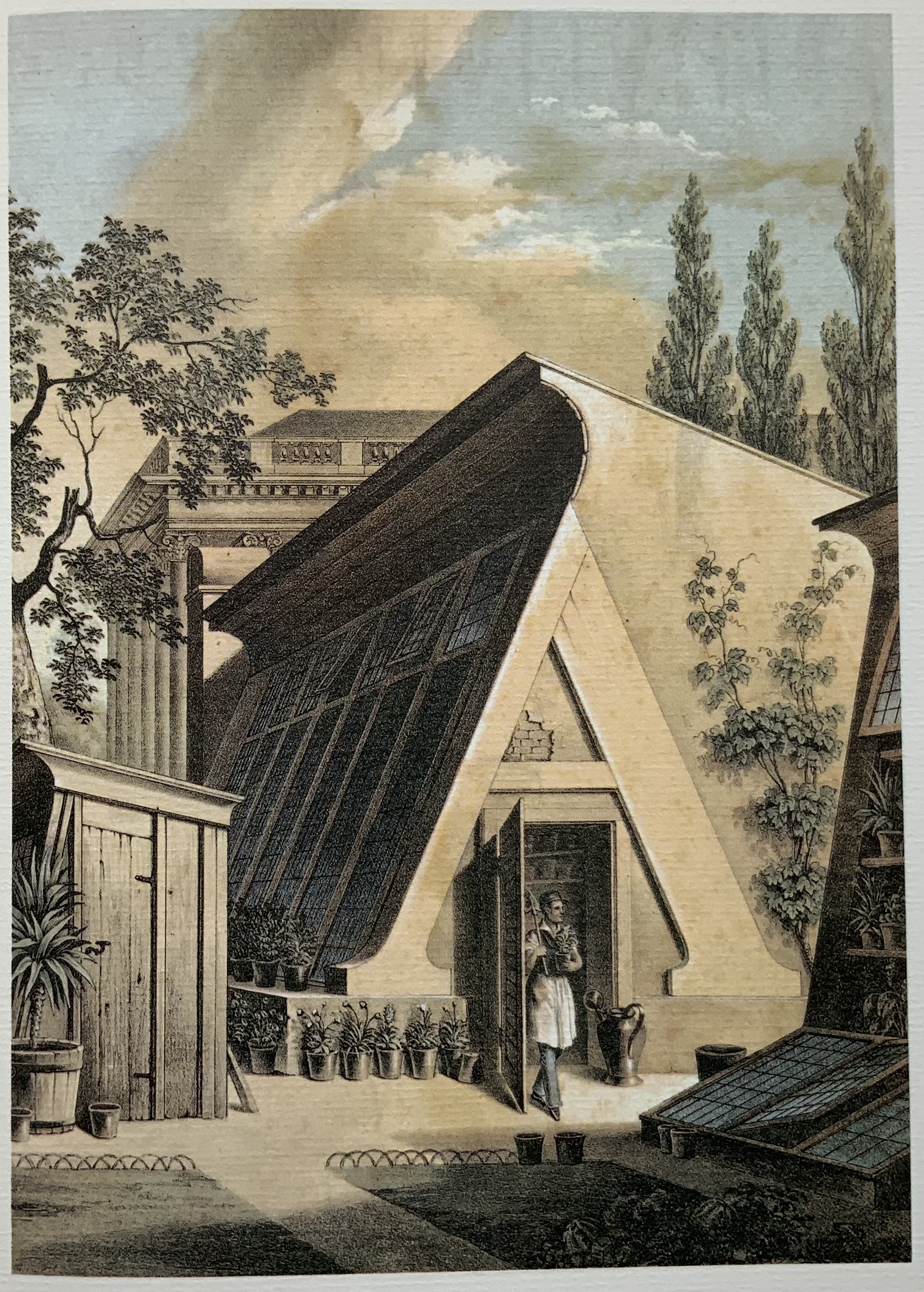
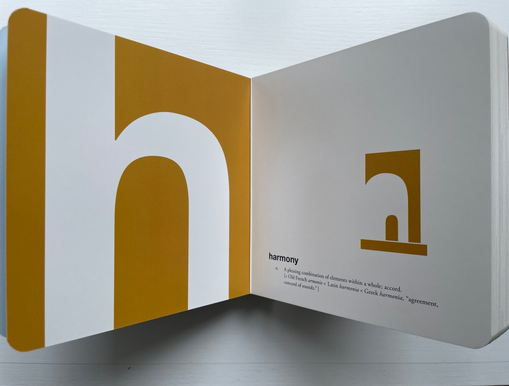
Consider this example in which the concept and object again start with the same letter: “h” (for harmony), where the bits of negative space construct a house or hearth.
It draws out the multifaceted subject of letters and architecture illustrated by Geofroy Tory’s Champ Fleury (1529/1927/1998), Antonio Basoli’s Alfabeto Pittorico (1839/1998), Giovanni Battista de Pian’s Alphabetto Pittoresque (1842).
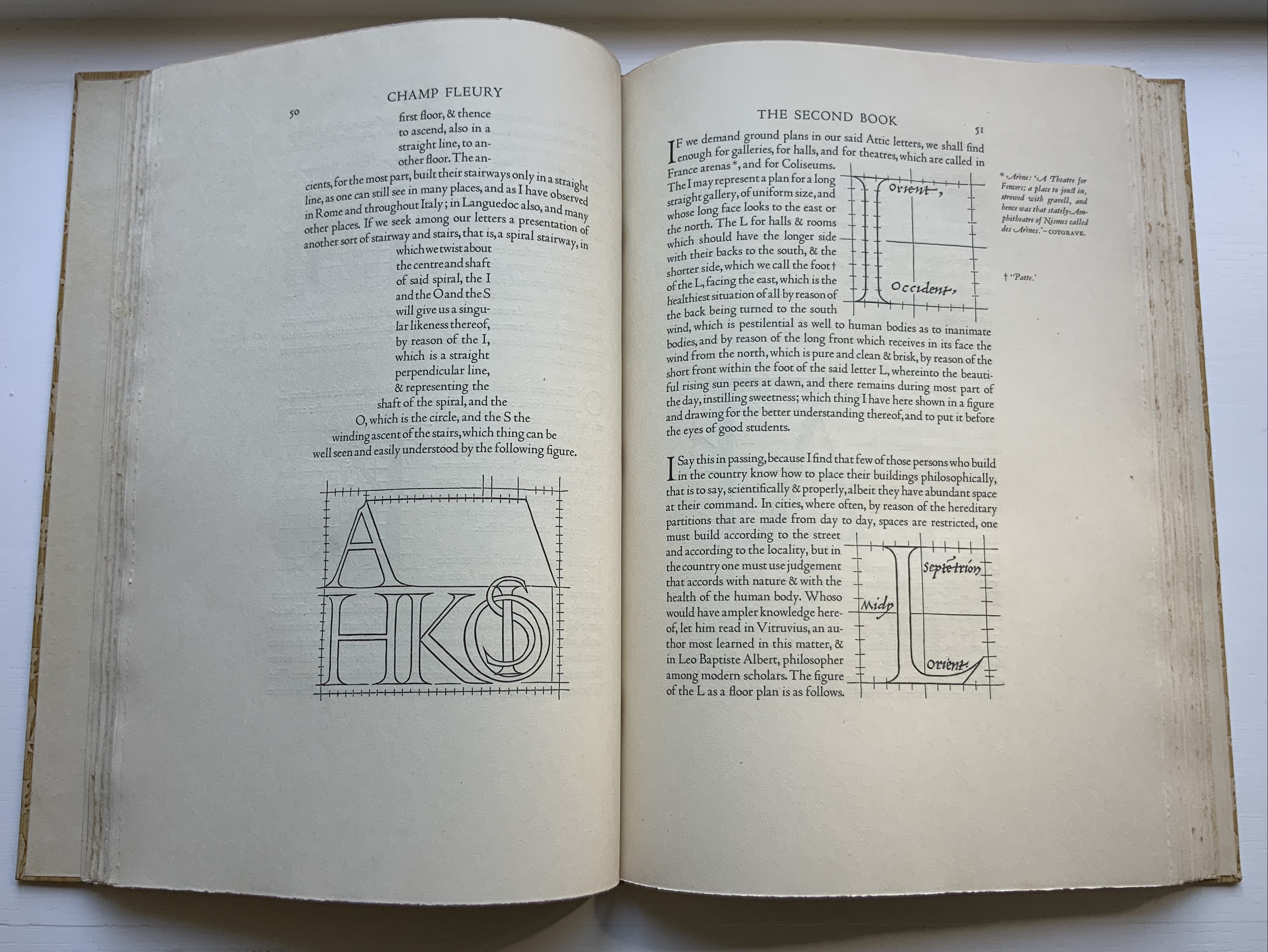
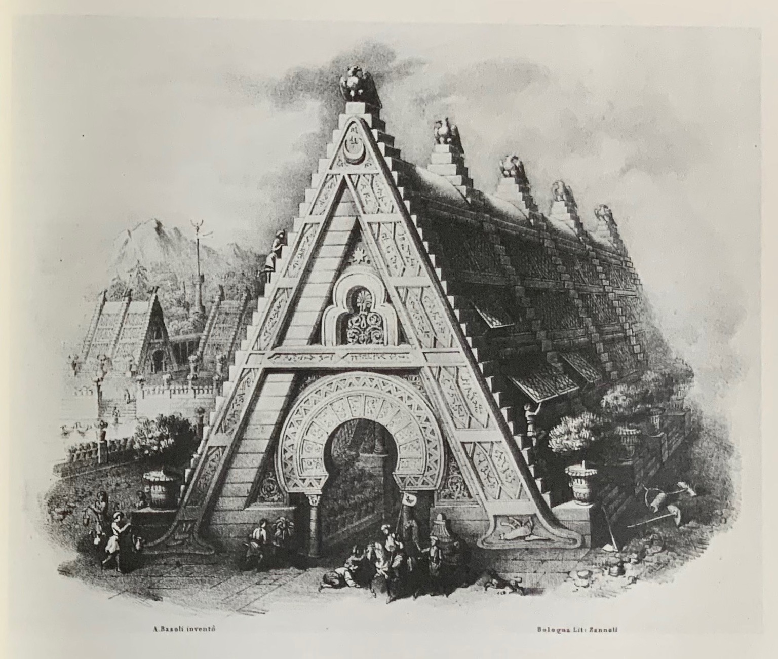
Left to right: Tory/Rogers, Champ Fleury; Basoli, Alfabeto Pittorico; Battista de Pian, Alphabetto Pittoresque. Photos by Books On Books Collection.

Consider again the “m” for metaphor and moo. Animals are the most frequent category of alphabet books in children’s literature, and so while there are dozens of them in the Books On Books Collection, it is the yaks in Suse MacDonald’s Alphabatics (1986) and David McLimans’ Gone Wild (2016) that ABCing conjures up.
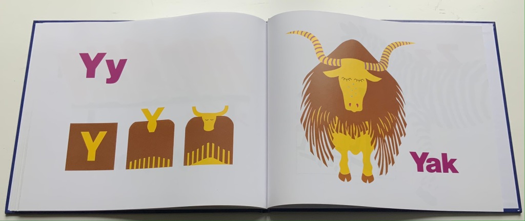
Alphabatics (1986)
Suse MacDonald
Paper on board, casebound sewn. H236 x 285 mm, 56 pages. Acquired from Book Depository, 10 September 2021.
Photos: Books On Books Collection.
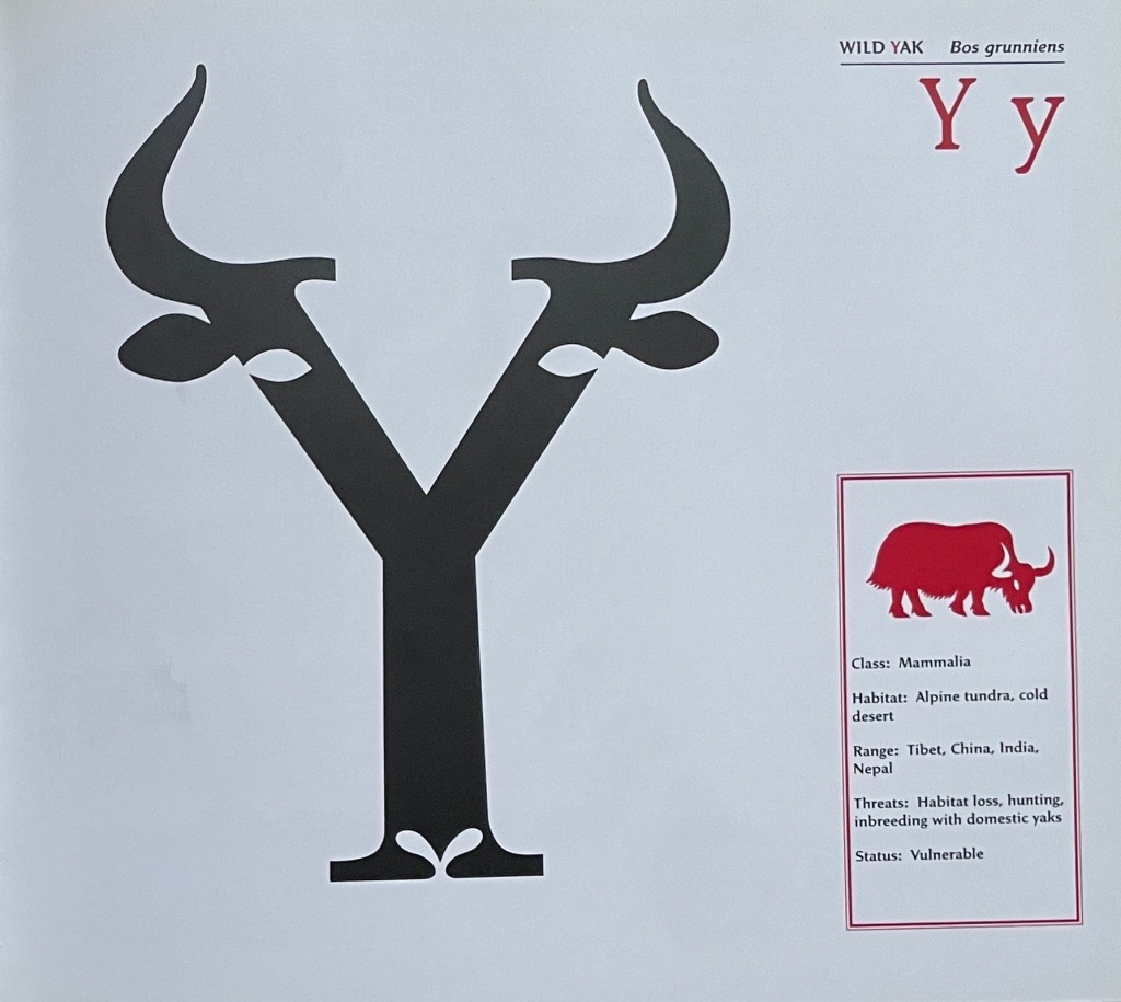

Gone Wild: An Endangered Animal Alphabet 
(2016)
David McLimans
Casebound, illustrated paper over boards, illustrated doublures, sewn book block. Illustrated, debossed glossy paper dustjacket. H255 x W285 mm. 36 unnumbered pages. Acquired from Gargoyle Books, 25 August 2022.
Photos: Books On Books Collection.

Consider again the “n” for negative space and its use of perspective to form its visual metaphor. Doesn’t it pull up Lisa Campbell Ernst’s The Turn Around, Upside Down Alphabet Book (2004), and Menena Cottin’s La Doble Historia de un Vaso de Leche (2019)?
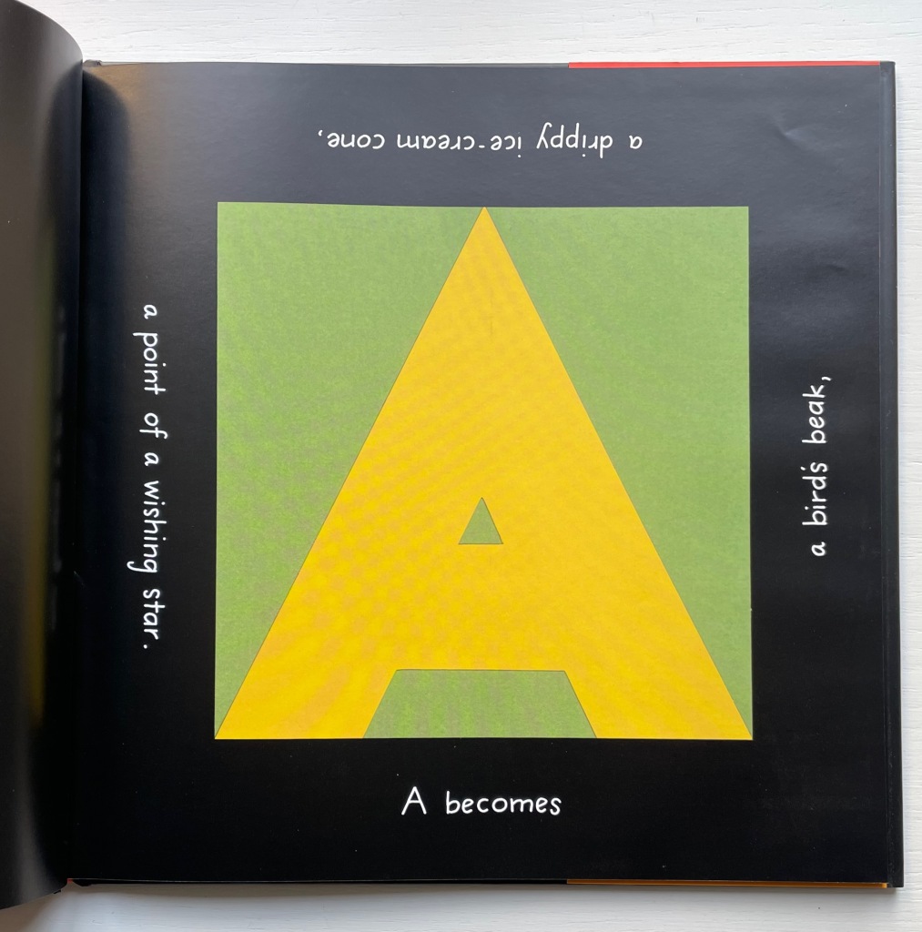
The Turn Around, Upside Down Alphabet Book (2004)
Lisa Campbell Ernst
Casebound, colored doublures, sewn. H241 x W241 mm, 32 unnumbered pages. Acquired from Thrift Books, 5 November 2021.
Photos: Books On Books Collection.
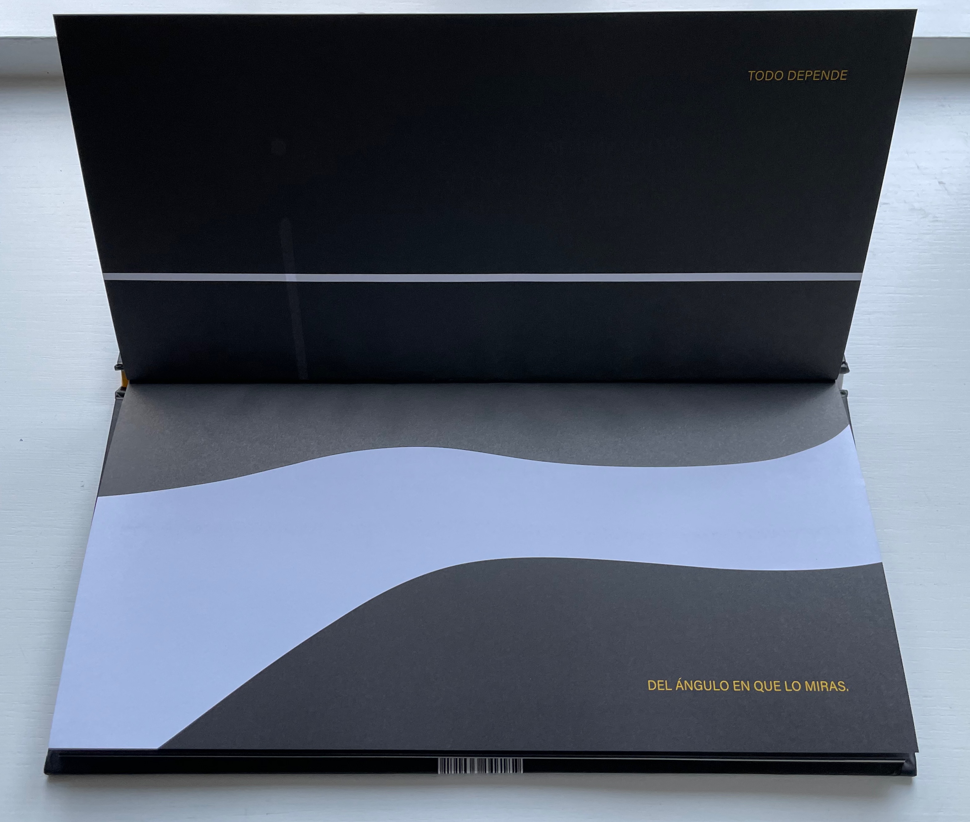
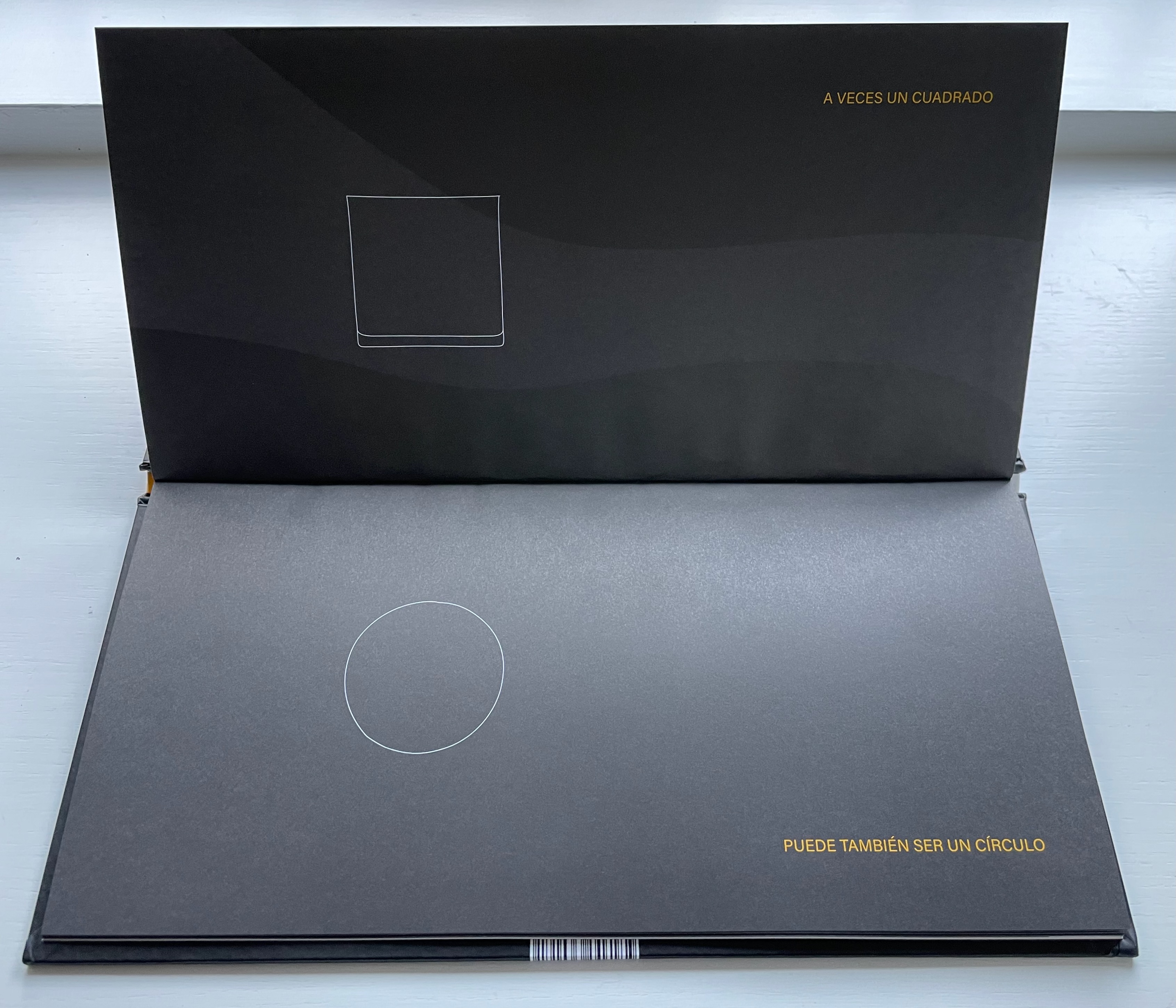
La Doble Historia de un Vaso de Leche (2019)
Menena Cottin
Casebound landscape, paper over boards, with orange-yellow doublures, sewn. H160 x W310 mm. 24 unnumbered pages. Acquired from the artist, 2022.
Photos: Books On Books Collection.

Consider, too, the board book format of ABCing. ABCing underscores the crossover between concept and craft when the imagination draws on the “artistic toolkit of the book”. It might send the reader off to alphabet board books like Harold’s ABC (1963, 2015) by Crockett Johnson in the collection, but here are board books not for the children’s section.
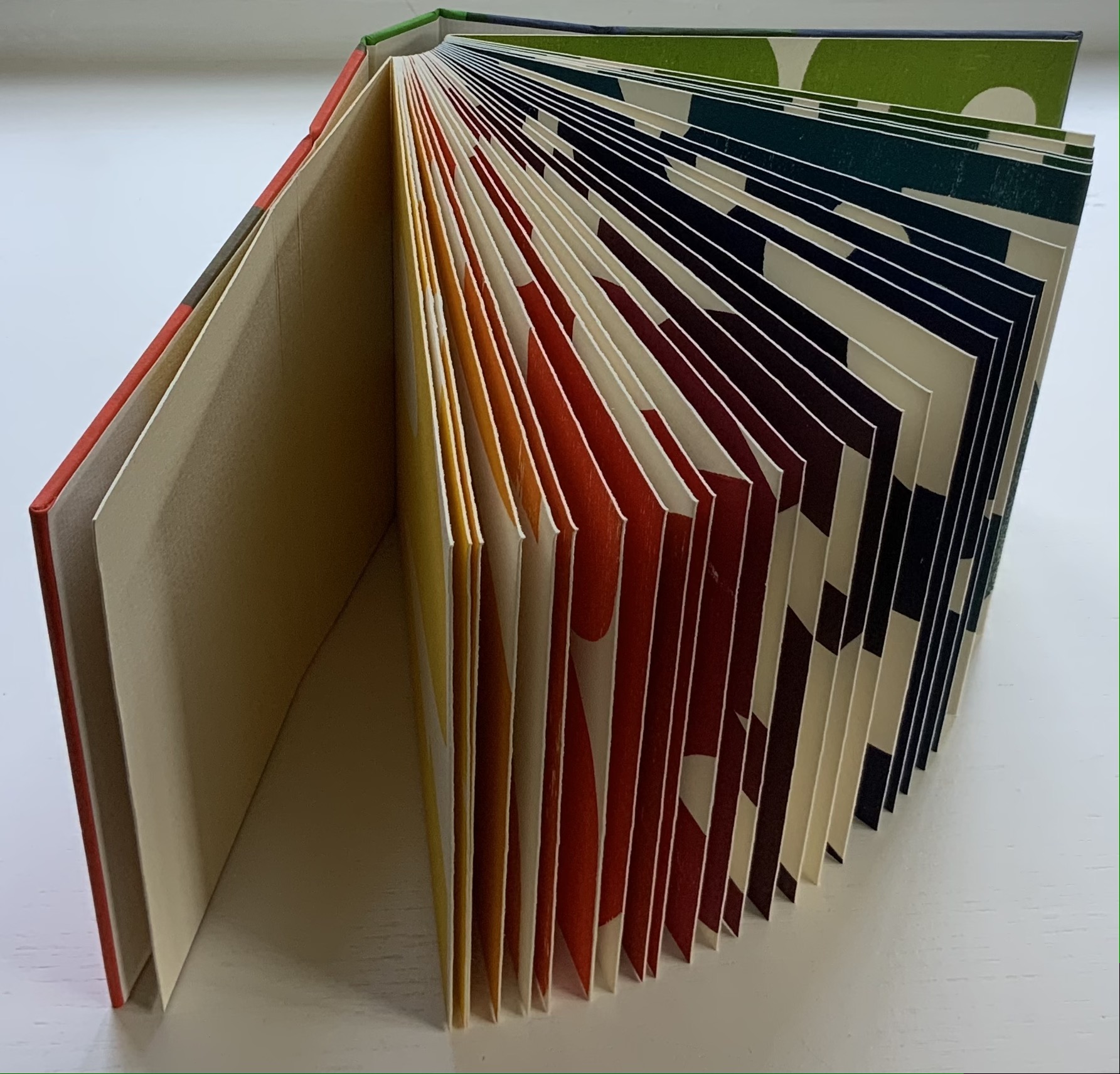
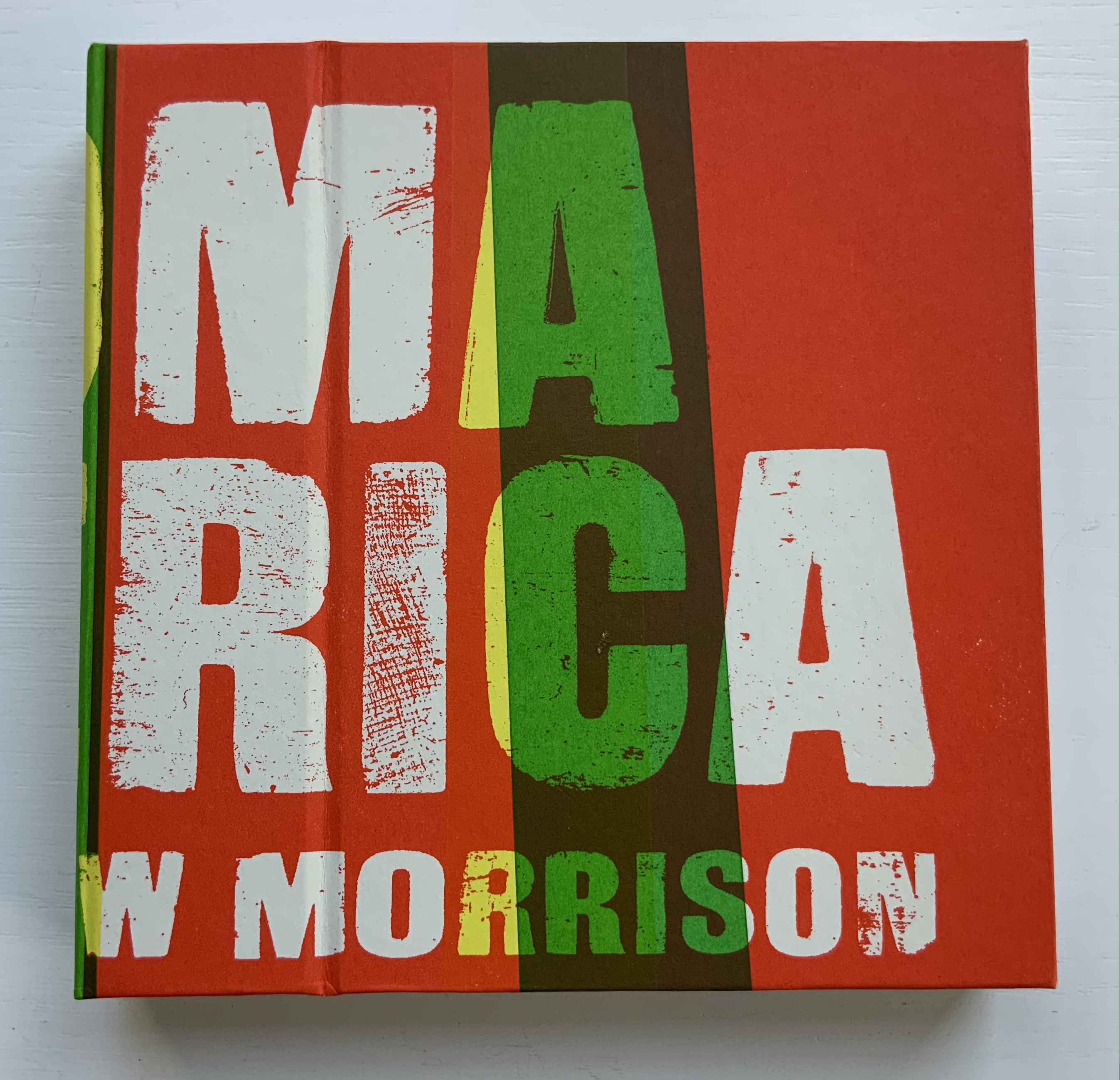
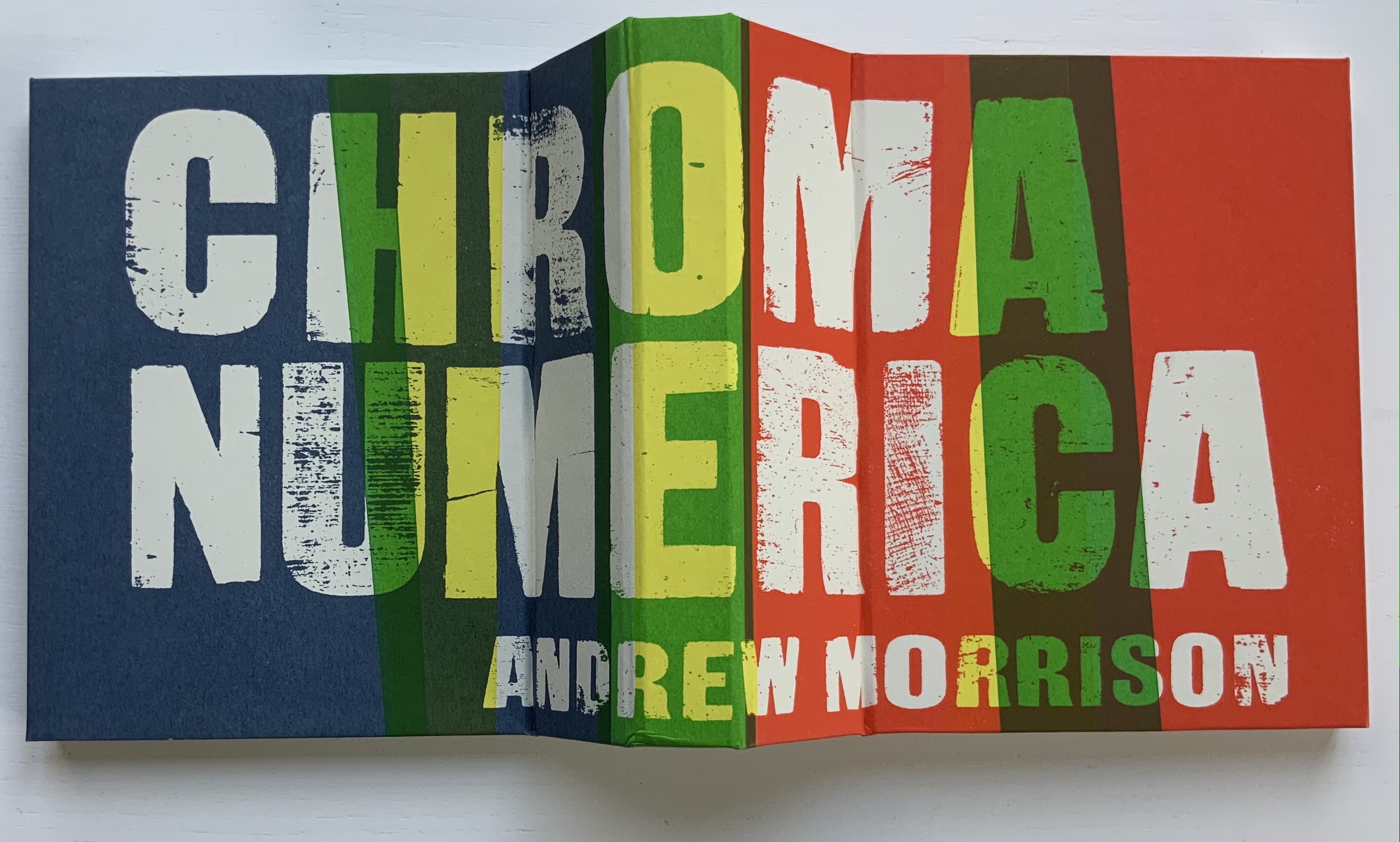
Chroma Numerica (2019)
Andrew Morrison
Perfect bound cased in quarter-hinged paper-on-board binding. H143 x W145 mm, 60 pages, printed on one side. Edition of 30, of which this is #17. Acquired from the artist, 2 September 2021.
Photos of the work: Books On Books Collection. Displayed with artist’s permission.
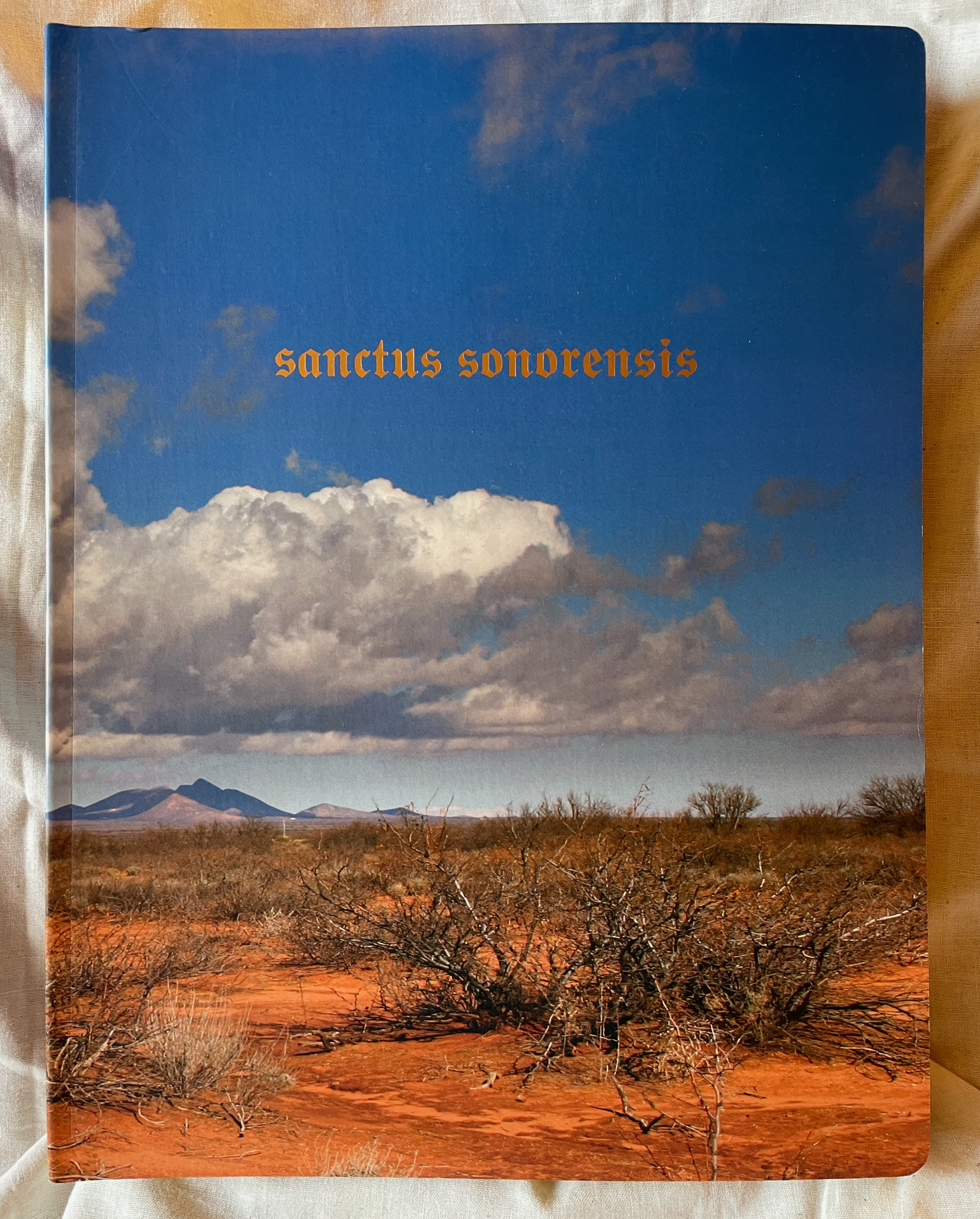
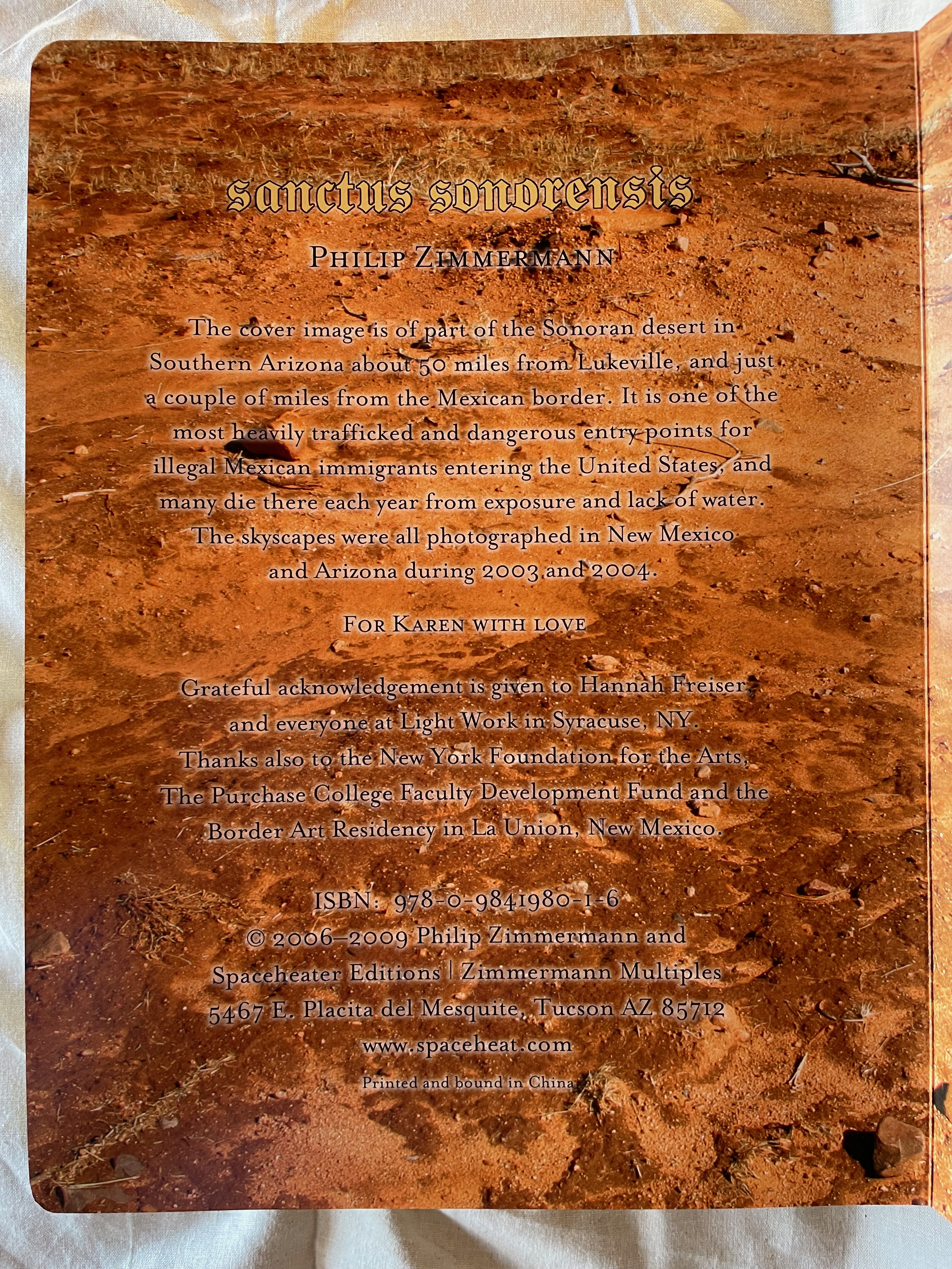
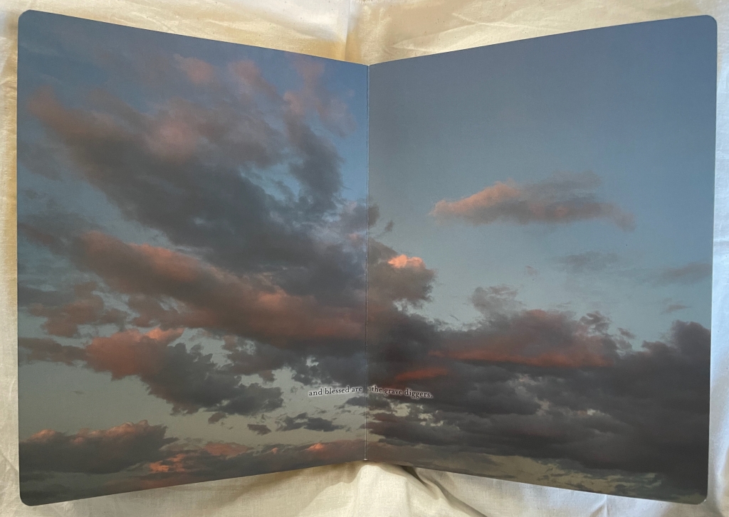
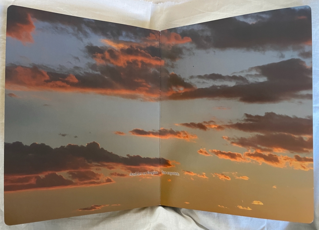
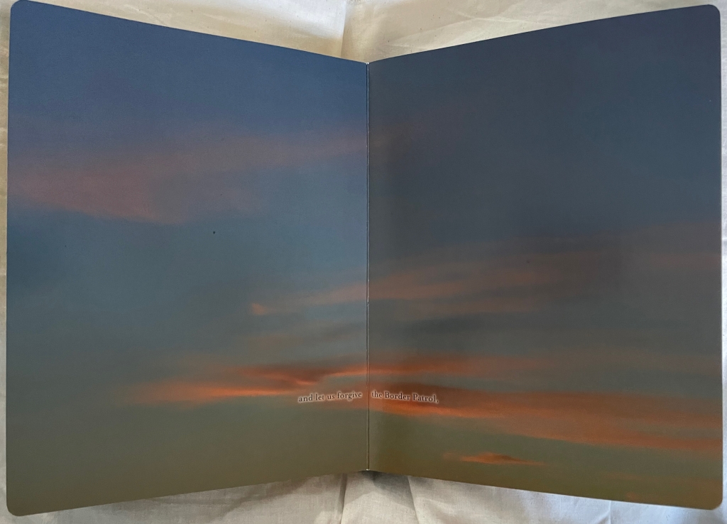
Sanctus Sonorensis (2009)
Philip Zimmermann
Perfect bound, self-covering board book, illustrated cover, gilt on top, bottom and fore edges. Gold-foiled title on the cover and spine. Four-color offset lithography. H273 x W208 x D35 mm. 90 pages. Edition of 1000. Acquired from Spaceheater Editions, 4 February 2024.
Photos: Books On Books Collection.

ABCing‘s abecedarian structure and its board book format underscore its intent in a wry manner. Introductory it may be, but its visual metaphors and use of negative space are subtle. Likewise, Chroma Numerica‘s counting book structure and board book format contrast with its Greco-Latinate title, limited print run and celebration of wood type printing, and the beatitudinal structure and religious gilding of the childhood book format of Sanctus Sonorensis heighten the biting condemnation in its message.

ABCing is more than “seeing the alphabet differently”. Like most effective artist’s books, it prods the reader/viewer into thinking about letter and image differently, the material aspects of the book differently — and looking for other artists’ books that take us further into reading and seeing differently.

Further Reading

Abecedaries I (in progress)“. Books On Books Collection.

Architecture“. 12 November 2018. Bookmarking Book Art.

Antonio Basoli“. 23 April 2021. Books On Books Collection.

Anne Bertier“. 10 August 2022. Books On Books Collection.

Giovanni Battista Braccelli“. 11 September 2023. Books On Books Collection.

Menena Cottin“. 12 July 2023. Books On Books Collection.

Lisa Campbell Ernst“. 10 Deceember 2022. Books On Books Collection.

Suse MacDonald“. 10 August 2022. Books On Books Collection.

David McLimans“. 25 April 2023. Books On Books Collection.

Andrew Morrison“. 15 September 2021. Books On Books Collection.

Bruno Munari“. 19 August 2021. Books On Books Collection.

Richard Niessen“. 23 April 2021. Books On Books Collection.

Dave Pelletier“. 10 August 2022. Books On Books Collection.

Giovanni Battista de Pian“. 23 April 2021. Books On Books Collection.

Rowland Scherman“. 11 September 2023. Books On Books Collection.

Laura Vaccaro Seeger“. 12 December 2022. Books On Books Collection.

Geofroy Tory“. 21 June 2021. Books On Books Collection.

Philip Zimmermann“. 14 January 2020. Books On Books Collection.
Books On Books Collection – Catherine Macorol

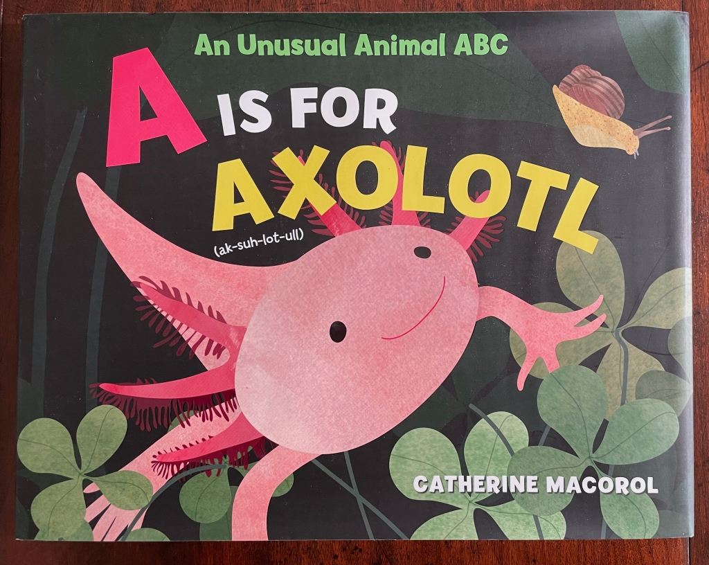
A is for Axolotl (2022)

A is for Axolotl: An Unusual Animal ABC (2022)
Catherine Macorol
Casebound laminated cover with dustjacket. H230 x W290 mm. 32 pages. Acquired from Saint Bookstore, 28 May 2023.
Photos: Books On Books Collection.

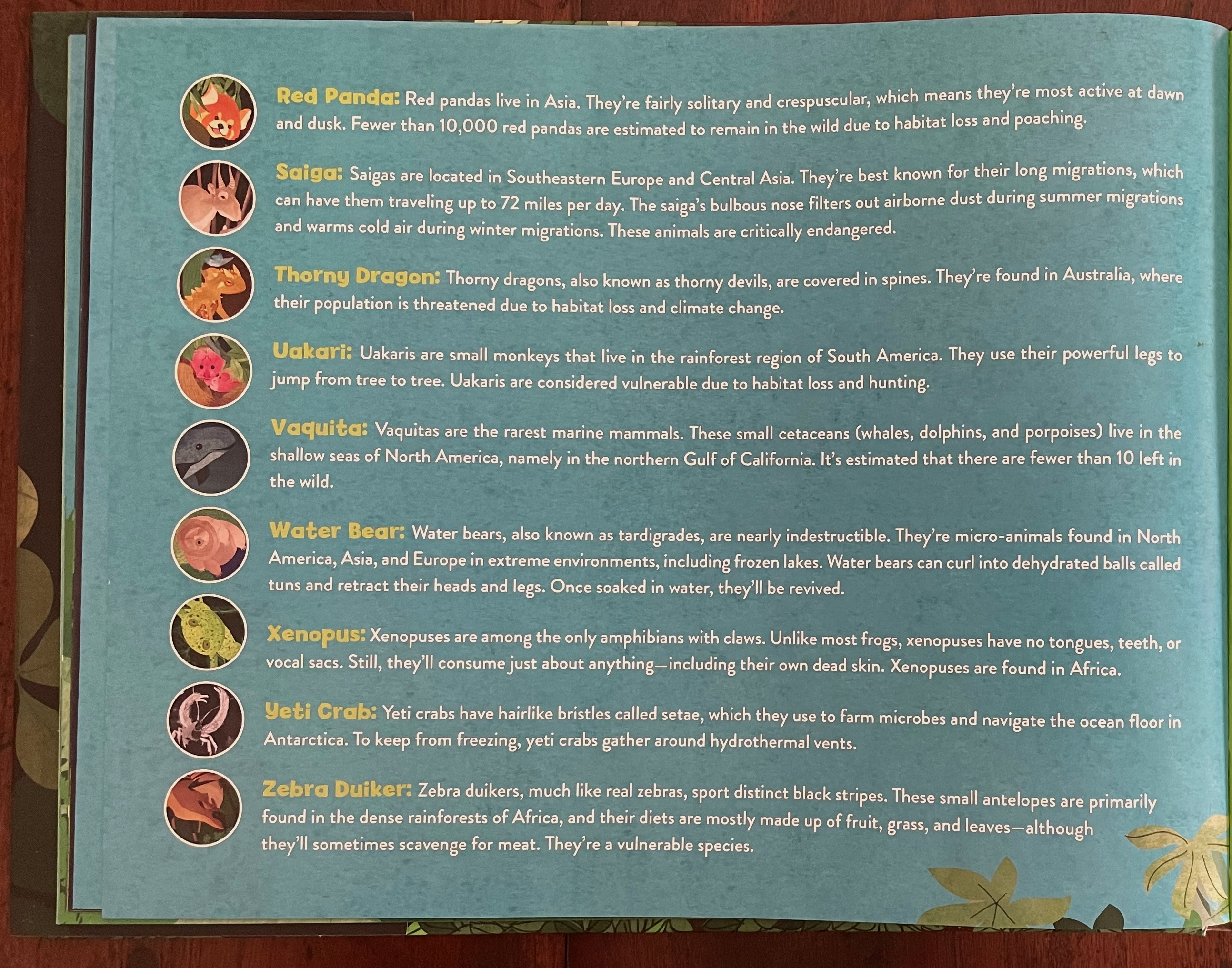
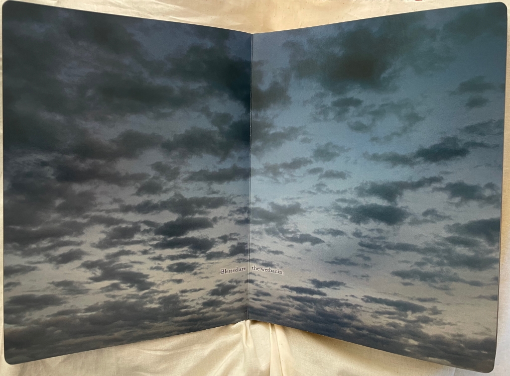
Unfortunately climate change makes possible a sub-collection of abecedaries on the subject of endangered animals. Since Dick King-Smith and Quentin Blake’s Alphabeasts in 1990, there have been more than a dozen. Catherine Macorol’s is the most recent within the Books On Books Collection.

Further Reading

Abecedaries I (in progress)“. Books On Books Collection.

Alphabets Alive! – Animals“. 19 July 2023. Books On Books.

Dick King-Smith and Quentin Blake“. In progress. Books On Books Collection.

David McLimans“. 25 April 2023. Books On Books Collection.

Endangered Animals Dictionary : An a to Z of the World’s Threatened Species. 2016. London: Alligator Products Limited.

Balog, James. 1996. James Balog’s Animals a to Z. San Francisco: Chronicle Books.

Cossins, Jennifer. 2017. A-Z of Endangered Animals. Sydney N.S.W: Lothian Children’s Books.

Jonas, Ann. 1990. Aardvarks Disembark! 1st ed. New York: Greenwillow Books.

Kierst, Anastasia. 2013. P Is for Pangolin : An Alphabet of Obscure Endangered & Underappreciated Animals. NP: Eternal Summers Press.

Mackey, Bonnie and Hedy Schiller Watson. 2017. Alphabet Books : The K-12 Educators’ Power Tool. Santa Barbara California: Libraries Unlimited. For a brief history and extended categorization of alphabet books.

Malone, Vicki. 2022. Can We Save Them? : An Alphabet of Species in Danger. 2022. Herndon VA: Mascot Books an imprint of Amplify Publishing Group.

Markle, Sandra; Markle, William; and Dávalos, Felipe. 1998. Gone Forever! : An Alphabet of Extinct Animals. 1st ed. New York N.Y: Atheneum Books for Young Readers.

Mullins, Patricia. 1995/1993. V For Vanishing : An Alphabet of Endangered Animals. Sydney N.S.W: Margaret Hamilton Books.

Pallotta, Jerry, and Masiello, Ralph. 1993. The Extinct Alphabet Book. Watertown Mass: Charlesbridge.

Shailer, Daniel. 25 November 2023. “‘Adopt an axolotl’ campaign launches in Mexico to save iconic species from pollution and trout“. The Independent.

Twinem, Neecy. 1994. Aye-Ayes Bears and Condors : An Abc of Endangered Animals and Their Babies. New York: W.H. Freeman.

Twist, Clint. 2005. Endangered Animals A-Z. San Diego: Thomson/Gale.

Wakefield, D. R. 2009. An Alphabet of Extinct Mammals. Goole: Chevington Press.

Wakefield D. R. 2010. Alphabet of Endangered Mammals : A Collection of Etchings Depicting Animals Considered Extinct in the Wild 2050. Goole: Chevington Press.

Books On Books Collection – Clotilde Olyff

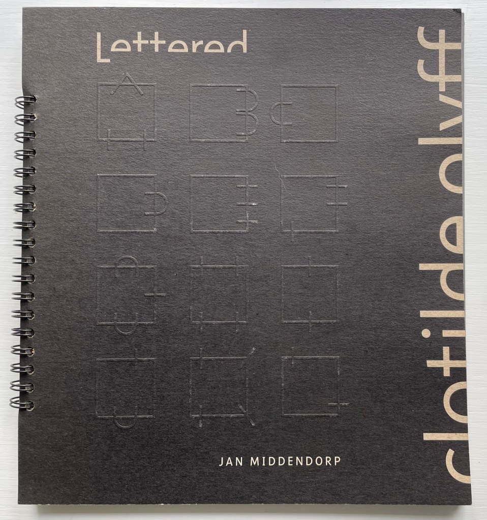
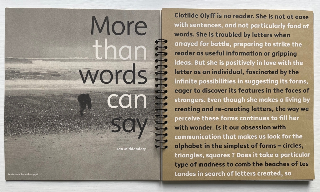
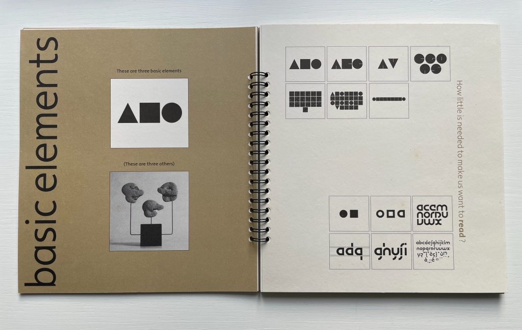
Lettered Typefaces and Alphabets by Clotilde Olyff (2000)

Lettered Typefaces and Alphabets by Clotilde Olyff (2000)
Jan Middendorp and Clotilde Olyff
Spiral-bound softcover of 78 pages and measuring H235 x W215 mm with a 28-page booklet measuring H165 x W115 mm bound in. Acquired from Klondyke Books, Almere, NL, 28 November 2023.
Photos: Books On Books Collection

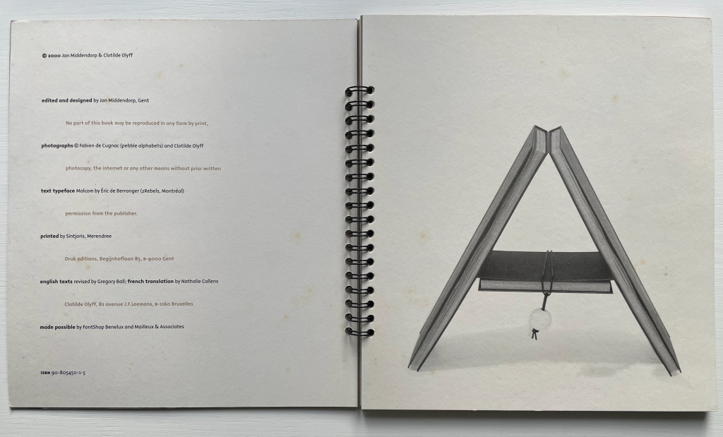
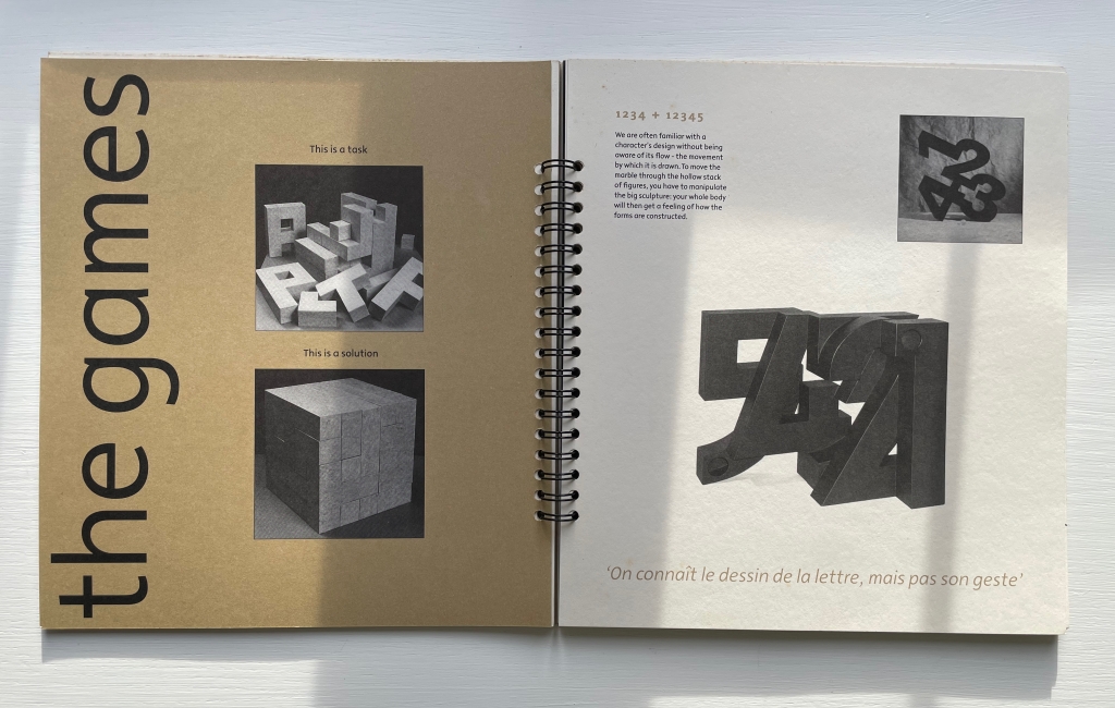
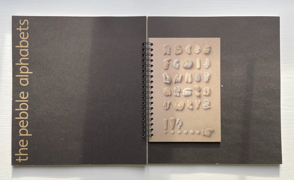
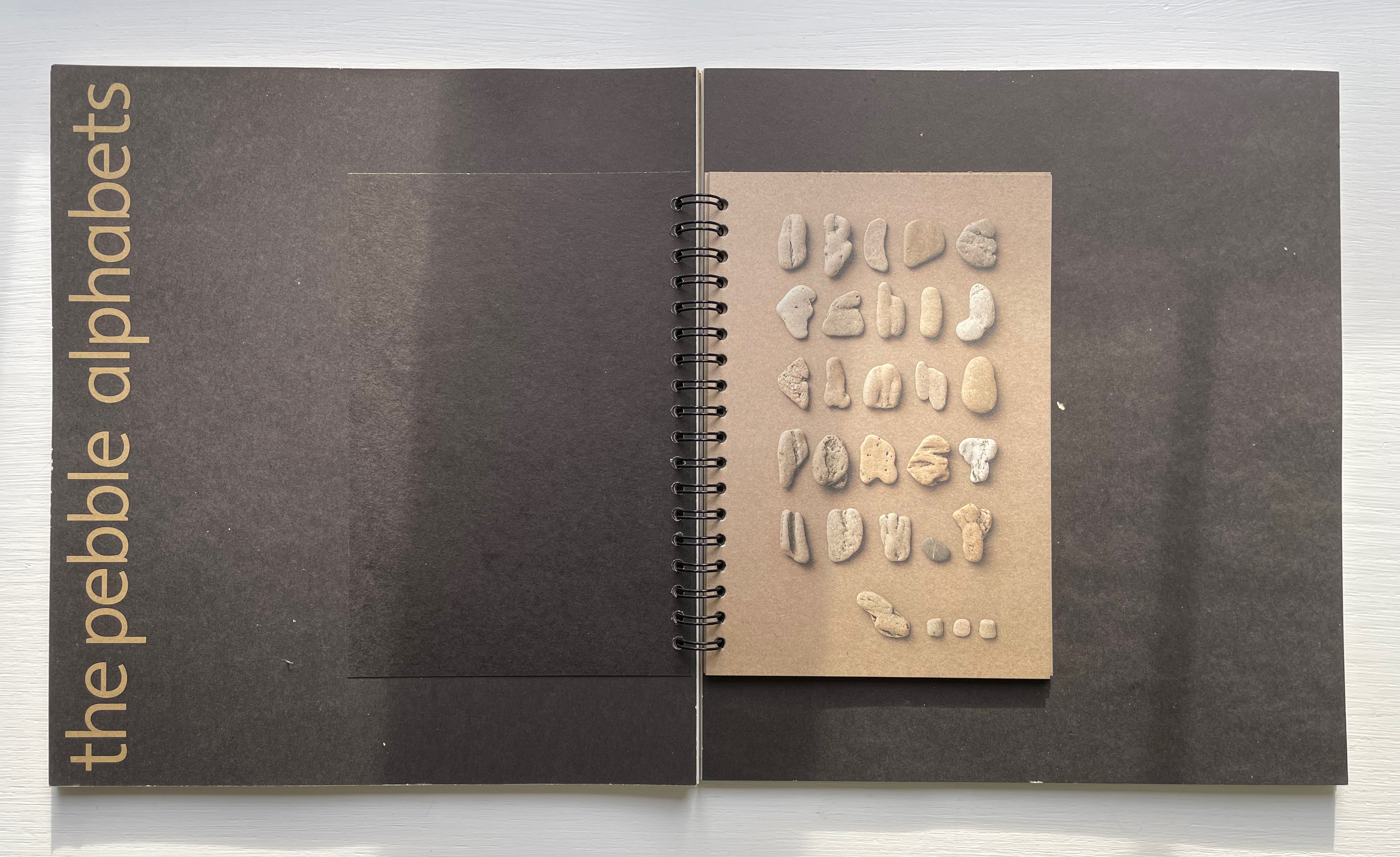
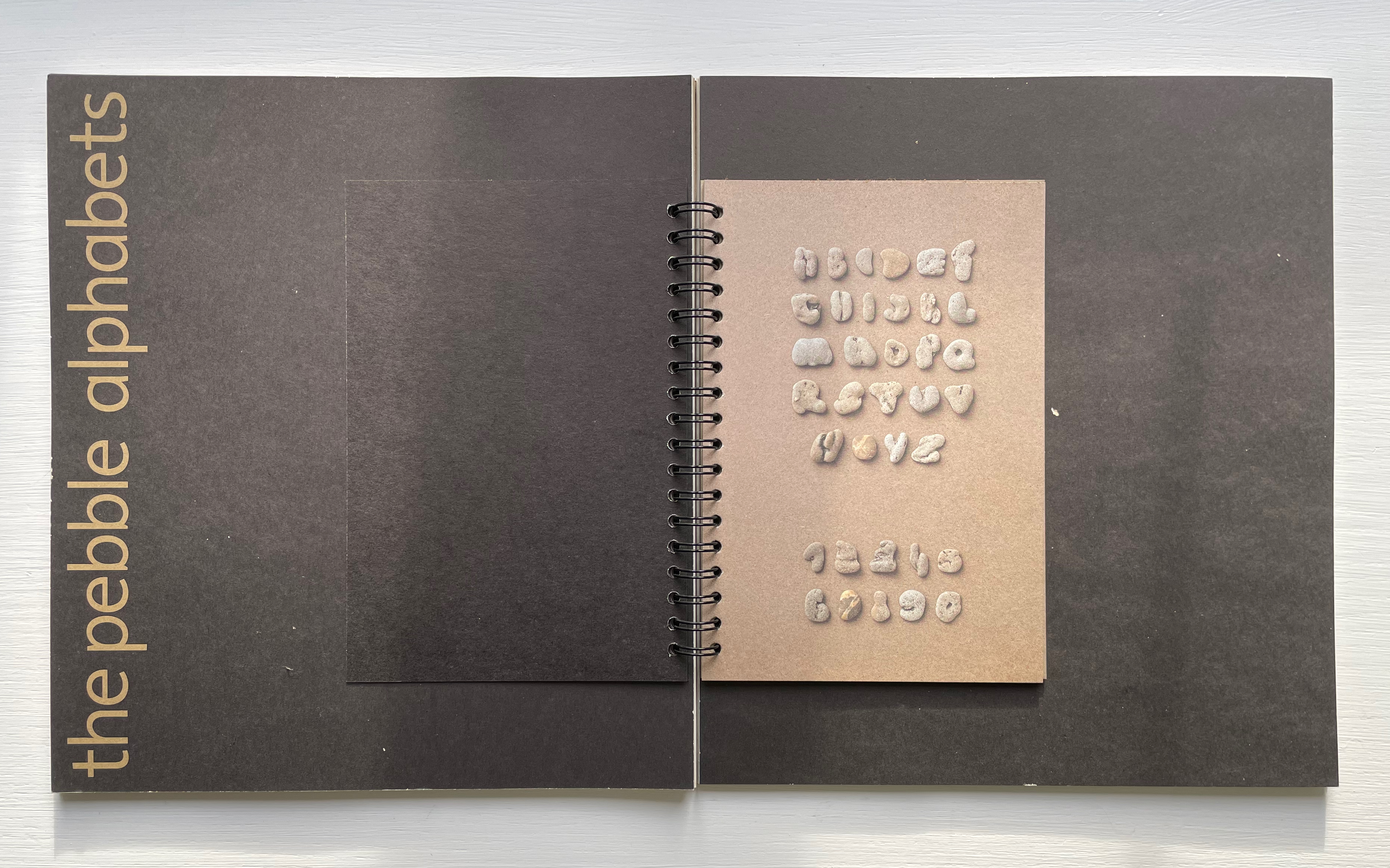
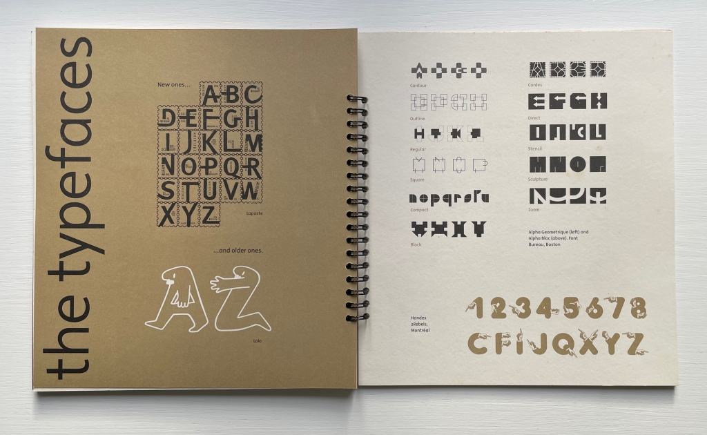
This is the rare first edition as published by the late Jan Middendorp through his Druk Editions. It bears all the hallmarks of his eye for design — the black coated wired binding, the heavy embossed card cover, the use of color to underscore the text’s theme, the embedded booklet — all nevertheless centering and providing a platform for the art and design of Clotilde Olyff.

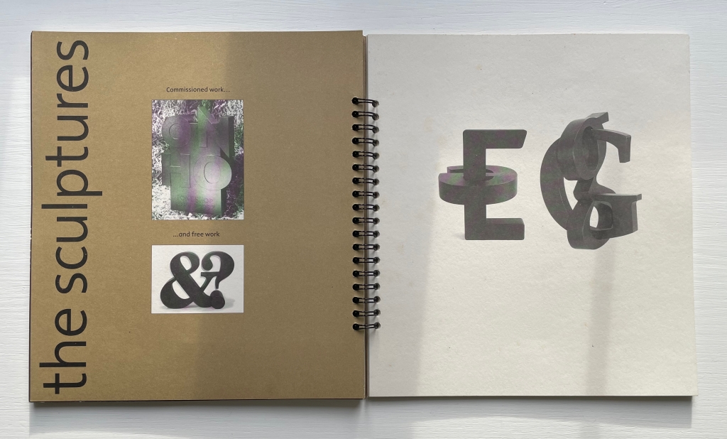
Perhaps mostly noted for her pebble alphabet, Olyff should be noted for her Munari-like focus on the relation of the basic forms of circle, triangle and square to the shapes of letters and numbers and her ability to express that in sculpture, book art and games as well as type. Her works, as Middendorp writes in the preface, “are the result of investigations into the essence of the letter, into the mechanisms and conventions that guide our perception”.

In addition to being remembered for his own typographic design and publications, Middendorp is owed a debt of gratitude for collaborating with Clotilde Olyff to document her work.

Further Reading

Abecedaries I (in progress)“. Books On Books Collection.

Alphabets Alive! – Alphabets All Around“. 19 July 2023. Books On Books.

Robert Beretta“. 18 February 2023. Books On Books Collection.

Kenneth Hardacre“. 18 February 2023. Books On Books Collection.

Elliott Kaufman“. 21 January 2023. Books On Books Collection.

Lisa McGuirk“. 28 February 2023. Books On Books.

Ellen Sollod“. 29 December 2022. Books On Books Collection.

De Looze, Laurence. 2018. The Letter and the Cosmos: How the Alphabet Has Shaped the Western View of the World. Toronto: University of Toronto Press.

Hugo, Victor, and Nathan Haskell Dole, trans. 1890 (1895). Victor Hugo’s Letters to His Wife and Others (The Alps and the Pyrenees). Boston, MA: Estes and Lauriat.

Middendorp, Jan. 2018. Dutch Type. Berlin: Druk Editions.

Middendorp Jan. 2009. Shaping Text : Type Typography and the Reader. Amsterdam: BIS.

Books On Books Collection – Klaus Peter Dencker

Dero Abecedarius! (2001)

Dero Abecedarius! (2001)
Klaus Peter Dencker
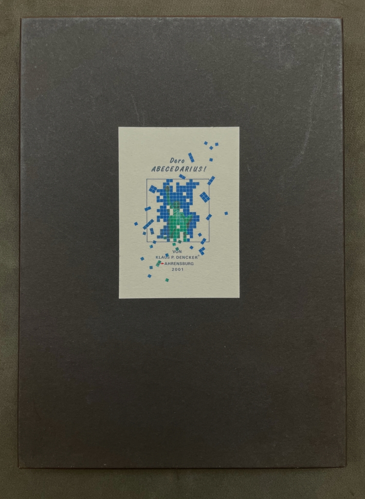
Loose folios in heavy card box, title on card pasted on front box cover. H298 x W210 mm. 34 folios. Inkjet on BFK Rives 210 gram. Edition of 50, of which this is #30. Acquired from Red Fox Press, 3 January 2023.
Photos: Books On Books Collection.

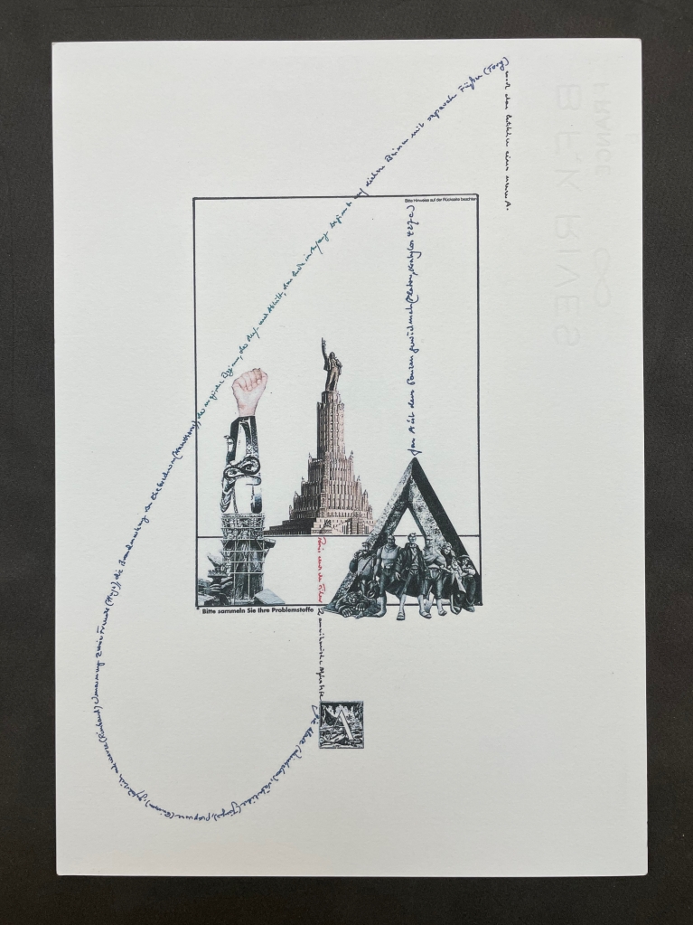
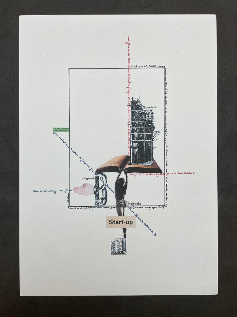
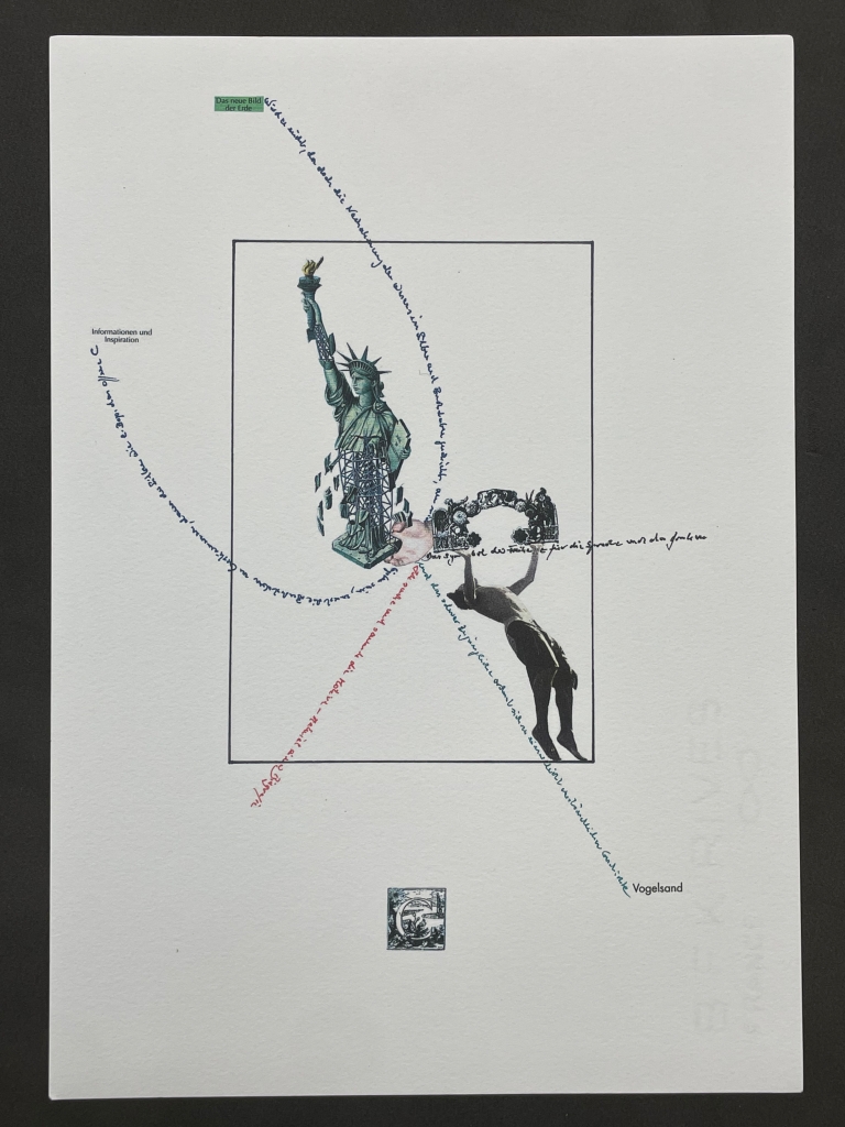
Visual poems in an ABC sequence and inspired by the Statue of Liberty. Klaus Peter Dencker belongs in the vast company of notable visual poets and “alphabet-etishists”, too many to list here, but within the Books On Books Collection, there are Jim Avignon & Anja Lutz, Jim Clinefelter, Martín Gubbins, Bernard Heidsieck, Karl Kempton and Sam Winston, all of whom offer fruitful comparisons.

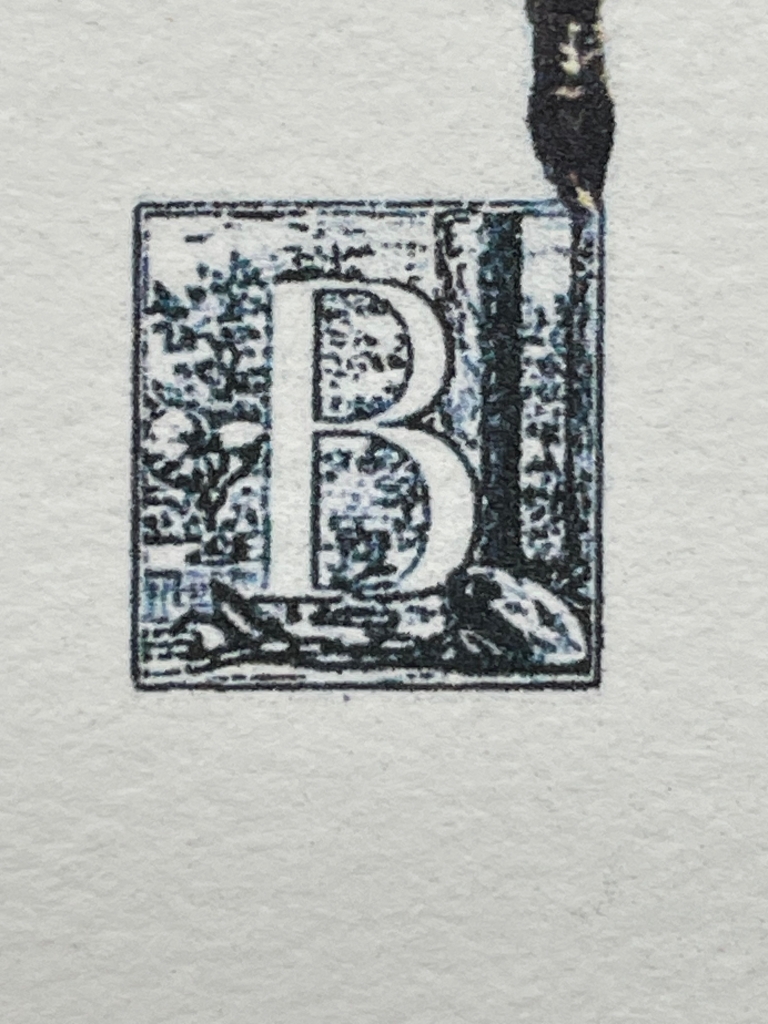
Detail from B folio

Artist’s statement: I started the work on “Dero Abecedarius” in the mid of July 2001. The work should have two principles of order: the sequence of the pages should follow the normal ABC, and the basic theme should be the Statue of Liberty which I am collecting since many years. This subject is a public-relation one in many variations, so that I could work on the idea of freedom especially with these partly absurd copies of our consumer society, to question it poetically and theoretically.

There exist three structures: 1. A-C, D-F, G-I, J-L, M, N-R, S-U, V-Z; 2. A-C, D-F, G-I, J-L, M, N-R, S-T, U-Y, Z; 3. A-C, D-F, G-I, J-L, M, N-P, O-R, S-T, V-Y, Z on four levels: black/poetic, green/poetry, blue/ABC, red/autobiographically.

Within this work are personal experiences of many visits to the USA and the absurd idea, that a letter has its own meaning/importance. The ABC as an own sign-world and as an example for the dealing with seeming/apparent unliberties and so called rules. I work on the sequences usually by making first all collages on the pages, then the text-elements and finally a follow-up of a few corrections in the existing collages. The work should have had 28 pages and was done for an exhibition in the Buch- und Schriftmuseum Museum of the Deutsche Bibliothek Leipzig with the opening on the 8th of November 2001. On the 11th of September all collages on the pages were done and also some pages with text-elements. Looking back that particular day over my work I noticed some elements which I can`t explain: I saw some disturbing connections. So on pages F, M, O and Z. I added after the 11th of September some new elements only in the existing collages of page R and Y, and I added the last two pages after Z. So that now the work has 32 pages as a consequence of 11 September and was finished on the 21st of October 2001.

Although Dencker refers to 32 pages, there are 34. They consist of 1 cover, 1 English preface (typeset), 1 German preface (handwritten), 26 letter folios, 1 entitled Noch zwei fündstucke (“Two more findings”), 2 modified collages of R and Y, 1 entitled “Art sheet”, 1 colophon.

Redfoxpress (founded by Francis Van Maele) is one of the more active and important publishers and distributors of artists’ books in the post-Fluxus tradition since 2000 to the present.

Further Reading

Abecedaries I (in progress)“. Books On Books Collection.

Jim Avignon & Anja Lutz“. 29 October 2022. Books On Books Collection.

Jim Clinefelter“. 17 July 2020. Books On Books Collection.
Martín Gubbins“. 9 August 2022. Books On Books Collection.

Bernard Heidsieck“. 29 October 2022. Books On Books Collection.

Karl Kempton “. 29 October 2022. Books On Books Collection.

Sam Winston“. 17 September 2018. Books On Books Collection.

J. Meejin Yoon“. 12 January 2017. Books On Books Collection.

Bean, Victoria, Kenneth Goldsmith and Chris McCabe. 2015. The New Concrete : Visual Poetry in the 21st Century. London: Hayward Gallery Publishing.

Dencker, Klaus Peter. 2000. “From Concrete to Visual Poetry, with a Glance into the Electronic Future“. Trans. Harry Polkinhorn. Kaldron On-Line.

Sackner, Martin and Ruth. 2015. The Art of Typewriting : 570+ Illustrations. 2015. London: Thames & Hudson. P. 234.

Books On Books Collection – Richard J. Hoffman

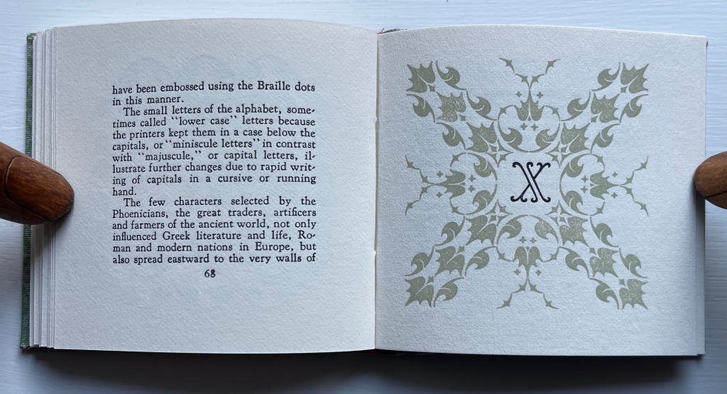
Richard J. Hoffman (1912-1989) was a fine press printer and taught print and design at California State University, Los Angeles. His interests in typography, miniature books and the alphabet are represented by two works in the Books On Books Collection: “Don’t Nobody Care about Zeds” (1987) and Otto Ege’s The Story of the Alphabet (1988).

Both books scratch the collection’s “alphabet itch”. The first provides the added satisfaction of complementing the children’s books that champion the alphabet’s last letter: Jon Agee’s Z Goes Home (2006), Alethea Kontis & Bob Kolar’s AlphaOops: The Day Z Went First (2012), Sean Lamb & Mike Perry’s Z Goes First (2018) and Lou Kuenzler & Julia Woolf’s Not Yet Zebra! . The second adds an alphabet history to the miniature abecedaries as well as a more than usually intricate design.

“Don’t Nobody Care about Zeds” (1987)

“Don’t Nobody Care about Zeds”
A Modest Book About an Oft-overlooked Character of the Alphabet Prepared for the Pleasure of Zamoranans
* (1987)
Richard J. Hoffman
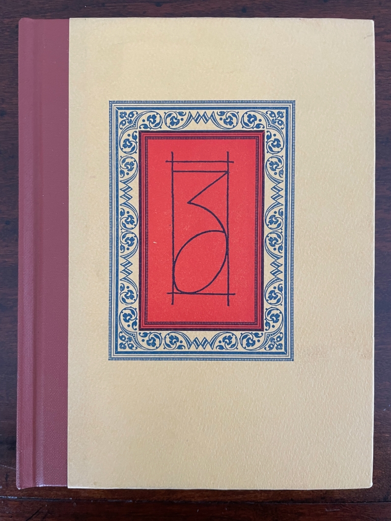
Hardcover, casebound. Cloth and paper cover with colored endbands and printed doublures. H160 x W120 mm. 176 pages. Edition of 200. Acquired from Scott Emerson Books, 5 September 2023.
Photos: Books On Books Collection.

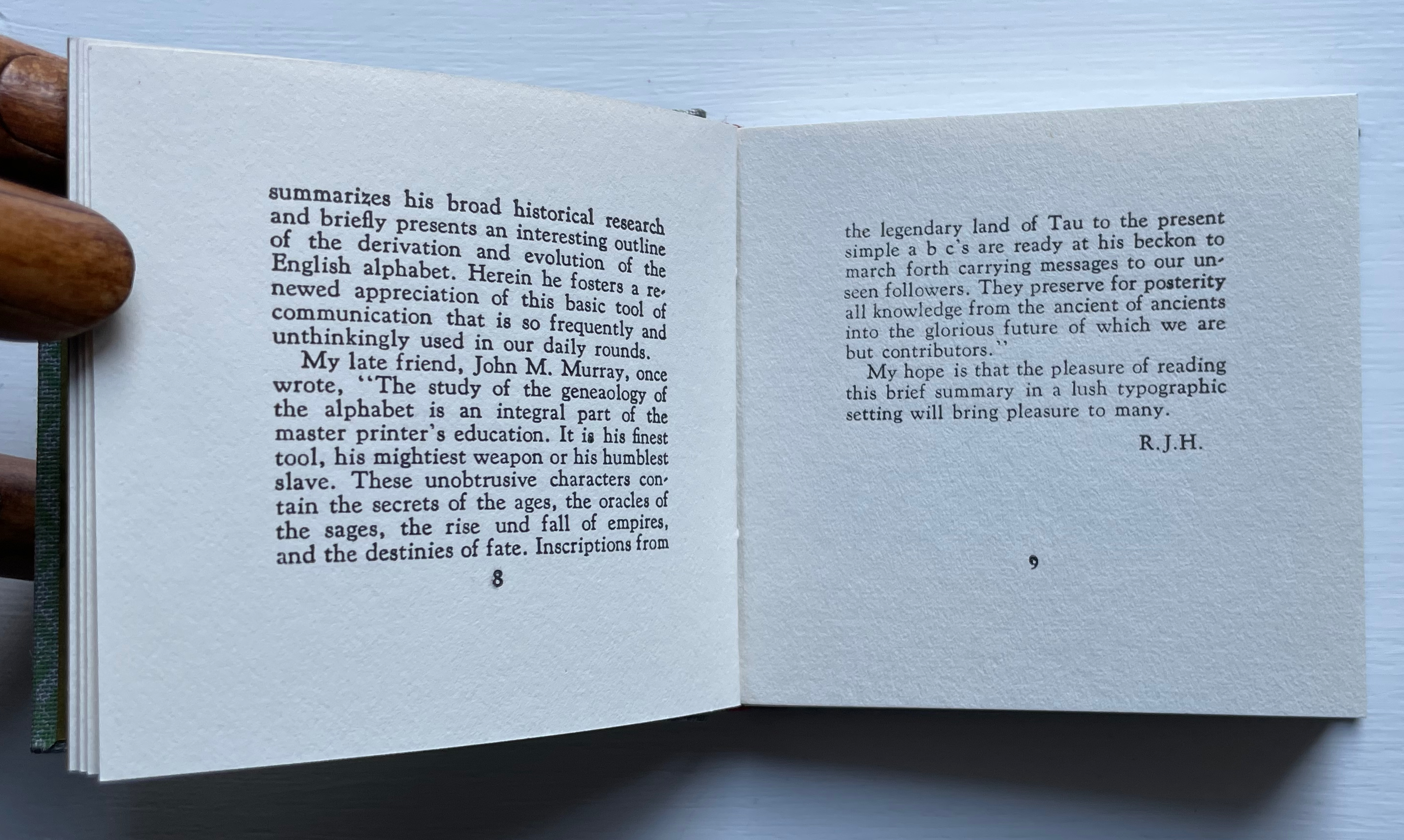
Hoffman’s introduction, which explains the book’s title and final image, also touches the collection’s expatriate funny bone.

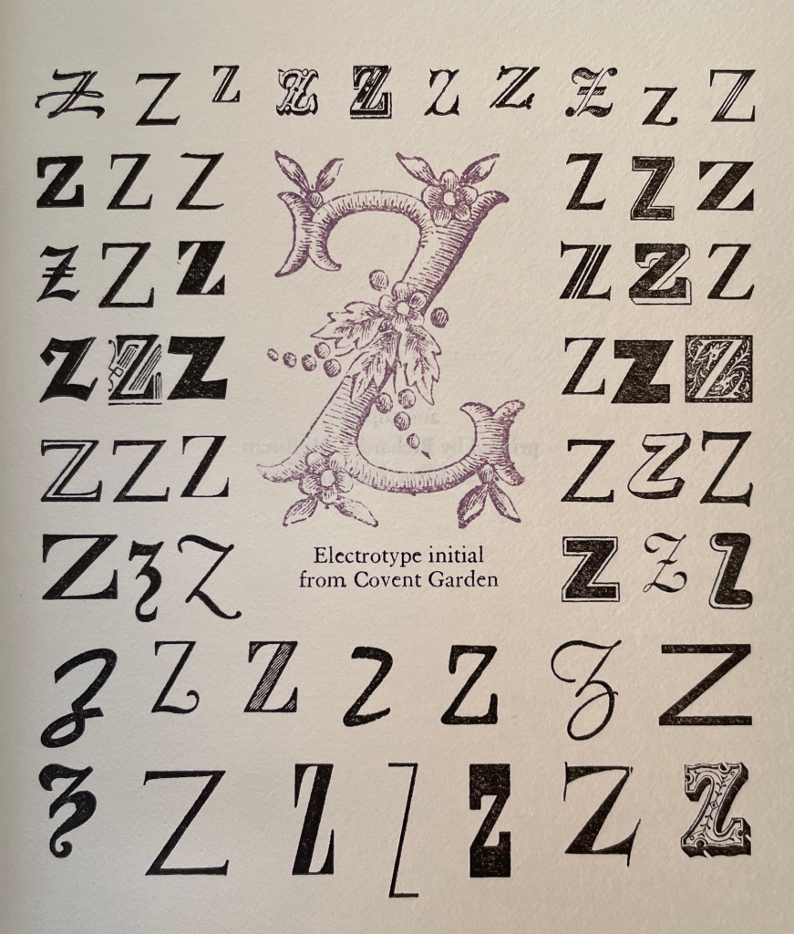
‘Zeds is what the English folk call the magnificent twenty-sixth character of our alphabet. This I learned while shopping at Covent Gardens in London some years ago. There I happened upon a flea market where from a pair of old wood type cases, an ‘uckster was peddling electrotyped initial letters. With a blob of sealing wax, he assured me, I could personalize my correspondence by stamping my initial in the soft wax. When I asked he had any Zs, he looked at me questioningly, then he beamed as I picked one up, very brightly responded that he still had some unsold, and then solemnly observed, “Don’t nobody care about Zeds.”‘

For those who consider the ampersand to be the alphabet’s twenty-seventh character, Hoffman’s book may remind them of Jan Tschichold’s A Brief History of the Ampersand (1957) or ~Zeug/Velvetyne Type Foundry’s Et & ampersands : une récolte internationale = a contemporary collection (2017), but those two come nowhere near Hoffman’s embellishments with fleurons and ornaments to highlight his extended sampler.

The Story of the Alphabet (1988)

The Story of the Alphabet
Its Evolution and Development… Embellished Typographically with Printer’s Flowers Arranged by Richard J. Hoffman
(1988)
Otto F. Ege** and Richard J. Hoffman
Hardback, casebound in gray cloth over boards, endbands, printed doublures. H70 x W74 mm. 82 pages. Edition of 250. Acquired from Bromer Booksellers, 1 November 2023.
Photos: Books On Books Collection.

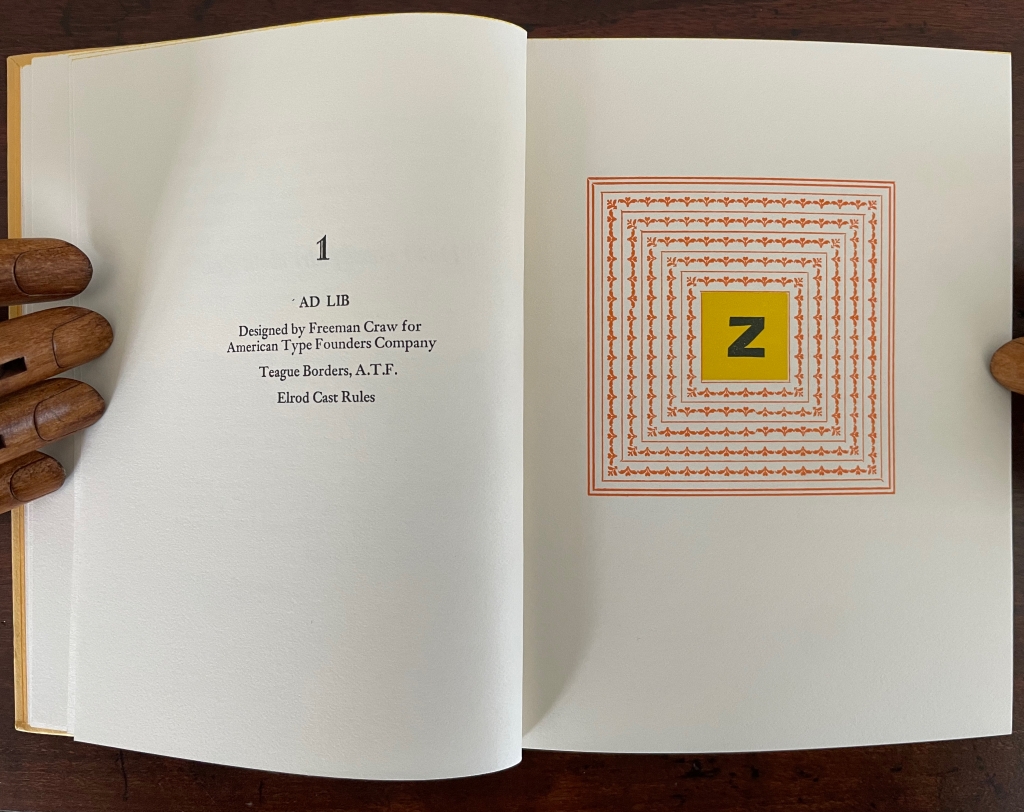
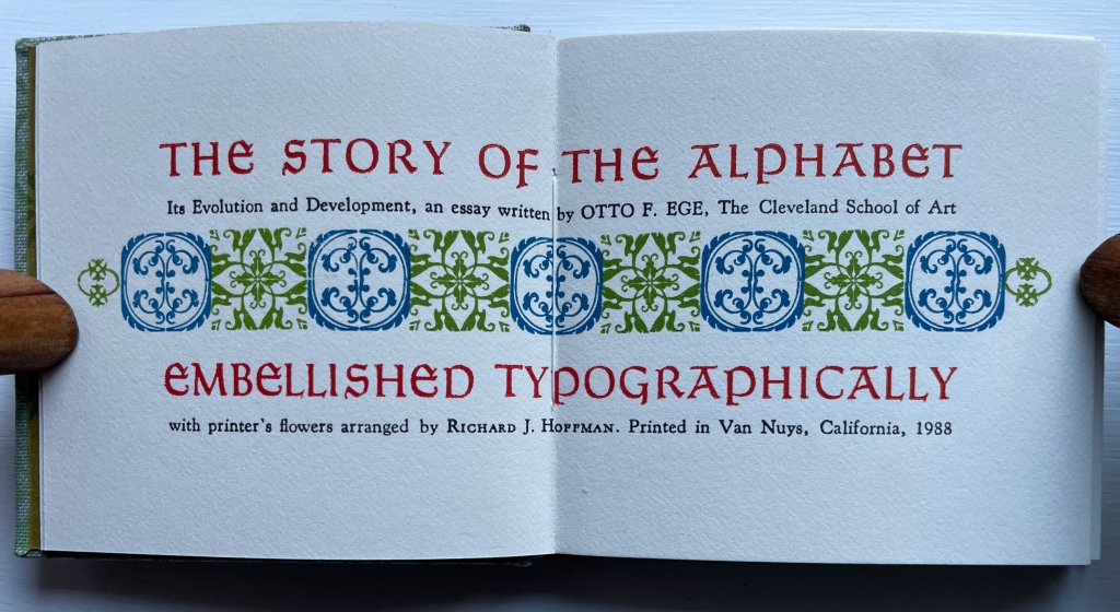
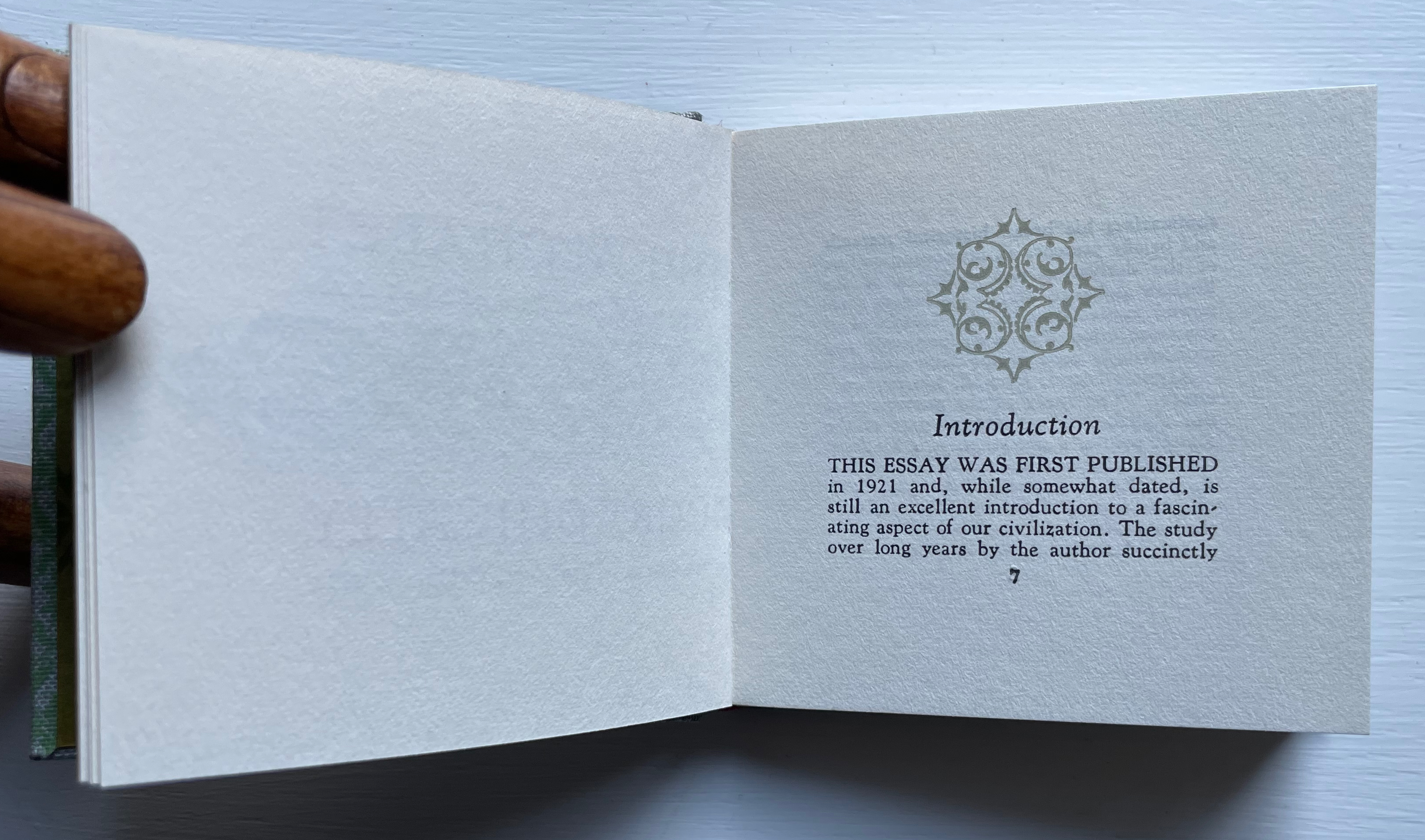
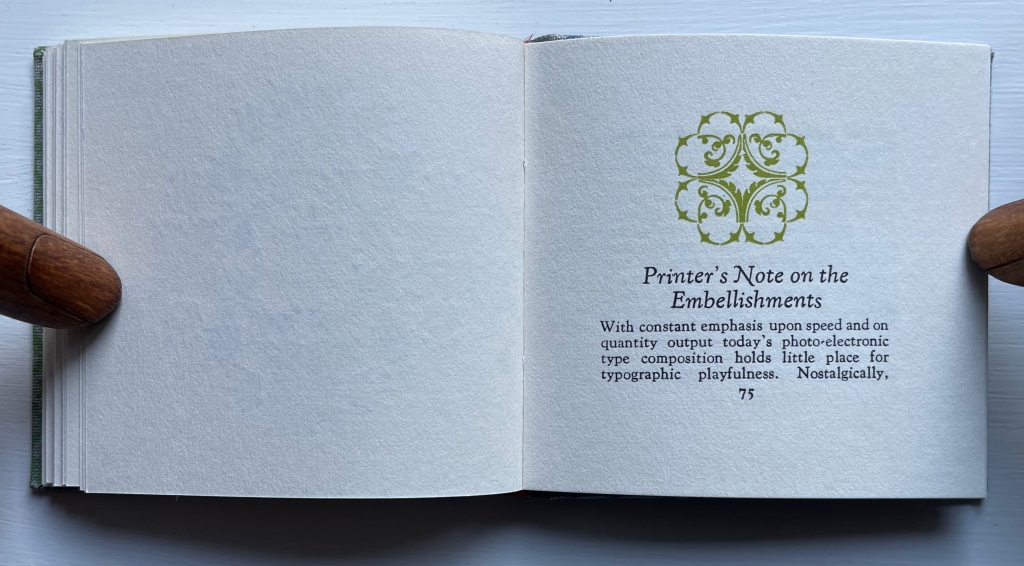
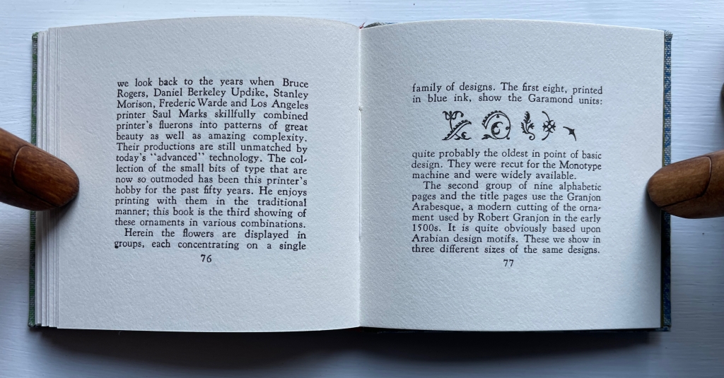
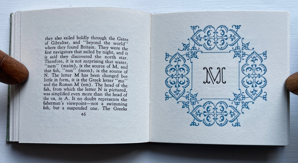
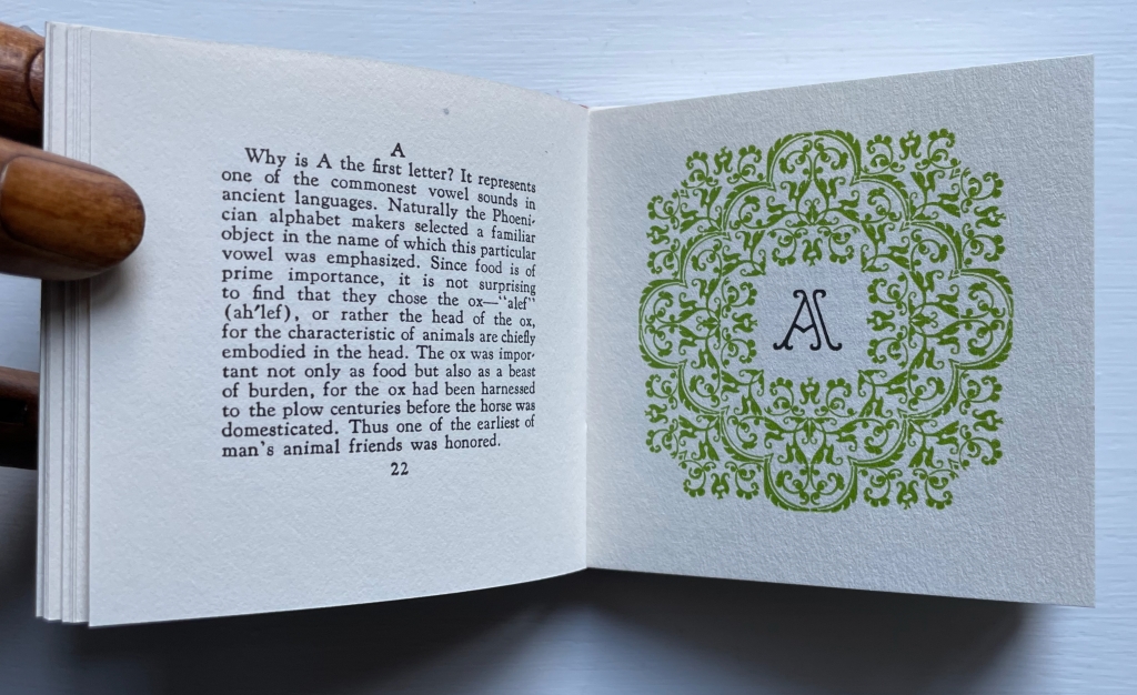
Color and embellishment in Hoffman’s The Story of the Alphabet perform an informative as well as decorative function. The cover cloth’s red, green, gray and blue are decoratively echoed on the title page and later are used in the color-organization of fleurons and ornaments described in the “Printer’s Note”. Little wonder that the book received a Distinguished Book Award from the Miniature Book Society in 1988.

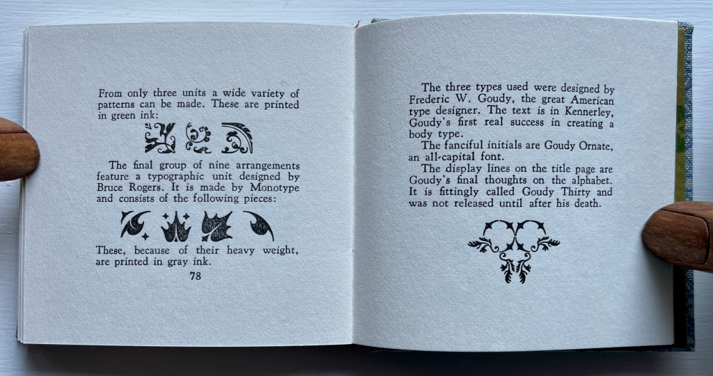
“The first eight, printed in blue ink, show the Garamond units”

“The second group … use[s] the Granjon Arabesque …. These are printed in green ink.”

“The final group … feature[s] a typographic unit designed by Bruce Rogers…. These, because of their heavy weight, are printed in gray ink….”

*”Zamoranans” refer to the members of the Zamorano Club of Los Angeles, named after Augustin Zamorano, who brought the first printing press to California in 1834.

**”Otto F. Ege” serves another purpose for the collection. Without the artistic justification atributable to some book artists, Ege was a notorious biblioclast. Thinking to make them more widely available, he broke apart numerous illuminated manuscripts to create portfolios of samples. Fortunately he was not comprehensive in his efforts, and a large number of intact works made it into Yale’s Beinecke Library (see below).

Further Reading

Abecedaries I (in progress)“. Books On Books Collection.

Jon Agee, Alethea Kontis & Bob Kolar, Sean Lamb & Mike Perry, Lou Kuenzler & Julia Woolf“. 16 October 2021. Books On Books Collection.

Alphabets Alive! “. 19 July 2023 – 21 January 2024. Bodleian Libraries, Oxford.

Lyn Davies“. 7 August 2022. Books On Books Collection.

Beinecke Library. 11 November 2015. “Beinecke Library acquires ‘treasure trove’ of medieval manuscripts from Otto Ege“. New Haven, CT: Yale University.

Ege, Otto F. 1921. The story of the alphabet. Baltimore: N.T.A. Munder & Co.

Howell, John. 21 March 2016. “Richard Hoffman: Prolific & Pioneering Printer“. The New Antiquarian: The Blog of the Antiquarian Booksellers’ Association of America.

Books On Books Collection – Nayla Romanos Iliya

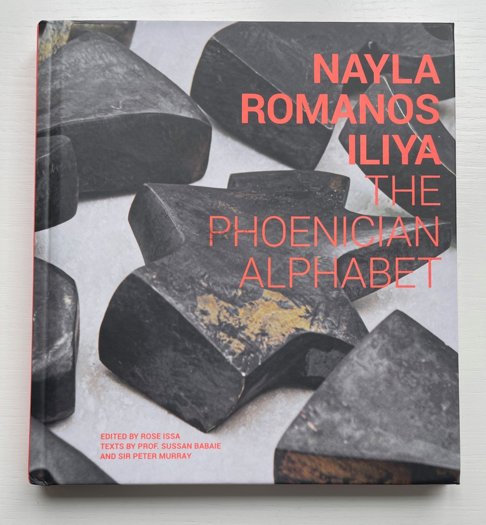
The Phoenician Alphabet (2022)

The Phoenician Alphabet (2022)
Nayla Romanos Iliya (art), Rose Issa, Susan Babaie and Peter Murray (text)
Casebound laminated cover. H205 x W185 mm. 108 pages. Acquired from Les presses du réel, 2 February 2023.
Photos: Books On Books Collection.

Herodotus first put forward the historical account that Cadmos, a prince from Byblos in today’s Lebanon, brought the Phoenician alphabet to the Greeks in ancient times (anywhere from the 12th to 8th century BCE according to scholars of the 20th and 21st centuries CE). The myth and story of Cadmos — his pursuit of his sister Europa kidnapped by Zeus, his founding the city of Thebes and his delivering the alphabet — are entertainingly recounted in the children’s book There’s a Monster in the Alphabet (2002) by James Rumford. The relative settling on the Semitic origins of Cadmos and the Phoenician alphabet is well covered in Johanna Drucker’s Inventing the Alphabet (2022).

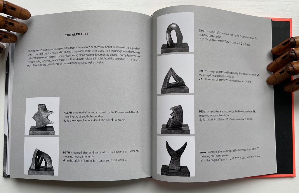
Lebanon’s being the ancient source of this civilizing invention and the site today of ever-present conflict and ever-elusive peace is a challenging irony. Architect and artist Romanos Iliya meets that challenge with works like On the Other Side of Time (a soaring public sculpture in Beirut), Flower Power (forms made of concrete, steel and shell casings and splinters), 1001 Lights (an interactive sculpture of light, cubes and Arabic calligraphy) and the Phoenician Alphabet (public sculptures inspired by those shapes that Cadmos brought to capture the sounds of language). The monograph displays these works and more, including the limited edition series called Small Characters that she made for the National Museum of Beirut and the AUB Archaeology Museum.

Small Characters (2014) displayed in The Phoenician Alphabet.

Just as Ron King’s ABC Paperweights have done for the Latin alphabet, Romanos Iliya’s Phoenician letters suggest rather than replicate.

ABC Paperweights [nd]
Ron King
Resin sculptures on painted wooden board Acquired from the artist, 24 July 2021.
Photos: Books On Books Collection.

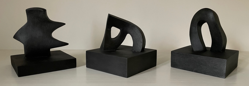
Alef, Beth and Gimel from the series Small Characters (2014)
Nayla Romanos Iliya
Sculptures in resin. 130 x 130 mm, variable height.Edition of 100 each, of which these are #26, #16 and #25, respectively. Acquired from the artist, 13 October 2023.
Photos: Books On Books Collection.

These three letters from the Small Characters series arrived too late to be included in the exhibition Alphabets Alive! at the Bodleian in Oxford. Had they arrived in time, however, they might have thrown the exhibition off track. The Alphabets Alive! exhibition began with a focus on artists’ books and the alphabet. A few non-print and non-book works slipped into the cabinets. But so resonant and evocative are these representations of the Phoenician alphabet that they would have — and have — led to a search for other sculptural works. Imagine the completely different and monumental display needed to accommodate these 26 artists alongside Romanos Iliya and King. Enjoy the links.

Cynthia Atwood

Preksha Baid

Ognyan Chitakov

Richard Deacon

Hazem el Mestikawy

Dominault Evelyne

Emily Floyd

Glagolitic Alphabet Trail

Thierry Gouttenègre

Ebon Heath

Eric Ho & Kostika Spaho

Takanobu Igarashi

Collene Karcher

Marianne Larsen

Catherine Lesueur

Paco Torres Monsó

Claes Oldenburg

Jaume Plensa

Azza al Qubaisi

Peyton Scott Russell

Joyce Steinfeld

J. Torosyan

La Table de Vox

John Ventimiglia

Ross Wilson

Nicola Yeoman

Further Reading

Abecedaries I (in progress)“. Books On Books Collection.

Alphabets Alive! “. 19 July 2023 – 21 January 2024. Bodleian Libraries, Oxford.

Lyn Davies“. 7 August 2022. Books On Books Collection.

Timothy Donaldson“. 1 February 2023. Books On Books Collection.

Cari Ferraro“. 1 February 2023. Books On Books Collection.

Ron King“. 1 March 2021. Books On Books Collection.

Abe Kuipers“. 15 February 2023. Books On Books Collection.

Don Robb and Anne Smith“. 26 March 2023. Books On Books Collection.

Renzo Rossi“. 10 July 2023. Books On Books Collection.

James Rumford. 21 November 2022. Books On Books Collection.

Tiphaine Samoyault“. 10 July 2023. Books On Books Collection.

Ben Shahn“. 20 July 2022. Books On Books Collection.

Tommy Thompson“. 21 August 2022. Books On Books Collection.

Ada Yardeni“. 10 July 2023. Books On Books Collection.

Bernal, Martin. 1990. Cadmean Letters : The Transmission of the Alphabet to the Aegean and Further West Before 1400 B.C. Winona Lake IN: Eisenbrauns. Bodleian.

Diringer, David, and Reinhold Regensburger. 1968. The alphabet: a key to the history of mankind. London: Hutchinson. A standard, beginning to be challenged by late 20th and early 21st century archaeological findings and palaeographical studies. Bodleian.

Drucker, Johanna. 2022. Inventing the Alphabet : The Origins of Letters from Antiquity to the Present. Chicago: University of Chicago Press. Bodleian.

Firmage, Richard A. 2001. The alphabet. London: Bloomsbury. Bodleian.

Fischer, Steven Roger. 2008. A history of writing. London: Reaktion Books. Bodleian.

Robb, Don, and Anne Smith. 2010. Ox, house, stick: the history of our alphabet. Watertown, MA: Charlesbridge. Children’s book.

Sacks, David. 2003. Language visible unraveling the mystery of the alphabet from A to Z. New York: Broadway Books. Bodleian.

Shaw, Gary. 15 April 2021. “Ancient ABCs: The alphabet’s ‘missing link’ discovered in Israel“. The Art Newspaper.

Books On Books Collection – Gennady Spirin

A Apple Pie (2005)

A Apple Pie (2005)
Gennady Spirin
Casebound, laminated paper over boards, pastedown with matching endpapers, sewn. 275 x 275 mm. 32 pages. Acquired from Bud Plant & Hutchison Books, 13 March 2023.
Photos: Books On Books Collection. Displayed with permission of the artist.

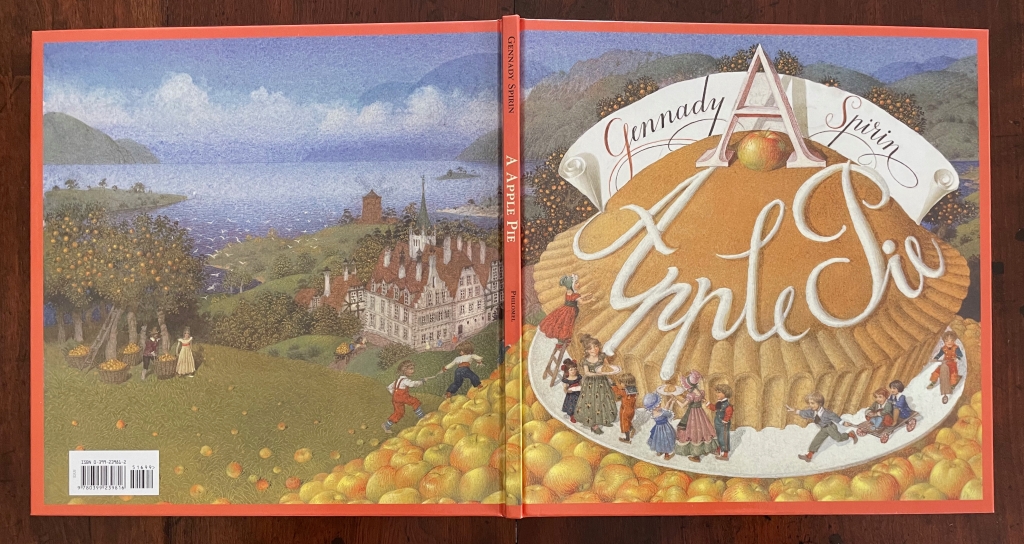
“Never judge a book by its cover” does not mean “ignore the clues and promises there”. A laminated cover and lay-flat binding are not uncommon among children’s books. Nor is the spreading of an illustration across the back and front covers. What is unusual about Gennady Spirin’s A Apple Pie is how it uses them to offer clues and promises of the lesson this book offers beyond the lesson of the alphabet. It promises a lesson about perspective and the canvas of the book.

Look at how the back and front covers play with landscape perspective and the notion of the book as frame and canvas. The head of the spine interrupts the landscape to join the narrow orange frame that demarcates the edges of the landscape. All the same, the landscape’s hill of apples in the foreground overlaps the spine to descend into the landscape’s midground on the back cover, which deepens into a background of at least five levels like a medieval or Renaissance painting.

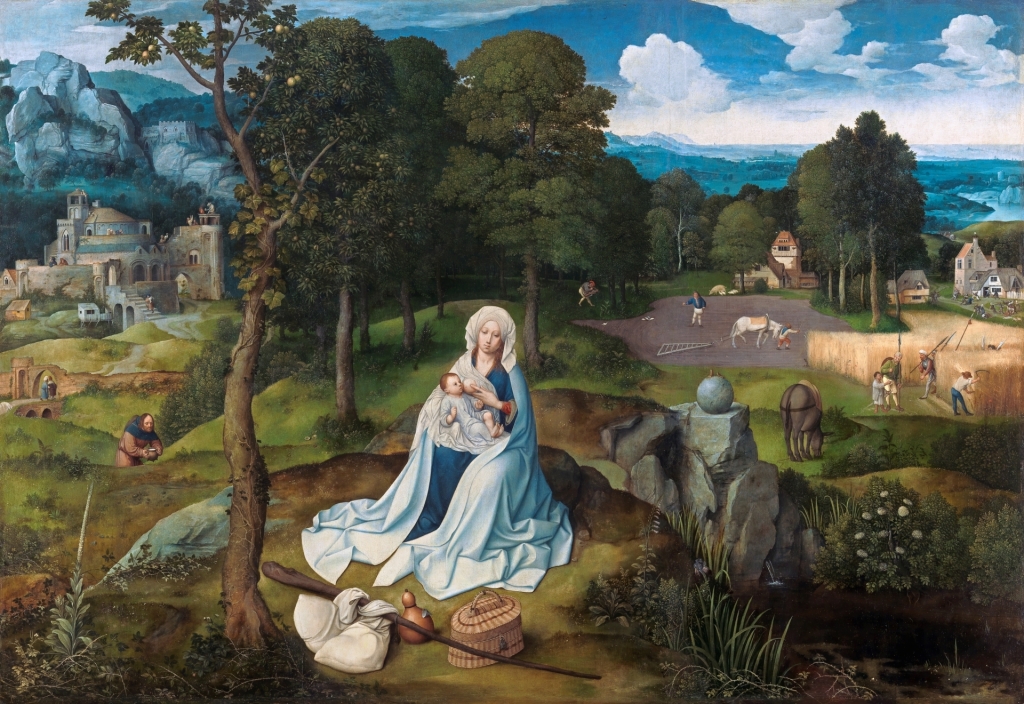
Another technique of perspective from those traditions is to place in the background things we know are large and in the foreground what we know is smaller. A temple or mansion behind, a mother and child or pie up front. These objects and figures often perform temporal double duty as in The Flight into Egypt, where the tiny workers misdirect the mass of Herod’s soldiers in the background while the Holy family looms large resting in the foreground. In Spirin’s illustration, the past apple-picking appears in the distance, and the resulting pie is near.

Rest on the Flight into Egypt (1518-20)
Joachim Patinir
Copyright ©Museo Nacional del Prado

Spirin slyly multiplies this trick with his apple pie in the foreground with its tiny characters dancing around it. Yes, this book is going to replay the traditional celebration of the apple pie alphabet, but pay attention to relative sizes. The pie is monumental, larger even than the three-dimensional letter A that sits atop and casts its shadow over the banner of calligraphy, so watch for how the trick of shadows draws attention to perspective, to the roman vs calligraphic letters and to the surfaces on which the letters and tricks of perspective play out.

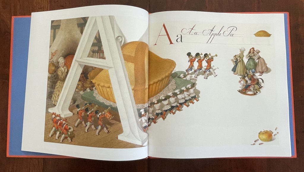
The very first double-page spread delivers on the cover’s clues and promises.

The oversized carved A serves as an arch to provide an example of a word beginning with A and casts its shadow over the oversized pie and cutting board that a team of elf-sized bakers has borne under it to the applause of mother and children who are mid-sized between the pie and bakers. The A is so oversized that its apex disappears from the image area. Bringing further attention to the image area and deepening its dimensionality, Spirin “cuts” the surface on which it is drawn and curls the cut section against the arm of the A.

In the world of letters, size matters — in the form of the upper and lower cases.

Further drawing attention to the art of illustrating the alphabet, not only does Spirin hand-draw examples of their forms in print and calligraphy, he leaves the guidelines for the base and x-height in place, eliminating them after (or before?) using them as the measure for the base and crust of a miniature pie in the margin. In a sense, the process of lettering has also become the canvas for A Apple Pie.

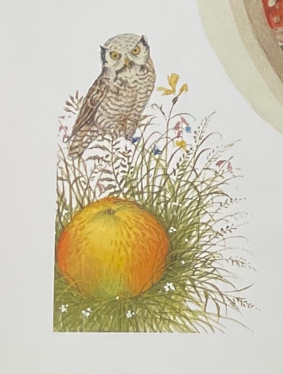
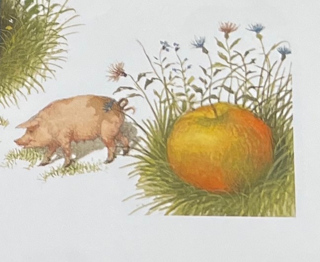
This process is displayed for every letter. Most also have a small apple vignette in the lower left or lower right corner.

As with the ants surrounding the apple, most of these vignettes serve up images that begin with the letters of their pages (for example, O for owl and P for pig) and are trimmed to re-emphasize the pages’ image space with which Spirin plays.

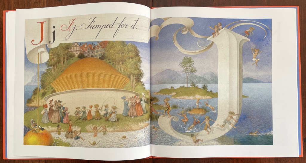
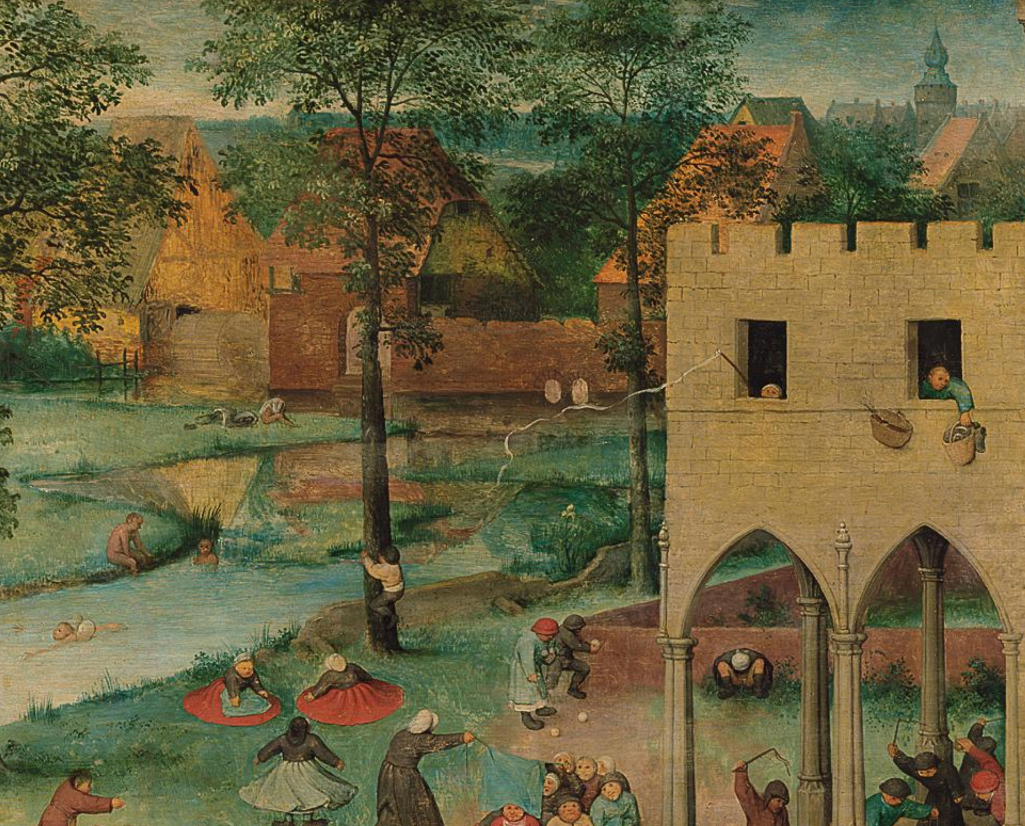
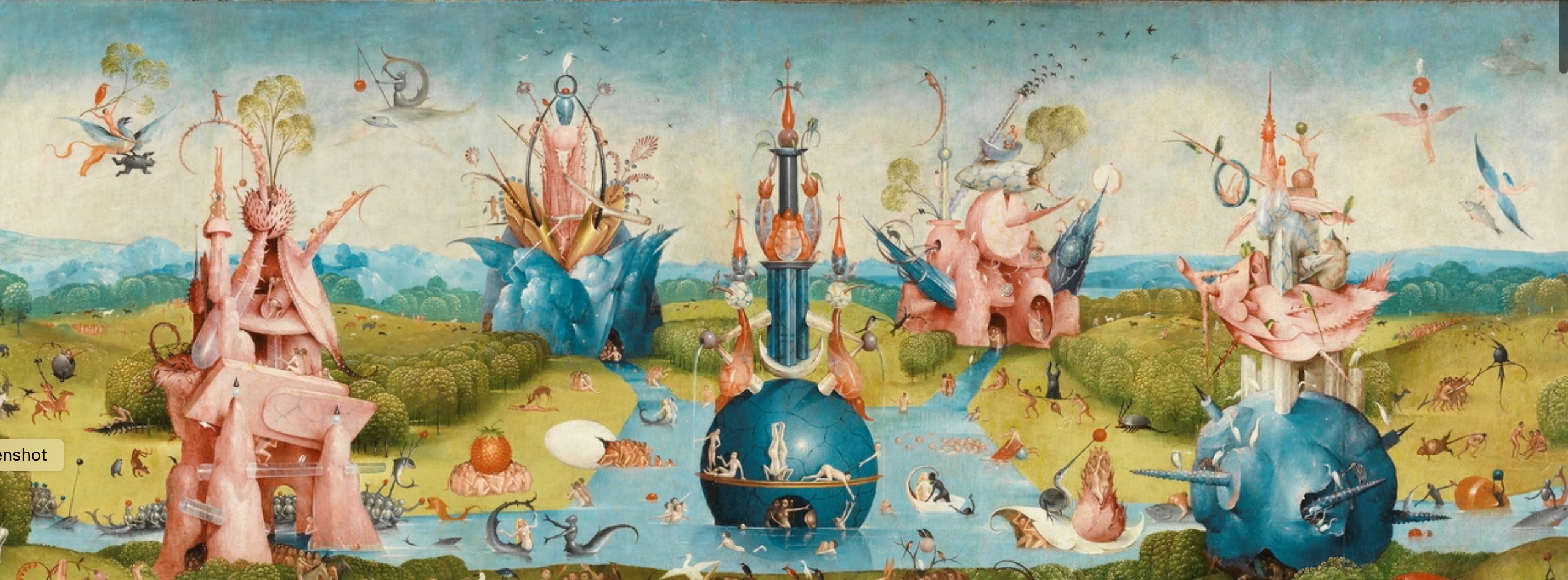
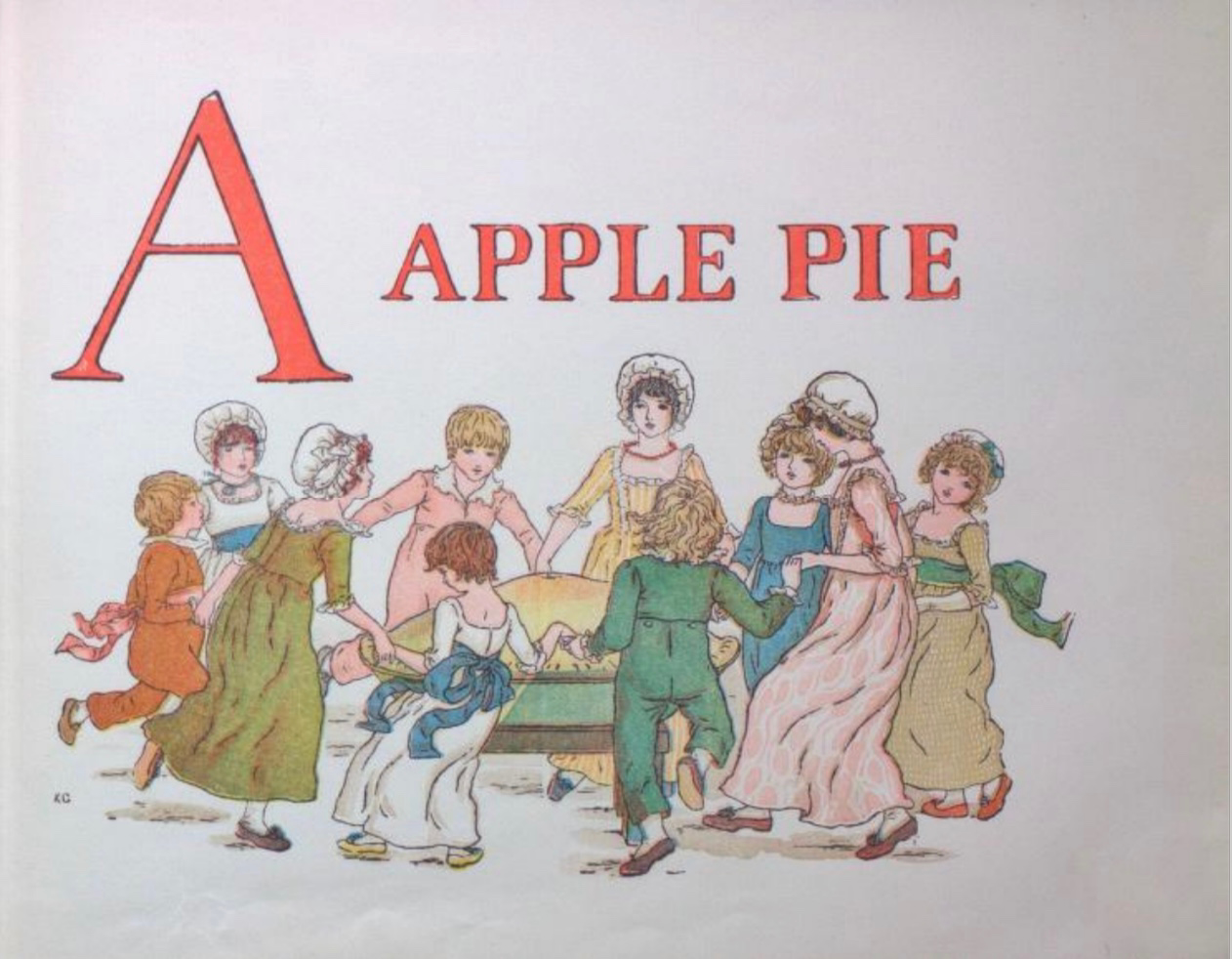
Letters other than A have images that cross the divide of pages. When they do, Spirin’s historical influences ranging from the medieval to the Renaissance to the Victorians stand out even more. His play with figures, color, perspective and shadow in the letter J pages recall Brueghel, Bosch, Patinir and, of course, Kate Greenaway.

Detail from Children’s Games (1560), Jan Brueghel, Kunsthistoriches Museum Wien
Detail from Garden of Earthly Delights (1490-1500), Hieronymus Bosch, Museo del Prado
A Apple Pie (c. 1886), Kate Greenaway, Internet Archive

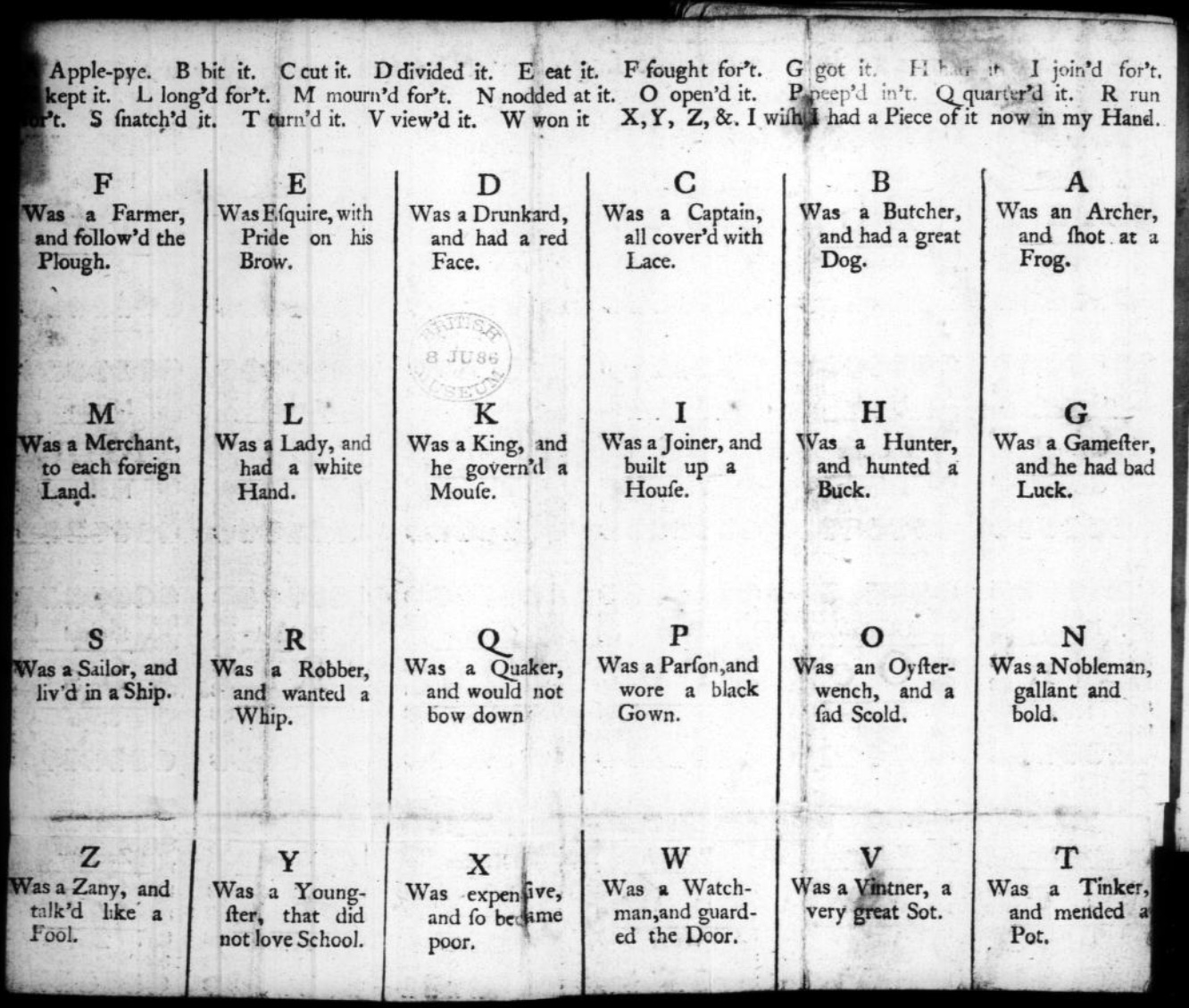
The tradition of the “apple pie” mnemonic reaches almost as far back as the artistic ones. As noted on Spirin’s copyright page and confirmed in Peter Hunt’s International Companion, alphabet primers based on the mnemonic must have been well known prior to 1671 when the English cleric John Eachard  referred to it. Compiled from the Bodleian Libraries’ record of “apple pie” items in the Opie Collection and from preparation for the exhibition Alphabets Alive!, here is a starting list for the industrious apple-picking artist interested in confecting an extension to the tradition. (Suggested additions to the menu are welcome in the Comments.) Scholarly baker’s apprentices should also start with the dissertation of the appropriately named A. Robin Hoffman (now at the Art Institute of Chicago); see Further Reading below.

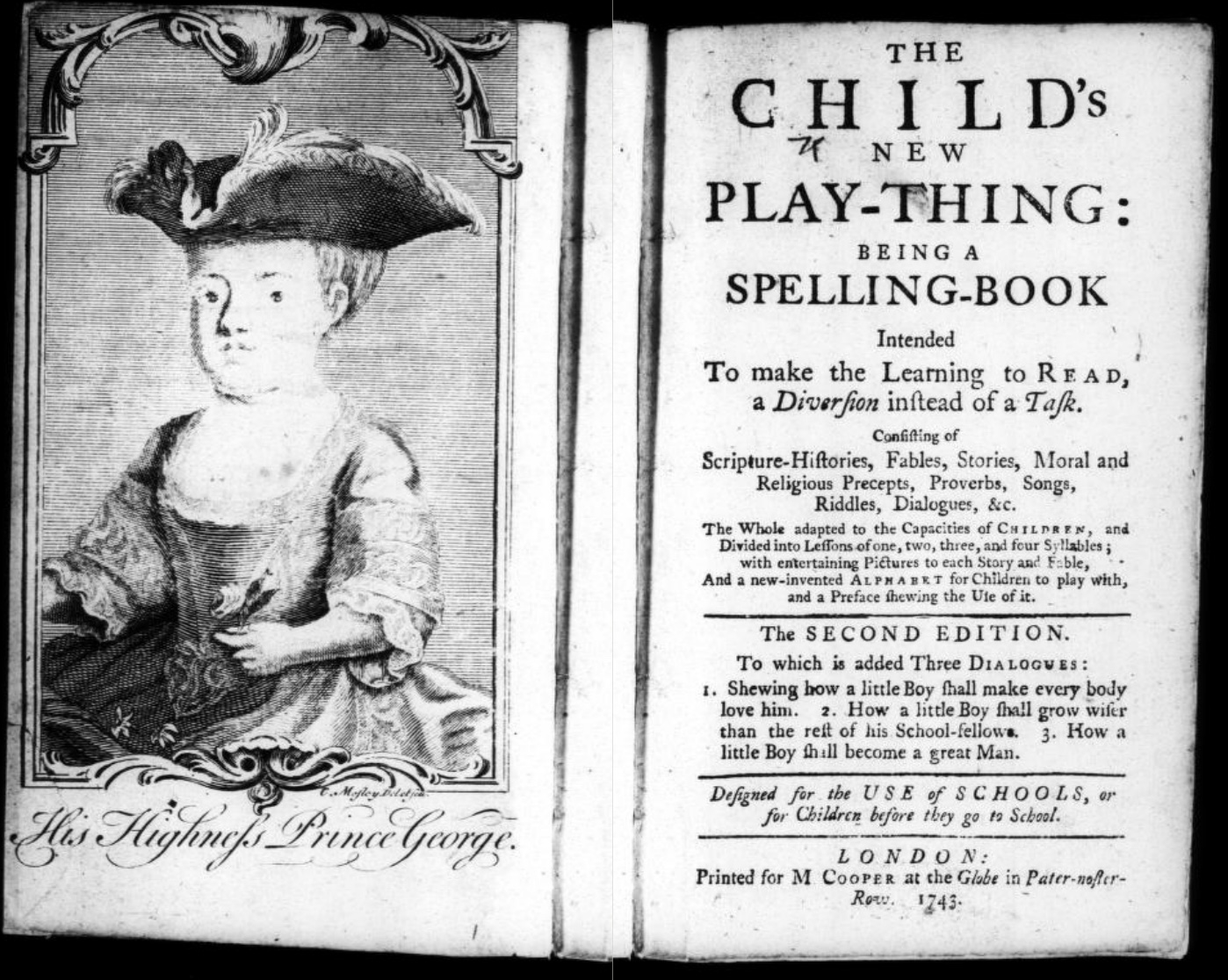
1743. The child’s new play-thing : being a spelling-book intended to make the learning to read, a diversion instead of a task. consisting of scripture-histories, fables, stories, moral and religious precepts, proverbs, songs, riddles, dialogues, &c. the whole adapted to the capacities of children, … or for children before they go to school. London: Mary Cooper.

British Library (formerly British Museum)

1764. Tom thumb’s play-book : to teach children their letters as soon as they can speak. London. Contains “A Apple Pie” as well as “A was an Archer“.

1791. The tragical death of a apple-pye : who was cut in pieces and eat by twenty five gentlemen : with whom all little people ought to be very well acquainted. London: J. Evans. Internet Archive.

1800-12. The Tragical Death of a Apple-Pye, Who Was Cut in Pieces and Eat by Twenty Five Gentlemen with
Whom All Little People Ought to Be Well Acquainted
.
London: Printed for John Evans, 42, Long-lane, West-Smithfield. Folded sheet, as issued. 9.5 x 5.9 cm. Opie N 589.

1808. The History of the Apple Pie. Written by Z. London: John Harris and Son. Opie C 1152. Also viewable here.

1815. The History of Master Watkins : To Which Is Added, The Tragical Death of an Apple-Pie. Chelmsford: Marsden, printer. Opie N 887.

1820. Hone, W. & Cruikshank, G. The Political “A Apple Pie” … by the Author of “The House that Jack Built”. Sixth ed. London: Printed for the Author; sold by J. Johnston. Johnson e.1111.

1820, ca. The History of an Apple-Pie. Written by Z. London: Harris and Son. 17.3 x 10.5 cm. Opie N 582.

1827. The History of A Apple Pie. Written by Z. London: Orlando Hodgson.

1835-57. Marks’ History of an Apple Pie. King Pippin’s Alphabet for Good Children. London: J. Marks.
17 x 10.2 cm. Opie N 588. Also view here.

1836. Bouncing B. The History of an Apple Pie. William Darton and Son.

1837-45. The History of an Apple Pie. London: Darton & Clark. 16 x 10.5 cm. Opie N 583.

1841. The tragical death of an apple pie : who was cut to pieces and eaten by twenty-five gentlemen with whom all little people ought to be acquainted. Printed by J. Paul & Co. London: 2 & 3 Monmouth-court. View here.

1843-49. The History of an Apple Pie; with Ditties for the Nursery, by Dame Dearlove’s Ditties. London: Grant and Griffith. 17.9 x 10.8 cm. Colophon of S & J. Bentley, Wilson, and Fley, Bangor House, Shoe Lane. Opie N 584.

1851-74. The Apple-Pie Alphabet. London: John and Charles Mozley, 6 Paternoster Row. 13.1 x 8.2 cm. Colophon of Henry Mozley and Sons, Derby. This title number 26 in the publisher’s series of penny chapbooks. Opie N 580. See also Opie N 581.

1856-65. The History of an Apple Pie. Written by Z. London: Griffith and Farran. 17.6 x 11.5 cm. Reissue as a rag book of the 1820 edition published by J. Harris. Wrappers have the colophon of H.W. Hutchings, 63, Snow Hill, London. Opie N 585. See also Opie N 586 for larger version (18 x 19.8 cm). From the library of Roland Knaster.

1860, ca. The History of an Apple Pie. London: J. Bysh, 157 & 158 Albany Road, Old Kent Road. 13.6 x 10.7 cm. Opie N 587.

1860, not after. The Apple Pie. London: Darton & Co., 58 Holborn Hill. 25 x 17 cm. Darton’s Indestructible Elementary Children’s Books. Inscription dated 8 February 1860. Opie N 2. Also view here.

1861, not before. The History of A, Apple Pie. London: Dean & Son, Printers, Lithographers, and Book and Print
Publishers, 11, Ludgate Hill. 25 x 16.5 cm. (Dean’s Untearable Cloth Children’s Coloured Toy Books). Opie N 4.

1865, ca. A. Apple Pie. London: Frederick Warne & Co. 26.8 x 22.6 cm. Aunt Louisa’s London Toy Books. Colophon of Kronheim & Co. Opie N 1.

1865-89. The History of A Apple Pie. London: George Routledge & Sons. 31 x 25.2 cm. Rear wrapper has colophon of the lithographer L. van Leer & Co, Holland and 62 Ludgate Hill Opie N 5. Also see Pussy’s Picture Book. Opie N 1017.

1874. Routledge’s nursery album for children. London: George Routledge and Sons. A.

1886, ca. Kate Greenaway. A Apple Pie. London: George Routledge and Sons. Opie N 18. Also view here and here.

1890, ca. E.A. Cooke. The Story of A Apple Pie. London: R. E. King & Co.

1899. A.B.C. of the Apple Pie. Printed on linen. New York: McLouglin Bros. Viewable here.

19__, ca. A Apple Pie. An Alphabet from Modelled Designs by Mrs. Wm. Harbutt. Pen and Ink Drawings by Noel C. Harbutt A.R.C.A. London: Dean & Son, Ltd; Bathampton: W. Harbutt. Plasticine Works & Studio. 25.4 x 18.8 cm. Opie N 3.

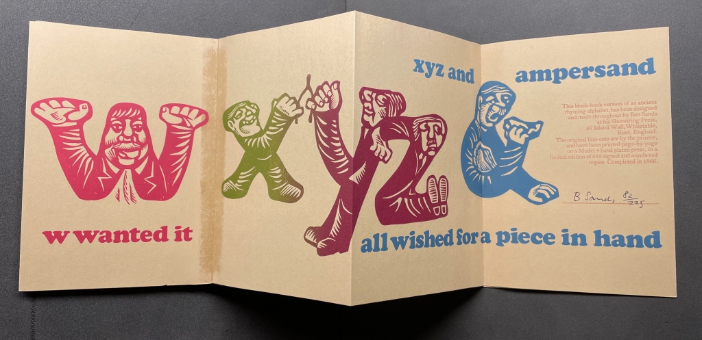
1966. The Tragical Death of A. Apple Pie Who Was Cut in Pieces, and Eaten by Twenty-Six Little Villains.
[Whitstable, Kent: Ben Sands at his Shoestring Press]. Leporello. 11.5 x 13.4 cm. #185/225 copies. Gift of Roland Knaster. Opie N 590.

From the Bodleian Librairies’ copy of The Tragical Death … (1966)
Ben Sands
Photo: Books On Books.

1974. William Stobbs. A is an Apple Pie. London: The Bodley Head.

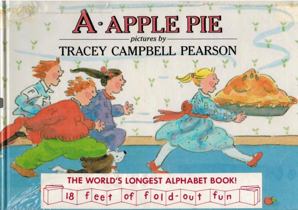
1986. Tracey Campbell Pearson. A Was an Apple Pie. London: Bodley Head.

1987. Gavin Bishop. A Apple Pie. Oxford University Press.

2011. Alison Murray. Apple Pie ABC. London: Orchard Books.

Further Reading

Alphabets Alive!“. 19 July 2023. Books On Books.

Hoffman, A. Robin. 2012. “‘Doubtful Characters’: Alphabet Books and Battles over Literacy in Nineteenth-Century British Print Culture“. Diss. University of Pittsburgh.

Hunt, Peter. 2004. International Companion Encyclopedia of Children’s Literature. 2nd ed. London: Routledge, p. 179.

Webb, Poul. 2017~ . “Alphabet Books — Parts 1-8” on Art & Artists. Google has designated this site “A Blog of Note”, well deserved for its historical breadth in examples, clarity of images and insight.

Books On Books Collection – Raj Haldar, Chris Carpenter & Maria Tina Beddia

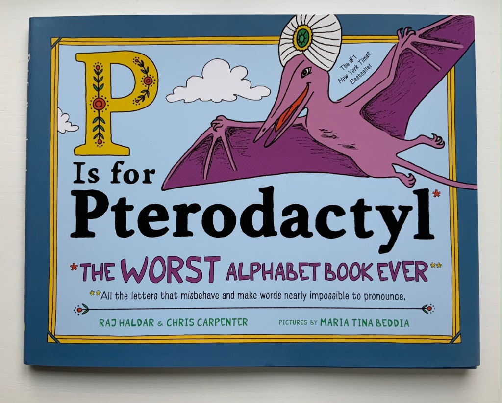
P is for Pterodactyl (2018)

P is for Pterodactyl: The Worst Alphabet Book Ever (2018)
Raj Haldar, Chris Carpenter & Maria Tina Beddia
Hardback, illustrated paper on boards, dustjacket. H222 x W286 mm. 40 pages. Purchased from Amazon, 17 August 2021.
Photos: Books On Books Collection.

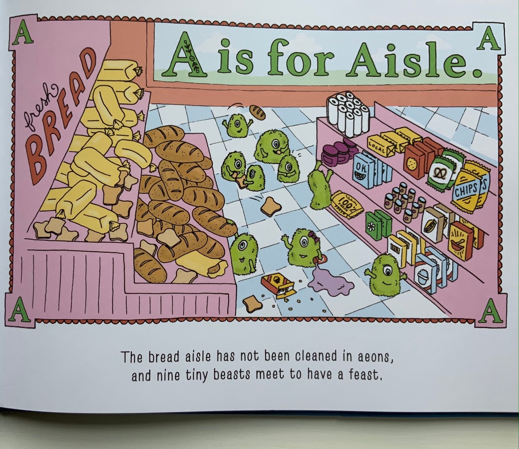
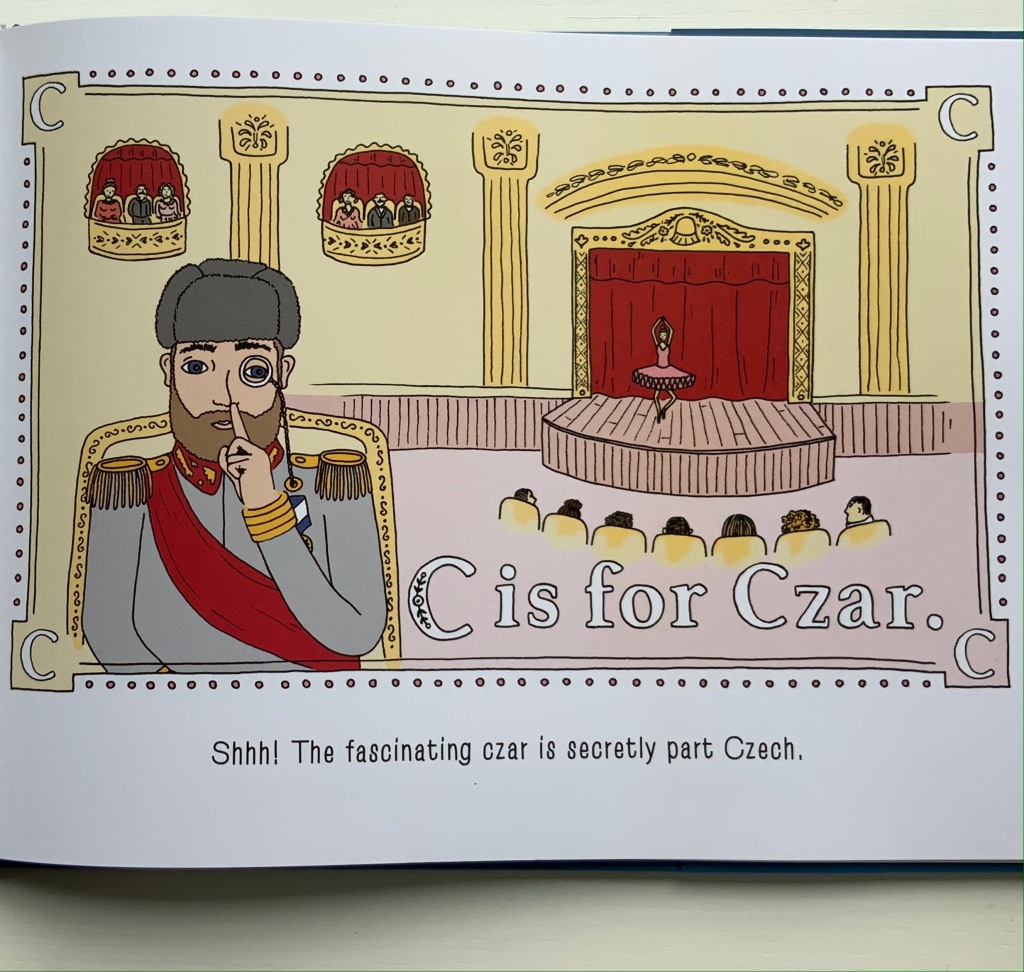
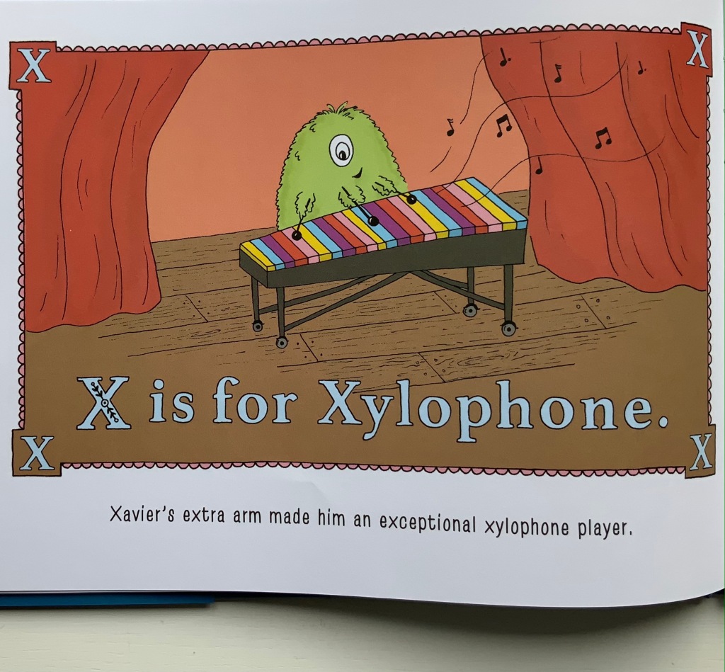
If a posthumous revision of Eric Partridge’s Comic Alphabets were possible, this one would have to be included. But why did it take so long for the oddball abecedary and the oddities of spelling to meet in “The Worst Alphabet Book Ever“? Or maybe the 19th century spelling reformer Alexander J. Ellis compiled a still-to-be-discovered abecedary displaying a carp above the word ghoti.

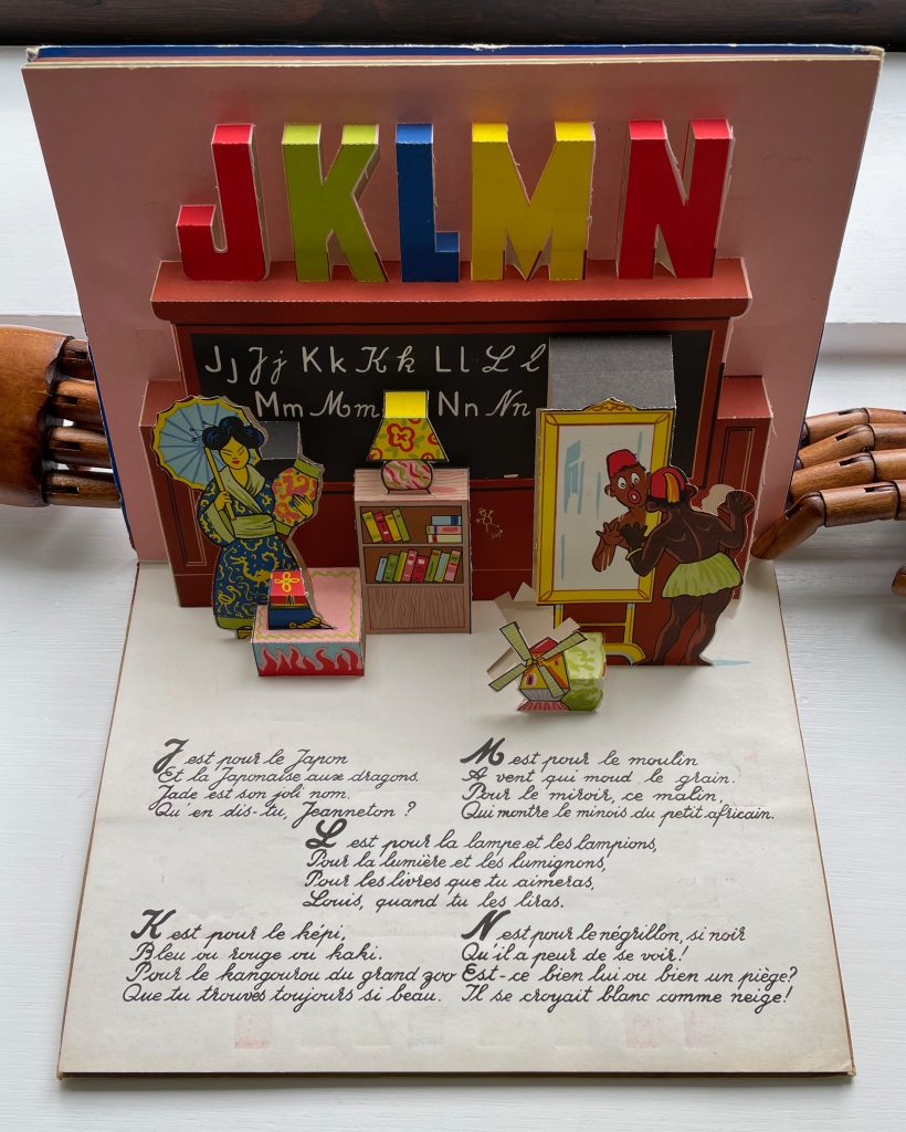
Apropos of carp, though: the entry for bdellium is irritating on two scores. First, it is not the only word dumb enough to begin with “b”; there is also bdellatomy and bdellometer. Second, while true that the tree producing the gum resin bdellium is native to the East Indies and Africa, there are words other than dumb ending in a silent /b/ that the authors might have chosen to underscore their point. But they didn’t and fell into the sticky colonial trap illustrated (somewhat more obviously) below.

From Abc En Relief (1955) 
Jo Zagula and Marguerite Thiebold
Photo: Books On Books Collection.

Further Reading

Abecedaries I (in progress)“. Books On Books Collection.

Alphabets Alive! – Adventures“. 19 July 2023. Books On Books Collection.

Ellis, Alexander John. 1848. A Plea for Phonetic Spelling. 2d ed. London: F. Pitman.

Partridge, Eric, and Michael Foreman. 1961. Comic Alphabets : Their Origin Development Nature. London: Routledge & Paul.

Harris, Chris and Dan Santat. 2020. The Alphabet’s Alphabet .First ed. New York: Little Brown and Company.

Books On Books Collection – Jason D’Aquino

Jason D’Aquino’s Circus ABC (2010)

Jason D’Aquino’s Circus ABC (2010)
Jason D’Aquino
Hardcover, cloth spine, printed paper over boards. H158 x W 158 mm. 56 pages. Acquired from Amazon, 24 September 2022.
Photos: Books On Books Collection

At the intersection of alphabet books and artists’ books, surrealists and neo-surrealists come sailing, unicycling, swimming, stilt-walking and crossbreeding. Jason D’Aquino distinguishes his contribution with a circus theme and miniaturist’s hand, although his publisher Simply Read Books expands it to 158 mm square (6 x 6 inches).

The illustrations are more R. Crumb than Max Ernst, and the letters themselves hark back to Jean Midolle’s Écritures Ánciennes D’après Des Manuscrits & Les Meillers Ouvrages (1834). But in concept and execution, Jason D’Aquino’s Circus ABC is original. The fineness of D’Aquino’s drawings fascinates the eye.

Jean Midolle, Alphabet Composée 1832. From Luc Devroye’s Type Design, Typography, Typefaces and Fonts, last updated 18 May 2023. Accessed 26 May 2023.

D’Aquino’s book is also eclectic in its abecedary approach. Above, where the illustration for the letter C offers several things beginning with that letter, those for A and B do not play the “find the object” game, although they do have their jokes. The mermaid’s is an optical illusion.The barker’s joke is that he is D’Aquino’s self-portrait. And with the letter Z below, for which nothing shown begins with the letter Z, the visual puzzle lies in figuring out what the crown, martini and cigarette have to do with the anatomical swap-out between the goldfish and chimp — and why the image so strongly echoes that for letter A.

Surrealism has roots in the art of Hieronymus Bosch as well as in the fantastical alphabets of Jean Midolle and his medieval predecessors. Not surprising then that elements of D’Aquino’s world can be found in the Garden of Earthly Delights and the Kennicott Bible. Other surrealist alphabets from the Books On Books Collection are listed below.

Above: Detail from Hieronymus Bosch, The Garden of Early Delights (1490-1510). Below: Hebrew Bible (Former Prophets with Targum and various commentaries), Bodleian Library MS. Kennicott 5, 446v.

Further Reading

Abecedaries I (in progress)“. Books On Books Collection.

Jim Avignon & Anja Lutz“. 29 October 2022. Books On Books Collection.

Leonard Brett“. 8 August 2023. Books On Books Collection.

Roman Cieślewicz“. Books On Books Collection. In progress.

Leslie Haines“. 4 November 2022. Books On Books Collection.

Lynn Hatzius“. 2 December 2022. Books On Books Collection.

Peter Hutchinson“. Books On Books Collection. In progress.

Peter Malutzki“. Books On Books Collection. In progress.

Clément Meriguet“. 13 November 2021. Books On Books Collection.

Paul Noble“. 20 April 2021. Books On Books Collection.

Judy Pelikan“. 2 June 2023. Books On Books Collection.

Rose Sanderson“. 30 May 2023. Books On Books Collection.

Pat Sweet“. 18 January 2023. Books On Books Collection.

Ludwig Zeller“. 24 March 2020. Books On Books Collection.
Druker, Elina, and Kümmerling-Meibauer, Bettina. 2015. Children’s Literature and the Avant-Garde. Amsterdam: John Benjamins Publishing Company. Especially Philip Nel’s “Surrealism for Children”, pp. 267-83.

Van Huijstee, Pieter, and NTR. 2016. Interactive Documentary, Jheronimus Bosch, The Garden of Earthly Delights. Amsterdam: Pieter van Huystee Film, NTR. Accessed 26 May 2023.

Books On Books Collection – Edmund Fry

Pantographia (1799/2022)

Pantographia, Containing accurate Copies of all the known Alphabets in the World (1799/2022)
Edmund Fry
Casebound in Italian Fedrigoni Imitlin, sewn book block, black endpapers. H215 x W140 mm. Acquired from Black Letter Press, 1 April 2022.
Photos: Books On Books Collection.

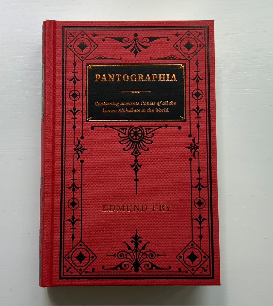
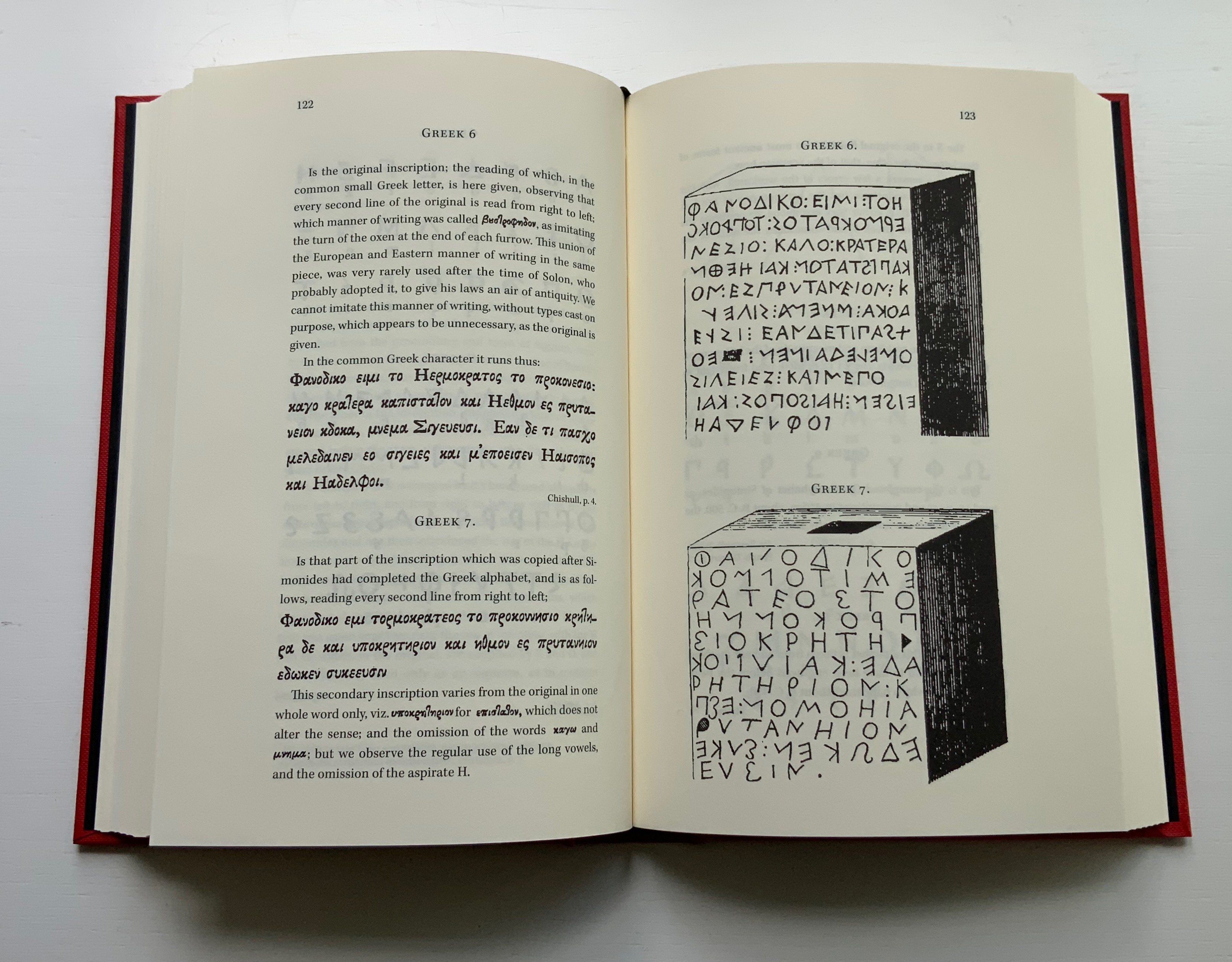
For the Enlightenment, everything that existed was meant to be in an encyclopedia. For Dr. Edmund Fry, scholar, typographer and owner of The Polyglot Foundry, this notion (and the spur of profit) led to his Pantographia (1799). Extraordinarily, Fry made the matrix for each of the roughly 5,000 characters for the 405 alphabet specimens, then handcast each — a monumental sixteen-year accomplishment in craftsmanship. Quite a type sampler for a printer specializing in foreign languages.

Fry was also driven by the importance of the subject: the origin of speech, its being made visible and the varieties of doing so. “The art of drawing ideas into vision, or of exhibiting the conceptions of the mind, by legible characters, may justly be deemed the noblest and most beneficial invention of which human ingenuity can boast — an invention which has contributed, more than all the others, to the improvement of mankind.” (xviii)

Fry is even handed in presenting the arguments and evidence for and against the two possible origins of speech he identifies — divine gift or human invention. He is unequivocal though “that all languages … that have been conveyed in alphabetical characters, have been those of people connected ultimately or immediately with the Hebrews, to whom we are indebted for the earliest specimens of the communication of ideas by writing” and “that there was but one truly original language, from which all others are derivations variously modified”. (xxxviii, xliii)

Plenty has been written about Fry’s accomplishment. Johanna Drucker has explored it in her Alphabetic Labyrinth and more recent Inventing the Alphabet. Even more recently, Hunter Dukes, editor of The Public Domain Review, posted a brief celebration, citing Drucker. Jan Düsterhöft, a German academic now affiliated with the Georg Eckert Institute, provides the publisher’s preface to the Black Letter Press edition shown above. All three identify the two features of Pantographia that echo two other works in the Books On Books Collection: Sam Winston’s One & Everything (2023) and Claire Jeanine Satin’s The Hebrew Alphabet Expressing the Celestial Constellations (2017).

Original at Mansfield College Library, Oxford University

Even in 1799 several of the alphabets displayed by Fry represented extinct languages. Today the Endangered Alphabets Project initiated by Tim Brookes aims rescue languages and their alphabets from that fate. Brookes’ project inspired Sam Winston’s story. More forcibly than Drucker and Dukes, Düsterhöft identifies the imperialist and Western perspective in Fry’s endeavor. Winston’s fable is populated with “story characters”, drawn as various sized and colored blobs, each filled with its distinguishing alphabet. Some are filled with hieroglyphic dogs (presumably for Egyptian shaggy-dog stories), others with Greek, Cherokee and so on. The one story that decides it is the “One and Only story” is filled with the English (Latin or Roman) alphabet and proceeds to eat up all the others.

In Pantographia, Chaldean, one of the extinct languages, is a special case, not because Fry includes 20 variant specimens (Greek has 39) but because it is reportedly celestial. The first of Fry’s cited sources for this alphabet is Jacques Gaffarel (1601–1681), a French scholar and astrologer. A bit of digging reveals the source to be more precisely a woodcut from a 1650 translation of Gaffarel’s Curiositez inouyes sur la sculpture talismanique des Persans, horoscope des Patriarches et lecture des estoiles (1629).

From Pantographia (2022)

Unheard-of Curiosities : Concerning the Talismanical Sculpture of the Persians, the Horoscope of the Patriarkes, and the Reading of the Stars (1650)
Jacques Gaffarel

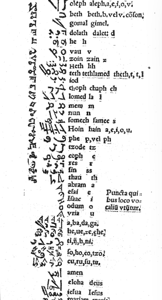
In addition to its astrological character, Gaffarel’s work sits in the traditions of gematria, the Kabbalah and alchemy, which Johanna Drucker has thoroughly explored in Alphabetical Labyrinth (1999) and Inventing the Alphabet (2022). Among the earlier contributors to these traditions is Heinrich Cornelius Agrippa. Like his mentor Johannes Trithemius, Agrippa was a polymath, occultist and theologian as well as physician, legal scholar and soldier. The Latinized Hebrew letters and their corresponding characters in the celestial alphabet seen below come from Agrippa’s De occulta philosophia (1533), which is more legible than Gaffarel’s above.

Henrici Cornelii Agrippae ab Nettesheym à consiliis & archiuis inditiarii sacrae Caesareae maiestatis De occulta philosophia libri tres (1533)
Heinrich Cornelius Agrippa von Nettesheim

Black Letter Press issued this edition in 2022. As indicated in the caption at the head of this entry, considerable attention to materials was given, including blind debossing and hotfoil printing on the front and spine. The edition is not a photographic facsimile; rather it has been scanned and phototypeset. Scanning in lieu of resetting does not eliminate errors, even if the scan is reviewed carefully. Aside from occurrences of “mod” instead of “most”, “mall” instead of “shall”, and “2ist” instead of “first”, though, the most unusual variation from the original is the deliberate movement of openings on the verso to openings on the recto and, in the specimen section, the reversal of all verso and recto pages. On his verso pages, Fry placed the specimen, and on the recto pages, he placed comments, explanations and sources. For Black Letter Press, the reverse seems to have made more sense. Below are comparisons of pages from the original (left) and the Black Letter Press edition (right).

Left: 1799 original. Right: Black Letter Press facsimile.

Most uncaught scanning errors leap out, so despite the niggling worry about accuracy, the greater legibility and probable accessibility of the 2022 edition is welcome for explorers of alphabets and alphabet-related works. For the Books On Books Collection, its enhancement of the pleasure in Winston’s and Satin’s works and others such as Golnar Adili’s BaaBaa Aab Dad, Islam Aly’s 26 Letters and Ben Shahn’s The Alphabet of Creation (1954), it is more than welcome.

Another 25 images of Fry’s original edition can be found here, courtesy of The Letterform Archive.

Further Reading

Abecedaries I (in progress)“. Books On Books Collection.
Drucker Johanna. 1999. The Alphabetic Labyrinth : The Letters in History and Imagination. London: Thames & Hudson.
Drucker Johanna. 2022. Inventing the Alphabet : The Origins of Letters from Antiquity to the Present. Chicago: University of Chicago Press. Not just another in the long line of histories of the alphabet, rather it explores “Who knew what when about the alphabet?” How did the way they knew it affect how they imagined its identity and origin? For Drucker, Pantographia marks an endpoint and transition. These printed compendia of alphabetic scripts began in 1518 with Johannes Trithemius. Initially spurred by interest in the occult as well as exotic and ancient scripts and a search for the “original” alphabet, compendia gradually became more secular but still eclectic. By 1799, Fry ‘s was an exception by still including the Celestial Alphabet and citing sources in trackable ways. Simultaneously an investment in imagination and a significant step forward for scholarship.
Dukes, Hunter. 10 October 2023. “Pantographia: A Specimen Book of All the Alphabets Known on Earth (1799)“. Public Domain Review. Dukes, editor of the Review, celebrates Pantographia‘s iconic presence in the public domain. In his celebrating, Dukes also notes the presence of the Celestial Alphabet in Pantographia and Drucker’s singling out Fry for taking the antiquarian compendium of alphabets to the earliest stage of specialized, professional research. He also surrounds Fry’s effort with other interesting direct and indirect contexts: the discovery of the Rosetta stone in the same year as Pantographia’s publication and the extinction of several of the languages that Fry’s alphabet represents.
Düsterhöft, Jan. 2022. “Foreword”. In Fry, Edmund. 1799. Pantographia, Containing accurate Copies of all the known Alphabets in the World. Turin, Ialy: Black Letter Press. A German academic now affiliated with the Georg Eckert Institute, Düsterhöft also raises the point about extinction and relates it to the West’s imperial colonial perspective, which Fry displays in his omissions and dismissal of the Chinese mind’s intellectual and rational capacity “as evidenced” by the lack of an alphabet. Düsterhöft also identifies Gaffarel’s source for the celestial alphabet: Guillaume Postel ‘s Linguarum Duodecim Characteribus Differentium Alphabetum Introductio [An Introduction to the Alphabetic Characters of Twelve Different Languages] (1538). Postel (1510 – 1581) was a polyglot French linguist, astronomer, Christian Cabalist, and di­plo­mat.

From Postel, Linguarum